10 Famous Logos With Hidden Meanings You Probably Never Noticed
A truly great logo does more than identify a brand. It communicates, persuades, and, in the best cases, tells a story without saying a single word. While many company logos rely on simplicity and clarity, the most memorable ones often hide clever details beneath the surface—subtle visual cues that reward those who take a closer look.
This is where logo history becomes fascinating. Behind many globally recognized designs lies a layer of meaning that goes unnoticed by millions of people every day. These hidden elements are not accidents. They are intentional decisions made by designers who understand that a logo should work on multiple levels: immediate recognition and deeper engagement.
In today’s visual economy, where attention spans are short and competition is fierce, these hidden messages can make a brand more memorable. From clever use of negative space to symbolic typography, many of the most iconic food logos, tech brands, and even fast food logos use this technique to create lasting impressions.
In this pillar guide, we explore ten remarkable logos with hidden meanings—some famous, some less obvious, but all brilliant in their execution.
1. FedEx — The Arrow You Can’t Unsee
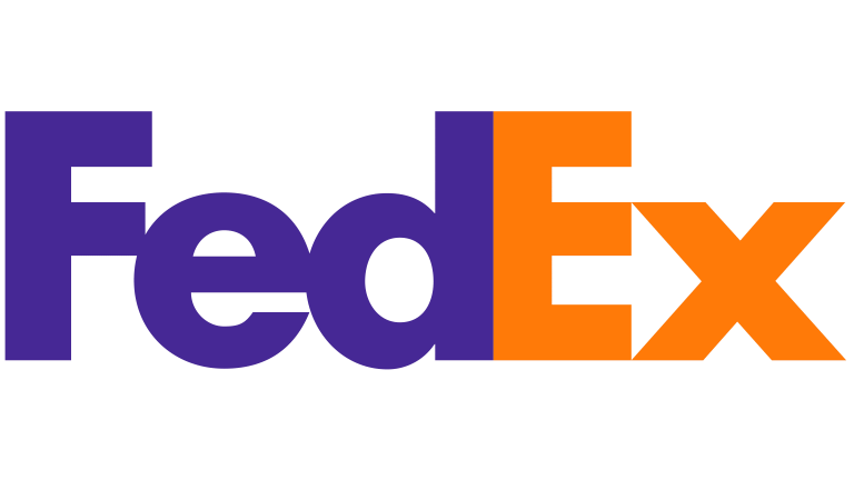
The FedEx logo is often cited as one of the greatest examples of hidden design in modern branding.
At first glance, it’s just bold typography in purple and orange. But look closer between the letters “E” and “x,” and you’ll spot a perfectly formed arrow.
This arrow symbolizes speed, precision, and forward movement—core values of the brand. Once you see it, it becomes impossible to ignore.
Among all company logos, this is one of the cleanest executions of negative space, proving that simplicity doesn’t mean lack of depth.
2. Toblerone — A Hidden Tribute to Its Origins
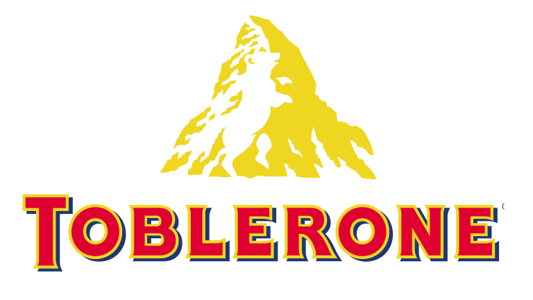
The Toblerone logo is known for its mountain, traditionally inspired by the Matterhorn.
But inside that mountain lies a hidden bear—an homage to the city of Bern in Switzerland, often called the “City of Bears.”
This subtle detail connects the product to its geographical roots, reinforcing authenticity and heritage—key elements in logo history, especially for premium food brands.
3. Baskin-Robbins — A Brand Built Around a Number
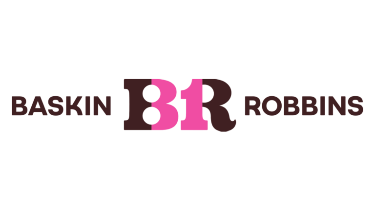
The Baskin-Robbins logo is colorful and playful, but it also hides a clever detail.
Within the “BR” initials, the number “31” is embedded in pink, representing the brand’s original concept: 31 flavors, one for each day of the month.
This is a perfect example of how food logos can integrate storytelling directly into typography, turning a simple number into a core brand message.
4. Formula 1 — Speed Hidden in Negative Space
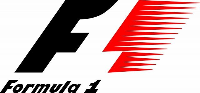
The Formula One logo uses negative space in a way that many viewers completely miss.
Between the “F” and the red speed lines, there is a hidden “1.” It’s subtle, but incredibly effective.
The design communicates speed, motion, and precision—all essential elements of the sport—while maintaining a clean and modern look.
This approach is often mirrored in fast food logos, where speed and efficiency are also key brand messages.
5. Tostitos — A Social Experience in a Logo
The Tostitos logo is one of the most playful in the food industry.
Look closely at the center of the wordmark. The two lowercase “t” letters represent people, the dot above the “i” becomes a bowl of salsa, and the yellow triangle between them is a chip.
Together, they form a scene of two people sharing food—perfectly aligned with the brand’s positioning as a social snack.
Among modern food logos, this is one of the most creative uses of hidden storytelling.
6. Tour de France — A Cyclist in Plain Sight
The Tour de France logo appears to be a stylized wordmark with a yellow circle.
But look closer, and you’ll see a cyclist hidden within the letters. The “R” forms the rider, the “O” becomes a wheel, and the yellow circle represents the sun—or the front wheel.
This dual meaning adds depth and personality, turning a simple logo into a visual narrative.
7. Hershey’s Kisses — More Than Meets the Eye
The Hershey’s Kisses logo already features two visible chocolate drops in its design.
But there’s a third one hidden between the “K” and the “I,” visible when you tilt your perspective slightly.
It’s a small detail, but it reinforces brand identity in a subtle and clever way—something often seen in well-crafted company logos.
8. Gillette — Precision Built Into Typography
The Gillette logo is sleek and modern, but it hides a sharp detail.
The gap between certain letters, particularly around the “G” and “I,” resembles a razor cut—clean, precise, and intentional.
This design choice visually reinforces the product’s function without using any literal imagery.
It’s a perfect example of how typography alone can carry meaning in logo history.
9. Amazon — More Than Just a Smile
The Amazon logo is widely recognized, but many overlook its full meaning.
The orange arrow stretches from “A” to “Z,” symbolizing that the company sells everything. At the same time, it forms a smile, suggesting customer satisfaction.
This dual-purpose design is what elevates it from a simple logo to a strategic branding tool.
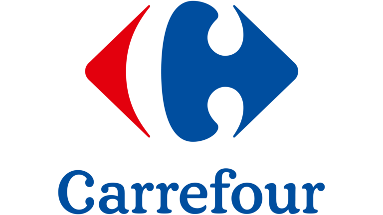
10. Carrefour — A Letter Hidden in Direction
The Carrefour logo uses red and blue shapes pointing in opposite directions.
Between them, in the negative space, lies a hidden “C”—the first letter of the brand.
It’s a subtle detail that many people never notice, yet it perfectly integrates identity into the design.
This kind of visual intelligence is what separates ordinary company logos from exceptional ones.
Why Hidden Meanings Matter in Logo Design
Hidden meanings are not just clever tricks. They are strategic tools.
In a world saturated with visuals, brands need to create multiple layers of engagement. A logo must work instantly, but it should also reward deeper attention. This is especially important in industries like food, where food logos compete for attention on crowded shelves, or in quick-service environments where fast food logos must communicate instantly.
From a logo history perspective, these hidden elements often become part of the brand’s mythology. They are shared, discovered, and remembered—adding value beyond the original design.
The Evolution of Company Logos: From Simplicity to Storytelling
If we look at the evolution of company logos, a clear trend emerges. Early logos focused on identification. Modern logos focus on experience.
Hidden meanings are part of this shift. They transform logos from static marks into interactive visuals—something users can explore and interpret.
This is particularly effective in digital environments, where engagement and shareability matter more than ever.
The Power Behind What You Don’t See
The most effective logos are not always the most obvious ones. Sometimes, their true brilliance lies beneath the surface.
From hidden arrows to embedded symbols, these designs show that great branding is about more than appearance. It’s about intention, storytelling, and attention to detail.
Understanding logo history, analyzing company logos, and exploring hidden meanings reveals just how much thought goes into even the simplest designs.
The next time you see a familiar logo, take a second look. You might discover something that’s been there all along.
Frequently Asked Questions About Hidden Logo Meanings
What are hidden meanings in logos?
Hidden meanings are subtle design elements embedded within logos, often using negative space, typography, or symbolism to convey additional messages.
Why do brands include hidden messages in their logos?
They make logos more memorable, engaging, and meaningful, strengthening brand identity and storytelling.
Are hidden meanings common in food logos?
Yes, many food logos use hidden elements to communicate values like sharing, freshness, or heritage.
How do fast food logos use hidden meanings?
Fast food logos often use color psychology and subtle design cues to suggest speed, energy, and satisfaction.
What is the best example of a hidden logo meaning?
The FedEx arrow is widely considered one of the best examples due to its simplicity and clarity.