The History of Logos: From Ancient Symbols to Modern Brand Identity
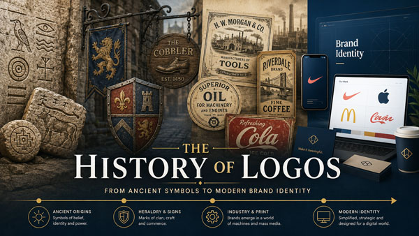
A logo may be small, but it can carry an entire brand on its shoulders. Before a customer reads a slogan, visits a website, or buys a product, the logo often does the first bit of work. It gives the brand a face. It makes it easier to remember. And, when it is used well over time, it can become almost impossible to separate from the company behind it.
Think of the Nike logo, the Apple logo, the McDonald’s logo, or the Coca-Cola logo. These are not just attractive pieces of design. They are visual shortcuts. You do not need a long explanation to understand them. You see the swoosh, the apple, the golden arches, or the flowing red script, and the brand immediately comes to mind.
That is the real power behind the history of logos. Logos are not a modern invention created by marketing departments. Long before corporations, advertising campaigns, and social media feeds, people were already using symbols to identify themselves, mark ownership, show loyalty, and stand apart from others.
The story of logo history begins with ancient civilizations and continues through medieval heraldry, shop signs, the printing press, mass production, corporate branding, and the digital age. At every stage, logos changed because the world around them changed. New technologies, new markets, and new ways of communicating all shaped the way brands used visual identity.
For LogoHeritage.com, this is what makes logos so interesting. A logo is never just a design. It is a piece of cultural memory. It tells us how people recognized value, trust, authority, and personality in different periods of history.
Ancient Symbols and the First Forms of Visual Identity
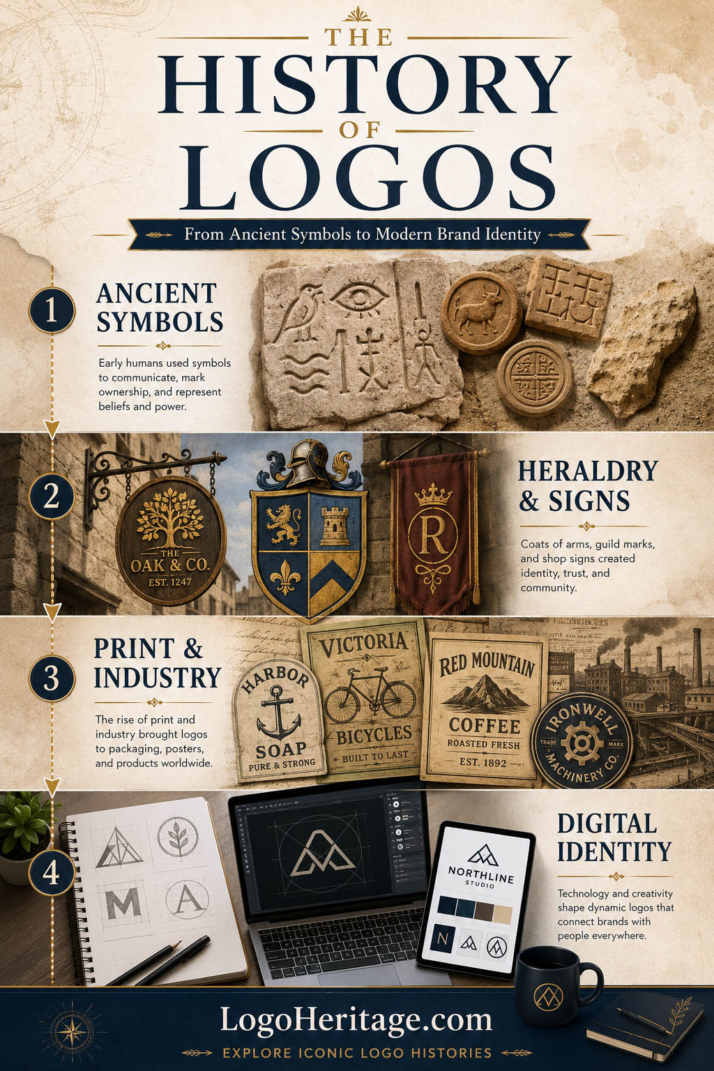
The earliest roots of the history of logos can be traced back thousands of years, long before the word “logo” existed. Ancient people used symbols because symbols were useful. They could communicate quickly, survive across generations, and make ideas visible.
One of the most important examples comes from Ancient Egypt. Around 3200 BC, Egyptians developed hieroglyphics, a writing system built from pictorial signs. These signs could represent sounds, words, objects, and ideas. They were not logos in the modern commercial sense, but they worked in a similar way: a visual mark stood for something larger than itself.
That principle still sits at the center of modern logo design. A logo does not need to explain everything. In fact, the best logos rarely do. They suggest, identify, and create recognition. A simple shape can stand for innovation, speed, reliability, luxury, tradition, or rebellion, depending on how it is designed and used.
The Egyptians also understood something that designers still care about today: proportion. Over time, Egyptian artists used structured grids to keep figures and symbols consistent. This idea matters because consistency is one of the foundations of brand identity. A symbol becomes recognizable when people see it repeated in the same form again and again.
Ancient China also developed a powerful tradition of visual communication through written characters. Each character could hold meaning, sound, or concept. In Ancient Greece, writing systems and symbolic marks continued to shape the relationship between image and language. The word “logo” itself is connected to Greek roots, with “logos” meaning word, speech, or reason, and “typos” meaning mark or impression.
These ancient systems were not branding in the way we understand it today, but they created the foundation for it. They showed that people naturally attach meaning to marks. Once a symbol becomes familiar, it can carry memory, identity, and trust.
Heraldry: When Symbols Became Family Brands
By the Middle Ages, symbols had become more personal, political, and social. Noble families, knights, and rulers used coats of arms and heraldic crests to identify themselves. In many ways, these were some of the earliest examples of visual identity systems.
Heraldry became especially important on the battlefield. A knight covered in armor was difficult to recognize. A shield, banner, or crest made him identifiable from a distance. Colors, animals, patterns, and objects were chosen with care because they communicated lineage, loyalty, courage, power, and status.
This is one of the clearest early examples of logo heritage. A coat of arms was more than decoration. It represented a family name, a reputation, and a story passed down through generations.
The use of animals in heraldry also influenced the later evolution of logos. Lions, eagles, horses, dragons, bears, and other creatures became visual symbols of strength, speed, protection, nobility, or dominance. That tradition did not disappear. It still appears in car logos, sports teams, universities, luxury brands, and government seals.
There is another important lesson here. Heraldic symbols were designed to last. They were not created for a single campaign or seasonal promotion. They were meant to be recognized across time. That same challenge still exists for brands today. A good logo must feel current, but it also has to survive changing tastes.
Medieval Shop Signs and Branding for Everyday People
While noble families used crests to show status, ordinary businesses needed symbols for more practical reasons. In medieval Europe, many people could not read, so shop signs helped customers understand what a business offered.
A baker could use a loaf of bread. A blacksmith could use a hammer. An inn might use an animal, a crown, a moon, or a colored object. These signs worked because they were simple and direct. They turned businesses into recognizable places.
This was branding before branding had a name.
A sign did not need to be clever. It needed to be remembered. That same idea still applies today. A customer scrolling through a phone screen is not so different from a medieval traveler walking down a crowded street. In both cases, the visual mark has only a moment to catch attention.
Pubs and breweries became especially important in this early chapter of logo history. In England, establishments were often required to display signs, partly so officials could identify and inspect them. Over time, many pubs adopted memorable visual names such as the Red Lion, the Green Dragon, the White Hart, or the Crown.
These signs did something clever. They did not just identify a place. They gave people something to talk about and return to. A customer might not remember the owner’s full name, but he could remember the pub with the red lion outside.
That is brand recognition in its simplest form.
One famous example often connected to early commercial identity is Stella Artois, a beer brand that traces its heritage back to the 14th century. Its long-running use of historical references shows how a brand can turn age, tradition, and continuity into part of its identity.
The Printing Press and the Spread of Reproducible Logos
The printing press changed communication forever. After Johannes Gutenberg introduced movable type printing in the 15th century, books, pamphlets, posters, and printed materials could be produced faster and shared more widely.
This was a major turning point in the history of logos because printed marks could now be repeated at scale. Printers and publishers began using distinctive marks to identify their work. These printer’s marks acted like signatures. They told readers who produced the book or document and helped build trust around quality.
A logo only becomes powerful when people see it repeatedly. The printing press made that repetition possible on a much larger scale.
As newspapers grew in popularity, businesses also began using visual marks in advertisements. A page filled with text could easily overwhelm readers, so a distinctive symbol, decorative name, or illustrated mark helped an advertiser stand out.
This was the moment when logos began to move beyond buildings and physical signs. A business identity could now travel through print. It could appear in newspapers, books, posters, labels, and handbills. The logo was becoming portable.
Industrialization and the Birth of Modern Branding
The Industrial Revolution pushed logo design into a new era. Goods were no longer made and sold only in small local markets. Factories could produce products at scale, and those products could travel far from where they were made.
That created a new problem. If customers could not meet the maker, how could they know which product to trust?
The answer was branding.
Packaging, labels, trademarks, and logos became essential tools for recognition. A customer standing in front of several similar products needed a visual cue. The logo helped say, “This is the one you know.”
This period gave rise to some of the most enduring famous logos in the world. The Coca-Cola logo, introduced in the late 19th century, became a masterclass in wordmark design. Its flowing script gave the brand a sense of personality and familiarity that still feels recognizable today.
Levi Strauss & Co. also developed one of the strongest early examples of product-based visual storytelling. Its “two horse” logo showed two horses trying to pull apart a pair of jeans. It was not just a mark. It was a message. The design told customers that the product was strong, durable, and worth trusting.
That is what made industrial-era logos so important. They were not only decorative labels. They were promises.
The 20th Century and the Rise of Corporate Logo Design
By the 20th century, companies were beginning to think about logos in a more strategic way. A logo was no longer just a label for a product. It was becoming the center of a larger brand identity.
Advertising, packaging, transportation, retail, and mass media all demanded stronger visual systems. Companies needed logos that could work on storefronts, delivery trucks, magazine ads, letterheads, product packaging, uniforms, and later television screens.
This changed the way designers approached logos. Detailed illustrations and ornate lettering became less practical. Simpler, clearer, more flexible designs became more valuable.
A strong logo had to survive different sizes, printing methods, and backgrounds. It had to be recognizable in black and white. It had to work quickly, without asking too much from the viewer.
This is why simplicity became one of the most important ideas in modern logo design. A complicated logo may look impressive up close, but a simple one is often easier to remember.
Mid-Century Identity Systems and the Modern Corporate Logo
The middle of the 20th century was one of the richest periods in corporate logo evolution. This was when professional designers helped turn logos into complete identity systems.
Designers such as Paul Rand, Saul Bass, Chermayeff & Geismar, and Massimo Vignelli showed that a logo could be simple, intelligent, and timeless. Their work shaped the visual language of American business.
Paul Rand’s logos for companies such as IBM, ABC, UPS, and Westinghouse helped define what a modern corporate identity could look like. Rand believed that a logo did not need to explain the entire company. It needed to identify it clearly and memorably.
The IBM logo is a perfect example. Its striped letters suggest precision, speed, technology, and structure without becoming overly complicated. It feels corporate, but not lifeless. It is controlled, but still distinctive.
Another landmark design was the Chase Bank logo, created by Chermayeff & Geismar in the 1960s. The abstract blue symbol was one of the first major abstract logos used by a large American corporation. It did not show a vault, a dollar sign, or a bank building. Instead, it used geometry to create a sense of stability, movement, and unity.
That was a quiet revolution. The logo no longer had to describe what a company did. It could stand for how the company wanted to be perceived.
Cultural Logos: When Design Becomes Bigger Than a Brand
Some logos become famous because they sell products. Others become famous because they capture a place, a movement, or a national feeling.
NASA’s logos are among the best examples. The agency’s classic “meatball” insignia and later “worm” wordmark represent different moods in American space history. The meatball feels patriotic, scientific, and adventurous. The worm feels clean, futuristic, and unmistakably tied to the design language of the 1970s.
Milton Glaser’s “I Love New York” logo is another example of a design that became much bigger than its original purpose. Created in 1977, it helped promote New York tourism during a difficult time for the city. With simple typography and a red heart, it became one of the most recognizable civic identities in the world.
These examples matter because they show that logo heritage is not only commercial. Logos can become part of public memory. They can represent cities, institutions, movements, and cultural pride.
The Digital Era and the Screen-Friendly Logo
The arrival of computers changed logo design again. Digital tools gave designers more control, more flexibility, and more ways to experiment. By the late 20th century and early 2000s, software such as Adobe Illustrator and Photoshop had transformed the design process.
At the same time, the internet created new challenges. Logos now had to work on websites, email headers, banner ads, digital documents, and eventually mobile apps. A logo was no longer designed mainly for packaging or print. It had to live on screens.
In the early days of the web, many brands used gradients, shadows, bevels, and glossy effects. These designs felt modern because digital design itself was new. Logos often looked three-dimensional, as if they were trying to jump out from the screen.
Google’s early logo reflected this period, with its dimensional styling and shadow effects. Over time, the company moved toward a flatter, cleaner, more geometric design. That shift was not just aesthetic. It made the logo easier to use across mobile devices, apps, and small digital spaces.
The same pattern happened across many industries. Brands simplified their marks because the digital world demanded it. A logo had to work as a tiny favicon, a social media profile picture, an app icon, and a large-scale ad. Details that once looked impressive in print often disappeared at small sizes.
That is one reason digital logo design moved toward flat, minimal, and responsive systems.
Responsive Logos and Flexible Brand Identity
Today, many brands no longer rely on just one fixed version of a logo. Instead, they use responsive logo systems. A brand may have a full wordmark, a shorter lockup, a standalone icon, a monochrome version, and a simplified app symbol.
This does not mean the brand is inconsistent. It means the identity is built to move.
The Apple logo is a strong example of a symbol that works almost anywhere. It can appear on a laptop, a phone, a store sign, a website, or a small digital interface and still remain instantly recognizable.
The Nike logo works in a similar way. The swoosh does not need the company name beside it anymore. Decades of consistent use have made the mark strong enough to stand alone.
That is one of the highest goals in brand identity. When a symbol can survive without explanation, it has become part of visual culture.
Instagram is another useful example of modern logo evolution. Its original camera-inspired icon had a detailed, retro look. Later, the company moved to a simpler gradient icon designed for the mobile era. The redesign was debated at first, as many redesigns are, but over time it became familiar because people saw it every day.
A logo gains meaning through use. Even a controversial redesign can become accepted if the product remains strong and the identity is applied consistently.
Minimalism and the Debate Around Modern Logos
In recent years, many brands have simplified their logos. Fashion houses, car companies, technology brands, streaming platforms, and consumer products have moved toward cleaner typography, flatter symbols, and fewer decorative details.
There are good reasons for this. Minimal logos are easier to reproduce. They scale better. They are easier to animate. They look cleaner on mobile screens. They work across more platforms.
But minimalism has also created criticism. Some people argue that too many modern logos now look the same. When every brand moves toward a clean sans-serif wordmark, personality can disappear.
That is the challenge of modern logo design. A logo should be simple, but not empty. It should be flexible, but not forgettable. It should feel current, but not erase the brand’s past.
The best redesigns preserve something familiar. They may simplify the shape, modernize the type, or adjust the color, but they keep a connection to the brand’s visual memory. That connection is what protects logo heritage.
For legacy brands especially, this matters. Customers often feel emotionally attached to old logos. A redesign can feel exciting, but it can also feel like a loss if it removes too much character.
Why Logos Still Matter
In a crowded marketplace, logos matter because people do not have unlimited attention. They scroll quickly. They compare quickly. They decide quickly.
A good logo does something quietly powerful: it helps a brand become easier to remember before the customer has even read much about it.
But a logo is not magic by itself. The design becomes meaningful because of everything attached to it: the product, the service, the advertising, the customer experience, the reputation, and the emotions people associate with the brand.
The McDonald’s logo is not famous only because of its shape. It is famous because those golden arches have appeared for decades on restaurants, signs, packaging, commercials, highways, and city streets around the world.
The same is true for the Coca-Cola logo, the Pepsi logo, and the Starbucks logo. Their designs matter, but their power comes from years of repetition, cultural presence, and emotional association.
That is why the evolution of logos is really the evolution of trust. A logo starts as a mark. Over time, if the brand earns recognition, the mark becomes memory.
The Logo as a Living Piece of History
The history of logos is much older than modern advertising. It begins with ancient symbols, grows through heraldry and medieval signs, expands with printing and mass production, and becomes a central part of corporate identity in the modern world.
Today, logos have to do more than ever. They must work on packaging, websites, social media, apps, videos, storefronts, products, and tiny mobile screens. They must be flexible without becoming generic. They must feel modern without losing their roots.
That balance is what makes great logos so difficult, and so valuable.
A logo is not only a visual mark. It is a living piece of brand history. When it is designed well and used consistently, it can become one of the most recognizable assets a company will ever own.
To see how these ideas developed across real brands, explore the logo history behind the Nike logo, the Apple logo, the Coca-Cola logo, the McDonald’s logo, the Pepsi logo, and the Starbucks logo. Each one shows how a simple mark can evolve into a lasting piece of logo heritage.
FAQ: The History of Logos
When did logos first appear?
Logos in the modern business sense developed over many centuries, but their earliest roots can be traced to ancient symbols, seals, hieroglyphics, and ownership marks. These early visual systems helped people communicate, identify, and remember important ideas or objects.
What is the origin of the word logo?
The word “logo” comes from “logotype,” which is connected to Greek roots. “Logos” refers to word, speech, or reason, while “typos” refers to a mark or impression. In branding today, a logo can be a wordmark, symbol, monogram, emblem, or combination mark.
Were coats of arms early logos?
Yes. Coats of arms and heraldic crests can be understood as early forms of visual identity. They helped identify noble families, knights, kingdoms, and alliances. Like modern logos, they used color, shape, symbolism, and repetition to create recognition.
How did the printing press influence logo history?
The printing press made it possible to reproduce symbols and marks at scale. Printers used marks to identify their work, while businesses later used logos in newspapers, posters, labels, and advertisements. This helped logos become more visible and consistent.
Why did logos become important during the Industrial Revolution?
During the Industrial Revolution, products were produced in larger quantities and sold across wider markets. Logos, labels, and trademarks helped customers recognize products they trusted, especially when they did not personally know the maker.
What makes a logo iconic?
An iconic logo is usually simple, memorable, distinctive, and strongly connected to a brand’s identity. Over time, repeated use and positive customer experiences turn the logo into a recognizable symbol.
Why are many modern logos so simple?
Many modern logos are simple because they need to work across digital platforms, mobile screens, social media, packaging, apps, and physical spaces. A clean logo is easier to scale, animate, reproduce, and recognize quickly.
What is logo heritage?
Logo heritage refers to the visual history and legacy of a brand’s identity. It includes the symbols, colors, typography, design choices, and meanings that have shaped a logo over time. Strong logo heritage helps brands modernize without losing recognition.