Gillette Logo History: Meaning, Symbolism & Brand Heritage
Gillette is one of the most influential brands in personal grooming, built on a simple but powerful idea: shaving can always be improved. Founded in 1901, the company revolutionized the industry with the invention of the safety razor, setting the foundation for a global brand that continues to define modern grooming. Much like explored in Philips Logo History and Braun Logo History, Gillette’s identity reflects a balance between engineering precision and everyday utility. Within the broader context of Pharma & Healthcare brand logos, its evolution stands out as a study in refinement and functional symbolism.
The Gillette logo history is not about radical transformation. Instead, it is a gradual process of sharpening — both visually and conceptually — aligning the brand’s identity with the precision of its products.
Gillette Logo Meaning and History: Innovation, Precision, and Brand Origin
The origin of Gillette is directly tied to innovation. King C. Gillette’s invention of the safety razor fundamentally changed how men approached shaving, making it safer, faster, and more accessible.
From the beginning, the brand positioned itself around improvement and efficiency. This philosophy extended naturally into its visual identity. The early Gillette logo meaning focused on sharpness and performance, often represented through symbolic elements like arrows cutting through the wordmark.
As the company expanded globally and became part of Procter & Gamble, its identity matured. The logo evolved alongside the brand, moving from decorative elements toward a cleaner, more controlled design language.
Today, Gillette logo heritage reflects more than just product innovation. It represents consistency, precision, and a long-standing commitment to refinement.
Gillette Logo Symbolism: Sharpness, Motion, and Functional Design
The Gillette logo symbolism is deeply connected to the concept of cutting precision. In its early versions, this was made explicit through the use of an arrow piercing the wordmark, a direct reference to the sharpness of razor blades.
Over time, the symbolism became more subtle. Instead of literal elements, the brand introduced visual cues within the typography itself. Angled cuts, tight spacing, and sharp edges began to define the design.
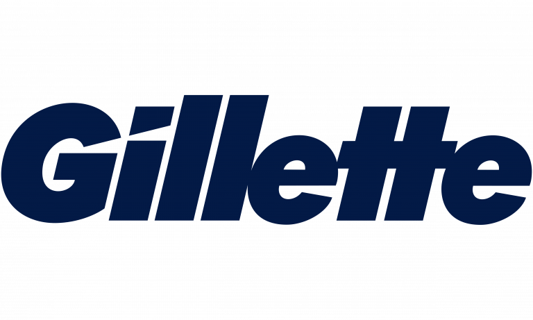
One of the most distinctive features in the modern logo is the treatment of certain letterforms, particularly the angled cuts on the “G” and the stylized dot above the “i.” These details evoke the idea of a blade without explicitly showing one.
This evolution demonstrates a shift from explicit symbolism to integrated design language, where meaning is embedded rather than illustrated.
Gillette Logo History Timeline: From Decorative Identity to Precision Wordmark
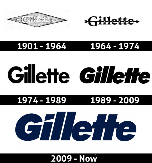
1901–1964: Early Logo Design and the Arrow Symbol of Sharpness
The original Gillette logo featured a more traditional typographic style with decorative elements. The wordmark used a mix of uppercase and lowercase letters, with subtle curves and stylistic details.
What made this version distinctive was the arrow running through the name. This element symbolized sharpness and cutting ability, directly linking the logo to the product.
The design was often enclosed within a geometric frame, reinforcing its structured appearance.
1964–1974: Refinement of the Arrow Concept and Corporate Identity
During this period, the core visual metaphor remained intact. The arrow continued to cut through the letters, but the typography became bolder and more uniform.
Additional branding elements were introduced, including a circular corporate emblem. While these additions aimed to strengthen identity, they also made the design more complex and less adaptable.
This phase reflects an attempt to balance symbolism with corporate structure.
1974–1989: Transition to a Stronger, Simpler Wordmark
In the 1970s, the Gillette logo underwent a significant transformation. The arrow was removed, marking a shift away from literal symbolism.
The typography became bolder and more geometric, introducing a sense of rhythm through the treatment of repeated letters. The horizontal bars of the “t’s” merged, creating a distinctive visual feature that remains part of the logo today.
This version marked the beginning of a more modern and scalable identity.

1989–2009: Introduction of the Modern Logo Structure
By the late 1980s, the foundation of the current Gillette logo was established. The wordmark became more compact, with tighter spacing and increased boldness.
All letters were capitalized, reinforcing strength and consistency. The design focused on clarity and impact, removing unnecessary elements while preserving distinctive features.
This stage represents a key moment in Gillette logo history, where the brand fully embraced minimalism.

2009–Present: Precision Detailing and Blade-Inspired Typography
The most recent refinement introduced subtle but meaningful changes. The dot above the “i” was replaced with an angled, blade-like shape, reinforcing the product connection.
Additional cuts in the letterforms create a sense of sharpness and motion, making the design feel more dynamic without adding complexity.
This version reflects the maturity of Gillette logo heritage, where every detail serves a purpose and reinforces the brand’s core identity.
Gillette Logo Typography and Color: Strength, Cleanliness, and Modern Identity
Typography is central to the Gillette logo design. The bold, geometric sans-serif typeface communicates strength and precision, while the tight spacing enhances visual cohesion.
The custom modifications to certain letters add uniqueness without compromising readability. These details ensure that the logo remains recognizable across different formats and applications.
Color plays an equally important role in the logo description. The use of black conveys authority and timelessness, while the dark blue variation introduces a sense of cleanliness and freshness.
This dual palette allows the brand to balance tradition with modern appeal, adapting to different contexts while maintaining consistency.
Gillette Logo Heritage: A Legacy of Precision and Continuous Improvement
The Gillette logo history reflects the same philosophy that defines its products: continuous improvement. Rather than reinventing its identity, the brand has refined it over time, sharpening both form and meaning.
Its logo heritage is built on precision, consistency, and attention to detail. Each iteration has moved closer to a design that feels both functional and iconic.
In a market driven by performance and reliability, the Gillette logo stands as a symbol of innovation shaped by discipline — a reminder that even the smallest details can define a global brand.
Gillette Logo History FAQ: Meaning, Symbolism, and Evolution
What does the Gillette logo mean?
It represents precision, sharpness, and innovation in personal grooming.
Why did Gillette remove the arrow from its logo?
To simplify the design and create a more modern, scalable identity.
What makes the Gillette logo unique?
Its blade-inspired details and tight typography create a distinctive visual identity.
What colors are used in the Gillette logo?
Black and dark blue, symbolizing strength, cleanliness, and reliability.
Has the Gillette logo changed significantly over time?
It has evolved gradually, focusing on refinement rather than complete redesign.