
YouTube Logo History & Heritage: Meaning, Evolution & Cultural Impact
![]()
Few symbols of the digital age are as universally recognized as the red play button of YouTube. What began in 2005 as an experimental idea created by three former PayPal employees quickly evolved into a global cultural force — and its logo has evolved right alongside it. In less than two decades, YouTube went from a scrappy startup to one of the most visited websites in the world, shaping modern entertainment, democratizing storytelling, and influencing everything from media consumption to political discourse.
The story of the YouTube logo is deeply tied to the platform’s own evolution. It represents innovation, accessibility, and the ever-changing nature of digital culture — a true example of logo heritage in the modern era.
From a Dating Site Idea to Cultural Powerhouse
YouTube’s origins are surprisingly humble — and slightly romantic. The platform was originally envisioned as a video-based dating site, launching symbolically on Valentine’s Day, 2005, when the trademark, domain, and first logo were officially registered.
Founders Chad Hurley, Steve Chen, and Jawed Karim, all PayPal employees, noticed how difficult it was to share video clips online. Photos were easy to post, but video platforms simply didn’t exist. Their “dating site” idea quickly faded as users began uploading videos about everyday life instead of dating introductions, revealing a much larger opportunity.
Within a year, YouTube exploded in popularity. Google acquired the company in November 2006 for $1.6 billion, marking one of the most legendary acquisitions in tech history.
YouTube Logo Evolution: A Complete Logo History
The YouTube logo is one of the most iconic symbols of the digital age, and its evolution tells a story of simplicity, clarity, and cultural influence.
![]()
2005–2011: The Original TV-Style Badge
The first YouTube logo introduced in 2005 set the foundation for the brand. It featured a two-part wordmark:
-
“You” in black
-
“Tube” in white, placed inside a glossy, rounded red rectangle reminiscent of a vintage TV screen
This 3D design captured the early internet aesthetic — bold, shiny, playful. More importantly, the red “Tube” shape immediately became the brand’s primary signifier, anchoring its logo heritage for years to come.
![]()
2011–2013: Matte, Modern, More Mature
In 2011, the company removed the glossy highlights, opting for a matte red rectangle. The color darkened slightly, giving the brand a more serious and contemporary presence. This redesign reflected YouTube’s shift from casual user videos to professionally produced content and large-scale global reach.
![]()
2013–2015: Lighter, Flatter, More Minimal
Minimalism took center stage in 2013 as the logo’s red panel became brighter and cleaner, losing shadows and extraneous effects. This flat design aligned with broader digital trends and helped the brand transition into the mobile era.
![]()
2015–2017: Richer Red, More Confidence
Another subtle evolution arrived in 2015 with a deeper, richer red tone. The typography stayed the same, but the new color gave the logo a more premium, authoritative feel, signaling YouTube’s dominance as a digital entertainment leader.
![]()
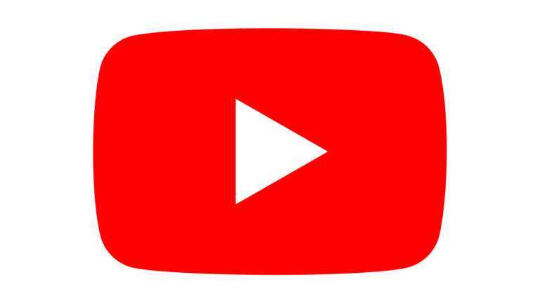
2017–2024: The Birth of the Play Button Icon
The most significant redesign in YouTube logo history came in 2017. For the first time, the brand detached the red shape from the wordmark and transformed it into a standalone emblem — a red rounded rectangle containing a white right-facing triangle, the universal “Play” symbol.
This shift achieved several things:
– Created a powerful, scalable icon for mobile screens
– Simplified the full logo into a clean black wordmark
– Made the Play Button one of the most recognizable symbols on Earth
The YouTube logo became modern, flexible, and unmistakable — a perfect reflection of digital culture.
2024–Today: Red, White, Black — A Global Visual Language
Today’s YouTube identity includes two official versions:
-
Red + white (primary)
-
Black + white (secondary, used for documents, formal communication, and commemorative events)
Red emphasizes power, passion, and entertainment. Black is used for solemnity, strength, and moments when YouTube wants to convey solidarity or sensitivity during global events.
Symbolism Behind the YouTube Logo
The YouTube symbol has always reflected clarity, accessibility, and action.
![]()
The Play Button
A white triangle pointing right is a universal cue: watch, explore, engage. It represents momentum, curiosity, and the constant flow of new stories.
The Red Screen Shape
Its rounded rectangle shape resembles the screens of early televisions — a subtle reminder that YouTube reimagined what video entertainment could be.
The Color Palette
YouTube’s colors convey:
– Red: energy, immediacy, creativity, entertainment
– White: simplicity, trust, transparency
– Black: authority, clarity, seriousness
Together, they form one of the most powerful combinations in brand identity.
Typography: Clean, Modern, Instantly Recognizable
For years, YouTube relied on a Helvetica-style sans-serif font, widely used in television graphics. The 2017 redesign introduced a narrow, elegant sans-serif typeface resembling Indecise Condensed Medium, bringing the brand into a new era of modern digital design.
The typography is clean, neutral, and adaptable — perfect for a platform where content must shine brighter than the branding behind it.
The YouTube Icon: A Digital Era Classic
The YouTube icon is among the most recognizable symbols ever created. Since 2017, the red Play Button has become the brand’s standalone ambassador. It works at any size, from massive billboards to tiny smartphone screens, capturing the platform’s essence in the simplest possible form.
It reflects movement, digital evolution, and the global shift from passive media consumption to interactive video storytelling.
![]()
Global Influence & Cultural Significance
Beyond design, the YouTube logo symbolizes one of the most important cultural transformations of the 21st century. It represents:
-
The democratization of entertainment
-
A platform where anyone can become a creator
-
A new global language of video communication
-
A digital space for activism, education, humor, art, and personal stories
YouTube reshaped how humans learn, connect, and express themselves — and its logo became the visual anchor of that revolution.
The Future of the YouTube Brand
With the rise of smart TVs, AR/VR environments, and immersive interfaces, YouTube’s logo will continue to evolve. Future branding may adapt to new devices, interactive spaces, or AI-driven personalization — but the core symbol will remain.
The red Play Button now has its place in global logo heritage, alongside icons like Nike’s Swoosh and Apple’s bitten apple.
A Play Button That Changed the World
The YouTube logo is more than a visual mark — it’s a symbol of global creativity, cultural openness, and digital storytelling. Its evolution mirrors the platform’s rise from niche startup to global phenomenon. Few logos in history have achieved such universal recognition while maintaining such simplicity and emotional resonance.
It stands as a modern lesson in logo history: a powerful brand doesn’t need complexity — only clarity, consistency, and purpose.
FAQs
1. Why did YouTube replace the “Tube” rectangle with a Play Button?
To create a scalable icon suited for the mobile era and to emphasize YouTube’s identity as a video-first platform.
2. What does the red color of the YouTube logo represent?
Red represents energy, passion, entertainment, and global reach — making it ideal for a video platform.
3. Is the YouTube Play Button considered a standalone logo?
Yes. Since 2017, YouTube officially treats the Play Button as an independent symbol used across apps, icons, and branding.
4. Why did early YouTube logos look like old TV screens?
The rounded red rectangle referenced traditional television screens, symbolizing a bridge between broadcast culture and digital video.
5. How has YouTube maintained such strong brand recognition?
Through minimalistic design, consistent use of color, and a symbol (the Play Button) universally understood across languages and cultures.