
Tropicana Logo History: Meaning, Symbolism & Brand Heritage
The story of Tropicana is inseparable from the evolution of its visual identity—a logo heritage that has come to symbolize freshness, purity, and the warmth of sun-ripened fruit. Born in 1947 and later becoming part of PepsiCo’s global portfolio, Tropicana has built a powerful brand presence rooted in nature, sunshine, and the promise of real fruit juice.
Over the decades, the Tropicana logo has undergone several refinements, color shifts, and creative reinterpretations, yet it has always retained its friendly, rounded wordmark that consumers instantly recognize. This is the logo history of one of America’s most beloved juice brands.
A Fresh Start: The Origins of the Tropicana Identity (1947–1989)
The original Tropicana logo, introduced in 1947, set the foundation for a visual identity that would remain remarkably consistent. The earliest wordmark featured a bold, rounded sans-serif typeface reminiscent of Hobo D—playful, approachable, and slightly whimsical. Beneath it sat a delicate ribbon holding the tagline “Pure Premium,” reinforcing the brand’s commitment to quality.
For decades, the logo remained monochrome, relying solely on shape and typography to express its personality. It was simple, honest, and reflective of a company grounded in natural ingredients.
1989–1992: The First Modern Tropicana Logo
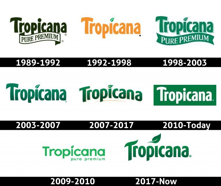
In 1989, Tropicana introduced its first widely recognized modern logotype. Executed in dark green, the lettering became thicker and more confident, and a refined green-outlined ribbon carried the familiar “Pure Premium” tagline.
This design established green as a symbolic color for Tropicana—representing nature, freshness, and authenticity.
1992–1998: Citrus Energy and the Leaf Icon Arrive
The next major update came in 1992. The ribbon was removed, and Tropicana embraced a warm, vibrant orange logotype. For the first time, the lowercase “i” gained its now-famous leaf accent, a stylized green leaf replacing the dot.
This small design choice sent a powerful message—Tropicana was a natural, fruit-forward brand connected directly to the source.
1998–2003: A Return to Green with a Refined Classic Look
In 1998, Tropicana combined elements from earlier versions, returning to a green wordmark and bringing back the ribbon beneath the lettering—this time solid green with a white serif tagline. Shadows and outlines added depth, giving the logo a premium look during a decade when 3D-style branding was in fashion.
2003–2007: A Clean, Contemporary Refresh
In 2003, Tropicana removed the ribbon again and introduced a sleeker, simplified design. The typeface remained recognizable, but the outlines and shadows vanished. A smooth gradient green filled the letters, creating a polished, modern aesthetic that matched early-2000s consumer expectations.
2007–2017: Elegance Through Gold Accents
The 2007 redesign brought a touch of sophistication. The logotype curved upward, gaining a subtle gold underline. Letters were outlined in gold and white, and the leaf above the “i” received a refined gold central vein.
This version felt premium and airy—an expression of natural luxury.
2009–2010: A Short-Lived Experimental Detour
In 2009, Tropicana briefly experimented with a radically different design—lighter greens, fully rounded shapes, and a minimalistic layout featuring a lowercase “Pure Premium” tagline. Consumer feedback was mixed, and the brand quickly returned to its familiar identity.
2010–Today: The Clean Banner Logo
A major simplification arrived around the mid-2010s: a white wordmark placed on a bold green rectangular banner. The leaf dot was removed, replaced with a simple white circle, signaling a minimalist shift.
This version is still used in some applications and aligns well with contemporary packaging trends.
2017–Today: The Return of Warmth and Natural Vibrancy
The current Tropicana logo, introduced in 2017, revisits the beloved 2003 version but reimagines it with a muted orange color palette—warm, fruity, and wholesome. The leaf above the “i” returned, larger and more organic, restoring a key element of Tropicana’s visual personality.
The refreshed logo balances heritage with vitality, making it one of the brand’s most expressive symbols to date.
Font & Color: The DNA of the Tropicana Brand
Tropicana’s typography has remained largely unchanged for decades—thick, rounded, and slightly arched. The signature typeface sits somewhere between Kandira Extra Black and Linotype Spitz Pro Black, though customized to feel friendlier and more approachable.
Color Meaning
-
Green: nature, health, authenticity, freshness
-
Orange: fruit, sunshine, warmth, optimism
These colors connect directly to Tropicana’s promise: juice made from real fruit with no artificial distractions.
A Logo Heritage Rooted in Nature
The Tropicana logo heritage is a story of consistency, confidence, and connection to natural ingredients. Through decades of redesigns—some subtle, some bold—the brand has never abandoned its rounded letterforms or its wholesome personality.
Its logo history mirrors the evolution of consumer expectations: from nostalgic ribbons and serif taglines to sleek modern minimalism and warm, nature-inspired tones. The current Tropicana emblem is more than a brand mark—it is a symbol of freshness, trust, and the comforting simplicity of real fruit juice.
FAQ
1. Why does the Tropicana logo often use green and orange?
Because these colors represent nature and fresh fruit—two core pillars of the brand.
2. What does the leaf above the “i” symbolize?
It communicates natural ingredients, fruit origins, and the brand’s connection to agricultural roots.
3. Has Tropicana ever changed its typeface?
The brand has consistently used a thick rounded typeface since the 1980s, refining rather than replacing it.
4. Why was the 2009 logo withdrawn so quickly?
The redesign strayed too far from the brand’s recognizable heritage, leading to mixed consumer reactions.
5. What makes the 2017 version the preferred design today?
It blends Tropicana’s classic shapes with warm, natural colors for a modern yet familiar identity.