
Carrefour Logo History: Meaning, Symbolism & Brand Heritage
Carrefour is one of the most recognizable retail brands in Europe, built on a concept that goes beyond shopping. Founded in France in 1958, the company introduced a new model of large-scale retail that quickly spread across the continent. Today, with thousands of stores worldwide, Carrefour represents accessibility, variety, and everyday convenience. Much like explored in Walmart Logo History and Tesco Logo History, its identity reflects both function and cultural roots. Within the broader category of retail and supermarket brand logos, Carrefour stands out for embedding meaning directly into its design.
The Carrefour logo history is deeply connected to its name. “Carrefour” means “crossroads” in French, and this idea has shaped every version of its visual identity. Rather than relying on decorative elements, the brand built its logo around direction, movement, and intersection — concepts that define both its name and its purpose.
Carrefour Logo Meaning and History: The Origin of the “Crossroads” Concept
The origin of Carrefour’s visual identity is inseparable from its name. From the very beginning, the brand sought to translate the idea of a crossroads into a graphic form.
A crossroads is a place of meeting, movement, and choice. This aligns perfectly with the role of a supermarket — a destination where people come together to find what they need.
The Carrefour logo meaning reflects this idea through directional elements, symmetry, and balance. Over time, these concepts were refined into a more abstract and sophisticated design.
As the company expanded internationally, the logo remained consistent in its core symbolism. This continuity defines Carrefour logo heritage, where meaning is preserved even as style evolves.
Carrefour Logo Symbolism: Hidden Letter, Direction, and National Identity
The Carrefour logo symbolism is one of the most clever uses of negative space in branding. At first glance, the emblem appears to be composed of two arrows pointing in opposite directions — one red and one blue.
However, the true meaning lies in what is not immediately visible.
Between the arrows, in the negative space, is a white letter “C.” This subtle detail represents the brand name while reinforcing the idea of intersection and balance.
The arrows themselves symbolize movement and direction, reflecting the concept of a crossroads. They also suggest accessibility, indicating that Carrefour is a place where different paths meet.
The color palette adds another layer of meaning. Red, white, and blue mirror the French national flag, anchoring the brand in its origin and heritage.
Together, these elements create a logo that is both simple and deeply symbolic.
Carrefour Logo History Timeline: Evolution of the Crossroads Identity
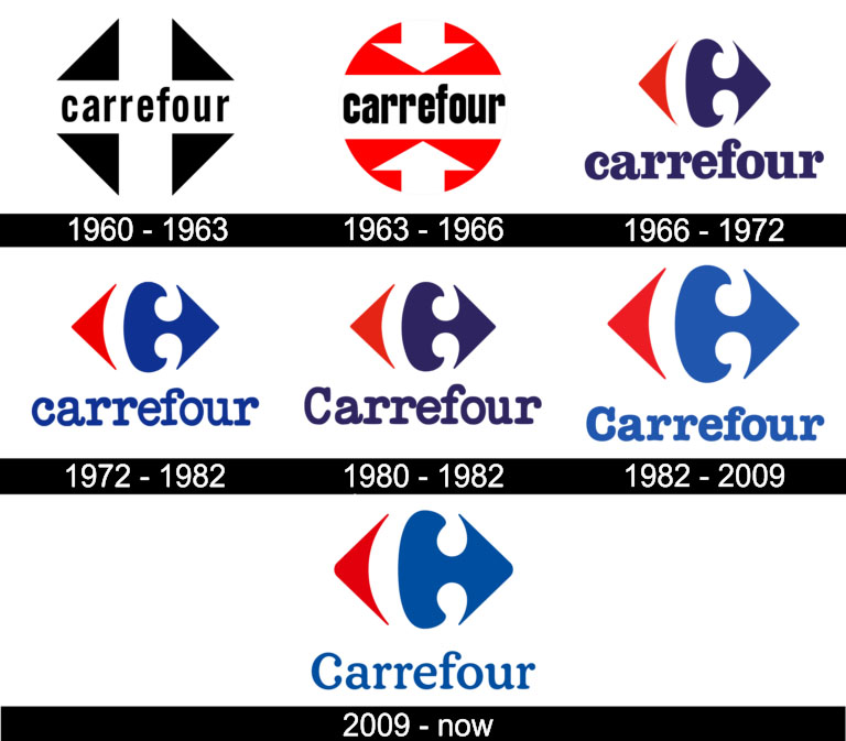
1960–1963: First Logo and Literal Interpretation of the Crossroads
The first Carrefour logo, introduced in 1960, was a direct and literal interpretation of the brand’s name.
It featured a lowercase wordmark placed inside a white cross, set against a dark rhomboid background. This design clearly represented a crossroads, using a straightforward geometric approach.
While simple and effective, this version lacked the abstraction that would later define the brand’s identity.

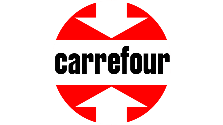
1963–1966: Introduction of Directional Arrows and Circular Composition
In 1963, the logo was redesigned with a more dynamic structure. The wordmark was placed on a white horizontal stripe, positioned within a red circular background.
Two white arrows pointed toward the center from above and below, introducing the directional concept that would become central to the brand.
Although this version was short-lived, it established the foundation for the iconic arrow-based design.
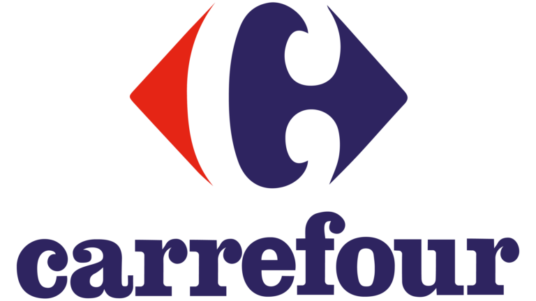
1966–1972: Creation of the Iconic Emblem with Hidden “C”
The 1966 redesign marked a turning point in Carrefour logo history. This is when the now-iconic emblem was created.
The design featured a white “C” formed by negative space between two colored shapes — red on the left and blue on the right — arranged within a rhomboid structure.
At first glance, the emblem appears to be two arrows pointing outward. Only upon closer inspection does the hidden letter become visible.
This version introduced the core identity that remains in use today, combining symbolism, abstraction, and national colors.
1972–1982: Addition of the Wordmark and Brand Reinforcement
During this period, the emblem was complemented by a wordmark placed below it. The lettering was set in blue, reinforcing the color palette of the logo.
This addition helped strengthen brand recognition, making the identity more complete and easier to apply across different contexts.
The emblem itself remained unchanged, highlighting the strength of the original design.
1980–1982: Typography Update and Stronger Visual Presence
A refinement introduced in the early 1980s focused on typography. The brand name was capitalized, giving it a more authoritative and professional appearance.
The blue color became darker, adding depth and contrast to the overall composition.
These changes enhanced the logo’s presence without altering its core structure.
1982–2009: Modernization and Cleaner Visual Identity
In the 1980s, the Carrefour logo was refined to improve clarity and consistency. The lines of both the emblem and the wordmark were cleaned and strengthened.
The typography shifted to a more stable and legible style, reinforcing the brand’s reliability and professionalism.
The color palette was slightly adjusted, becoming deeper and more balanced.
This phase represents the consolidation of Carrefour logo heritage, where the design was optimized for long-term use.
2009–Present: Subtle Refinement and Contemporary Adaptation
The current version of the Carrefour logo was introduced in 2009 as a refined update of the previous design.
The blue tone became lighter and more vibrant, while the contours of the emblem were softened slightly. The typography was also refined, resulting in a more elegant and modern appearance.
Despite these changes, the core concept — the hidden “C” and the directional arrows — remains unchanged.
This continuity demonstrates the strength of Carrefour logo history, where evolution is achieved through precision rather than reinvention.
Carrefour Logo Typography and Color: Clarity, Identity, and Recognition
Typography in the Carrefour logo design plays a supporting role to the emblem. The serif typeface used in the wordmark adds a sense of tradition and stability.
The rounded terminals of certain letters, particularly the “C,” create a distinctive visual signature that complements the emblem.
Color is central to the logo description. The combination of red, white, and blue reinforces the brand’s French origin while ensuring strong visibility.
Red conveys energy and attention, blue represents trust and reliability, and white provides balance and clarity.
Together, these elements create a cohesive and recognizable identity.
Carrefour Logo Heritage: A Masterclass in Symbolic Simplicity
The Carrefour logo history is a perfect example of how a brand can build a powerful identity through simplicity and meaning.
By transforming the concept of a crossroads into a visual system, Carrefour created a logo that is both functional and symbolic. The hidden “C,” the directional arrows, and the national colors all work together to tell a cohesive story.
Its logo heritage is defined by consistency. For decades, the brand has refined its identity without losing its essence.
In a competitive retail environment, where visibility and trust are essential, the Carrefour logo remains a strong and enduring symbol — a crossroads where design, meaning, and brand identity meet.
Carrefour Logo History FAQ: Meaning, Symbolism, and Evolution
What does the Carrefour logo mean?
It represents a crossroads, reflecting the meaning of the brand’s name.
Where is the hidden “C” in the Carrefour logo?
It is formed by the white space between the red and blue shapes.
Why does the Carrefour logo use red and blue?
To reflect the French national flag and the brand’s origin.
When was the current Carrefour logo introduced?
The current refined version was introduced in 2009.
What makes the Carrefour logo unique?
Its use of negative space to create a hidden letter within directional shapes.