
Crocs Logo History: Meaning, Symbolism & Brand Heritage
![]()
In a footwear industry dominated by athletic silhouettes and luxury minimalism, Crocs stands entirely apart. From the moment the brand appeared in the early 2000s, it rejected conventional ideas of what shoes should look like—and its logo followed the same philosophy. Friendly, bold, and almost cartoonish, the Crocs logo became inseparable from the product itself, transforming a practical foam clog into a global cultural symbol.
The history of the Crocs logo is closely tied to the brand’s unconventional rise. What started as a functional boating shoe quickly evolved into one of the most recognizable footwear products in the world. The crocodile mascot, often affectionately called “Duke,” is not an abstract marketing creation but a direct visual translation of the product’s shape, comfort-first philosophy, and playful brand voice. In terms of logo heritage, Crocs offers a rare case where humor, simplicity, and instant recognition outperform prestige-driven design.
Meaning and History: The Origin of the Crocs Logo
Crocs was founded in 2002, during a period when performance footwear and sleek athletic branding dominated the market. Instead of competing visually with established giants, Crocs embraced a radically different identity rooted in comfort, practicality, and approachability.
The brand name itself originated from an observation: when viewed from the side, the foam clogs resembled the snout of a crocodile. Interestingly, the proprietary foam material used to manufacture the shoes—Croslite—was named before the brand itself existed. This organic development of both product and identity shaped the logo origin in a very literal way.
Rather than symbolizing speed, elegance, or status, the Crocs logo was designed to communicate friendliness, durability, and ease of use. The crocodile was not chosen for aggression or power, but for recognizability and memorability, reinforcing the idea that Crocs footwear was different by design.
Crocs Logo History Timeline
![]()
2002–2006: Playful Introduction and Brand Personality
The original Crocs logo, introduced in 2002, featured a green cartoon-style crocodile placed to the left of a bold uppercase wordmark. The crocodile had a smiling expression, outlined in green, and slightly overlapped the first letter “C,” visually connecting mascot and name.
The wordmark was executed in a heavy custom sans-serif typeface, using thick black strokes intersected by thin white lines that ran through the center of each letter. This detail softened the visual weight of the typography and added movement to the otherwise blocky construction.
A secondary tagline, “Get a Grip,” appeared beneath the wordmark in playful green lettering, emphasizing functionality and traction. This first logo clearly positioned Crocs as a casual, comfort-driven brand rather than a fashion label.
![]()
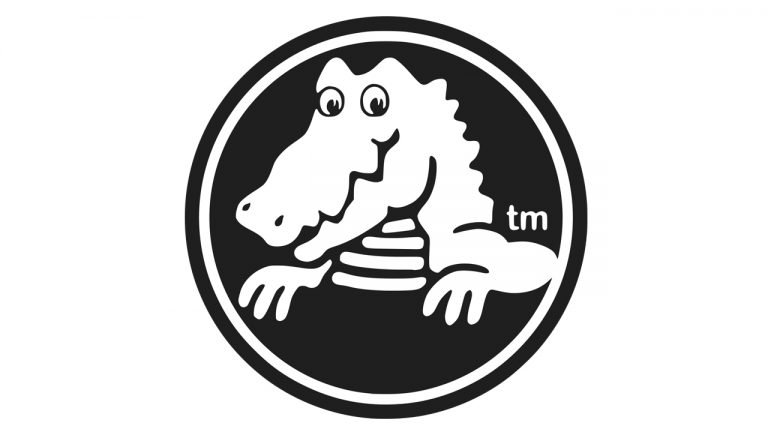
2006–Today: Simplification and Global Recognition
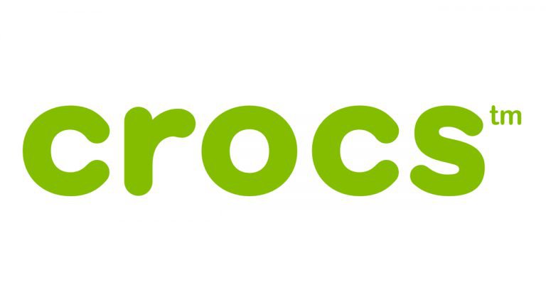
In 2006, Crocs introduced the logo that remains in use today. The redesign eliminated color complexity and visual noise in favor of clarity and scalability. The crocodile mascot was simplified and placed inside a circular frame, rendered in black and white. The illustration became cleaner, flatter, and easier to reproduce across products, packaging, and digital platforms.
The wordmark was rewritten in lowercase letters and moved beneath the emblem. The new typography adopted a rounded sans-serif style, reinforcing friendliness and accessibility. The circular geometry of the letters mirrored the shape of the emblem and subtly echoed the ventilation holes found on Crocs shoes.
While black-and-white became the default palette, the logo retained flexibility. Neon green and other bright variations appear occasionally, especially in marketing campaigns and limited collections, without compromising brand recognition.
Logo Symbolism: Comfort, Humor, and Distinction
The symbolism of the Crocs logo is intentionally straightforward. The crocodile represents the brand name directly, eliminating any ambiguity or abstract interpretation. Unlike many animal-based logos that rely on symbolism such as speed or dominance, Crocs uses its mascot as a friendly guide rather than a totem of power.
The circular frame enclosing the crocodile reinforces ideas of completeness, comfort, and protection. The mascot’s smile and rounded shapes create an emotional connection, making the brand feel approachable rather than intimidating.
In a market where footwear branding often emphasizes performance metrics or luxury aspiration, Crocs’ logo meaning stands out for its honesty. It promises comfort and ease—and delivers exactly that.
Typography and Color in the Crocs Logo
Typography plays a crucial role in shaping the Crocs identity. The lowercase wordmark, with its rounded terminals and soft curves, rejects rigidity and formality. The letterforms are based on circular proportions, contributing to a cohesive visual system that feels friendly and modern.
The typeface is often compared to AG Book Rounded Bold, though the Crocs wordmark features custom modifications to stroke width and spacing, ensuring uniqueness.
Color usage is deliberately restrained. Black and white dominate the official logo, ensuring maximum contrast and versatility. Bright green, long associated with the brand, appears as an accent color rather than a constant, allowing Crocs to adapt its visual presence without diluting identity.
Crocs Logo Heritage and Brand Identity
The Crocs logo heritage is inseparable from the product itself. The crocodile icon appears not only in branding but also as a physical element on many shoe models, often attached as a molded button or strap emblem. This tactile presence reinforces authenticity and helps consumers distinguish genuine products from imitations.
As Crocs expanded into collaborations, fashion partnerships, and seasonal collections, the logo remained unchanged. This consistency allowed the brand to explore new cultural spaces while maintaining a stable visual anchor.
Crocs’ success demonstrates that heritage is not defined by age but by recognizability and emotional resonance. In just over two decades, the logo has become one of the most identifiable marks in modern footwear.
A Logo That Embraces Difference
The Crocs logo history shows how clarity and character can outperform convention. By embracing a mascot-driven identity and refusing to conform to industry norms, Crocs built a visual language that feels confident, honest, and instantly recognizable.
The crocodile emblem does not aspire to luxury or athletic prestige. Instead, it celebrates comfort, individuality, and practicality. In doing so, Crocs created a logo heritage rooted not in tradition, but in fearless differentiation—proving that sometimes, being different is the strongest brand strategy of all.
FAQ: Crocs Logo Meaning, Symbolism, and History
Why is there a crocodile on the Crocs logo?
The crocodile reflects both the brand name and the shape of the original clogs, which resemble a crocodile’s snout.
When was the Crocs logo introduced?
The first Crocs logo appeared in 2002.
Has the Crocs logo changed over time?
Yes, it was simplified in 2006, resulting in the current black-and-white emblem.
What does the Crocs logo symbolize?
It symbolizes comfort, friendliness, and practical design.
What font is used in the Crocs logo?
The wordmark is based on a rounded sans-serif style similar to AG Book Rounded Bold, with custom modifications.
Is the Crocs logo the same worldwide?
Yes, the core logo is consistent globally, with occasional color variations for marketing purposes.