
Porsche Logo: A Deep Dive Into Its Heritage
![]()
Few symbols in the automotive world command as much instant recognition as the Porsche crest. Sleek, regal, and unmistakably German, the emblem reflects far more than luxury performance—it carries nearly a century of cultural heritage and engineering pride. Understanding the Porsche logo history means stepping into a story shaped by Stuttgart roots, heraldic tradition, and an evolving identity that mirrors Porsche’s rise as one of the world’s most respected sports-car manufacturers.
Porsche was founded in 1931 by Ferdinand Porsche, whose innovative engineering shaped everything from early racing legends to modern supercars. As the brand grew, so did its need for an emblem that embodied prestige, power, and unmistakable heritage. The result? A crest that blends regional symbols with the spirit of high-performance engineering.
The Meaning Behind the Porsche Crest
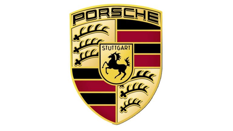
The heart of the Porsche logo is its striking horse—a tribute to Stuttgart, the city where the company was born. Stuttgart’s own coat of arms features a rearing black stallion, a symbol of vitality, speed, and the region’s historical horse-breeding tradition. Surrounding it are four quadrants inspired by the former state of Württemberg, decorated with antlers and bold red-and-black stripes.
This combination created one of the most iconic emblems in automotive logo heritage: proud, royal, and instantly identifiable. Power meets tradition, prestige meets craftsmanship—everything Porsche stands for, distilled into a crest.
Porsche Logo History: Evolution Through the Decades
1922–1945: The Württemberg Roots
Before Porsche existed as a carmaker, Württemberg’s heraldry already displayed the elements that would later inspire the Porsche crest: antlers, red-and-black stripes, and golden shields. These historical designs set the foundation for the emblem that would follow.
1938–1948: Stuttgart’s Stallion Takes Center Stage
When Stuttgart introduced its modern coat of arms—a bold black horse on a golden background—it became a defining symbol of the region and would later become the centerpiece of the Porsche crest.
1948–1952: Simplicity Before Identity
Early post-war variations were more restrained and lacked the layered symbolism. The shield shape began forming, but the Porsche personality had not yet emerged.
1952–1963: Birth of the Official Porsche Crest
The true Porsche emblem debuted in 1952. For the first time, the Stuttgart horse was placed inside a crest incorporating Württemberg’s antlers and stripes. A golden banner reading “Porsche” crowned the top of the shield, establishing the visual identity that still defines the brand today.
1963–1994: A More Refined, Premium Identity
The crest was polished with deeper gold, sharper outlines, and subtle stylistic touches. The stallion’s posture became more defined, and the overall appearance shifted toward a more upscale, luxurious feel.
1994–2014: Modernization and Stronger Contrast
The color palette darkened, giving the emblem more depth and weight. Black outlines thickened, the letterforms became cleaner, and the badge looked more stable and confident—reflecting a growing sports-car empire.
2014–2023: A Sleek, Contemporary Upgrade
Gold elements became slightly flatter and cleaner, details were refined again, and the central Stuttgart shield gained a lighter gold tone. This version became the globally recognized emblem mounted on everything from the 911 to the Taycan.
2023–Present: The New Matte Era
Porsche’s latest redesign introduces a matte metallic finish, modern honeycomb textures, sharper antlers, and a more dynamic horse. Subtle yet impactful, this update preserves heritage while embracing a future defined by electric innovation and modern performance.
![]()
Symbolism Within the Crest
Every element of the Porsche emblem carries meaning:
-
The Stallion: speed, power, and Stuttgart pride.
-
The Antlers: symbols of Württemberg’s natural heritage.
-
Red and Black Stripes: a nod to historic regional heraldry and Porsche’s spirit of tradition.
-
The Shield Shape: timeless, royal, and rooted in European coat-of-arms design.
Together, they form a badge synonymous with excellence—an icon across racing history, superb engineering, and luxury craftsmanship.
The Porsche Emblem in Print and Branding
Porsche’s wordmark, often paired with the crest, uses a custom sans-serif typeface designed for clarity and authority. Through different eras, the lettering shifted from gold to black, enhancing readability and offering a more modern, understated elegance. Today it stands as one of the world’s cleanest luxury automotive wordmarks.
Color Palette: What the Porsche Logo Represents
The Porsche logo traditionally employs:
-
Gold for heritage, luxury, and nobility
-
Black for precision, boldness, and strength
-
Red for passion, racing roots, and dynamism
Shade variations across decades reflect shifting design trends, but the palette’s meaning remains constant: power, history, and prestige.
![]()
Frequently Asked Questions
Why does the Porsche logo have a horse?
Because Porsche was founded in Stuttgart, whose official coat of arms features a rearing stallion representing strength, vitality, and regional heritage.
Why are there antlers in the Porsche crest?
The antlers come from the historic coat of arms of Württemberg, the former German state where Stuttgart is located.
Is there any connection between the Porsche and Ferrari logos?
No direct connection. Both use horses, but Ferrari’s prancing horse originated from Italian fighter pilot Francesco Baracca. Porsche’s horse is purely Stuttgart heritage.
How many antlers appear in the Porsche logo?
Six in total—three in each of the two antler quadrants.
What is the Porsche crest made of?
It’s a combination of a central Stuttgart shield with the stallion, surrounded by four quadrants featuring antlers and stripes, all framed within a gold coat-of-arms-style crest.