Ferrari Logo: History, Meaning & Evolution
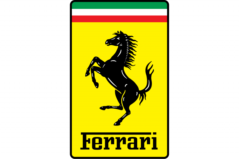
Few symbols in the automotive world are as instantly recognizable as the Ferrari logo. The yellow shield, the elegant black prancing horse, and the small strip of Italian tricolor at the top have come to represent speed, luxury, and racing heritage. Even people who have never driven a Ferrari know the emblem – it’s become a global shorthand for prestige and performance.
Ferrari’s visual identity has been remarkably consistent over the decades. While the shape, proportions and details of the badge have been refined many times, the core idea – a rearing black horse on a yellow field – has stayed almost untouched since the early years of the brand. And behind that horse sits a very human story, tied to war, heroism and Enzo Ferrari’s deep respect for Italian history.
Meaning and Origins of the Ferrari Logo
Ferrari is one of the most iconic luxury sports car manufacturers in the world. Founded in Italy, the brand is closely associated with powerful engines, unmistakable design and bold colors – especially red, yellow and black. The logo mirrors these values: it’s proud, energetic and instantly memorable.
The famous prancing horse actually predates Ferrari as a car manufacturer. During World War I, Italian fighter ace Francesco Baracca painted a black horse rearing on its hind legs on the fuselage of his aircraft. It quickly became his personal emblem and a symbol of bravery and victory in the air.
Years later, Enzo Ferrari met Baracca’s parents. Baracca’s mother suggested that Enzo should adopt the horse as his racing symbol, believing it would bring good luck. Ferrari agreed, adapting the horse for his own racing team and placing it on a yellow background – a nod to the color of his hometown, Modena. Over time, this prancing horse became inseparable from the Ferrari name.
The letters “SF” that often appear on the shield stand for “Scuderia Ferrari”, which literally means “Ferrari Stable” – a perfect match for a logo centered around a horse and a brand rooted in racing.
Early Versions and Logo Evolution
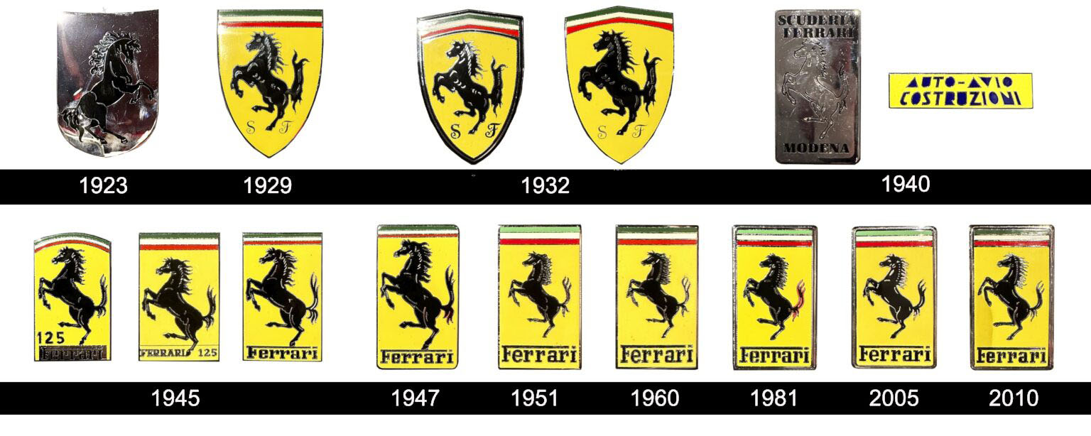
1923–1929: The First Prancing Horse
The earliest version of the Ferrari symbol was fairly simple: a metallic crest with a black horse rearing on a polished surface. It carried many of the details we still see today – the posture of the horse, the dynamic lines, the sense of motion – but there were no colors, no wordmark and no national elements yet. It was a pure racing emblem, focusing entirely on the animal.
1929–1932: The Yellow Shield Appears
By 1929, the logo evolved into something much closer to what we recognize today. The prancing horse was placed inside a yellow shield, with a small banner at the top featuring stripes and the initials “S” and “F” at the bottom for Scuderia Ferrari.
This is where the core formula of the Ferrari badge was born:
-
a black horse in side view, rearing up
-
a yellow field symbolizing Modena
-
racing initials to highlight the team identity
From here on, all major variations of the Ferrari logo would build on this structure.
1932–1940: Refinement and Italian Tricolor
In the early 1930s, the shield became more refined. The curved top was straightened, and the upper strip was updated to clearly show the Italian tricolor – green, white and red. The horse’s silhouette was cleaned up, with smoother outlines and better-defined muscles. The overall look became brighter and more modern, with the original thick black framing reduced to keep the emblem lighter and more elegant.
1940–1945: A Different Direction
Around 1940, Ferrari briefly experimented with a very different emblem for Auto-Avio Costruzioni, the company Enzo created before officially founding Ferrari as we know it today. This badge featured a circular medallion with an orange gradient, a yellow frame, a refined inscription and a winged horse turned to the opposite side.
It was an interesting detour in the visual history of the brand, but once Ferrari returned to its own cars, the rectangular yellow badge and classic prancing horse quickly came back to the spotlight.
1945–1960: Establishing the Classic Badge
From the mid-1940s through the 1950s, several small variations of the logo were used, all preserving the same basic structure: a vertical yellow rectangle, the Italian flag strip at the top, the black prancing horse in the center and the Ferrari wordmark at the bottom.
Edges were strengthened, the proportions of the rectangle were adjusted, and the typeface was refined. Colors became brighter and more carefully balanced. By the late 1950s, the Ferrari badge already looked very close to the one we know today.
1960–1981: More Color, More Character
In the 1960s, the background yellow became more saturated, giving the logo a stronger presence on the body of the cars. The Ferrari lettering at the bottom of the badge was updated with taller, more elegant letters, harmonizing better with the dynamic shape of the horse. The emblem now communicated both speed and sophistication – not just raw performance.
1981–2005: A Premium Framed Look
During the 1980s, Ferrari introduced a silver frame around the yellow rectangle. This shiny border tied the emblem more clearly to the high-end feel of the cars themselves. Lines were sharpened, shadows and contrasts were intensified and the overall logo became bolder and more polished.
2005–2010: Subtle Refinement
In the mid-2000s, the silver frame was slimmed down and given a smoother, more contemporary finish. The idea wasn’t to reinvent the logo but to make it look even more refined on modern body shapes and materials.
2010–Today: Timeless Icon
The most recent adjustments to the Ferrari logo are very subtle: the separation lines in the Italian tricolor have been simplified, and the contours have been cleaned up once again. The result is a timeless badge that feels classic and modern at the same time – a perfect match for a brand that’s deeply rooted in racing history, yet always pushing technology forward.
Symbolism of the Prancing Horse
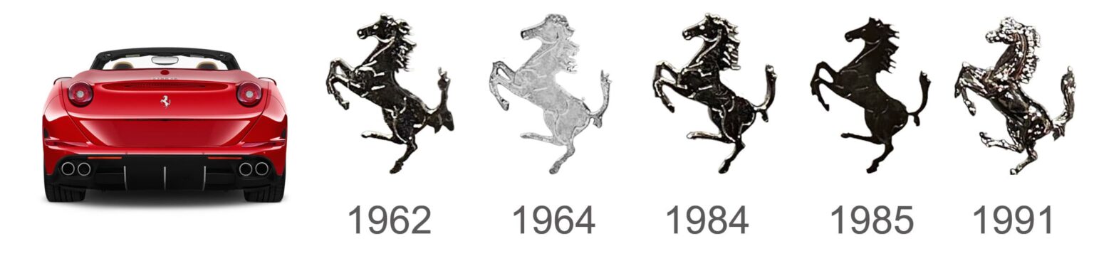
The prancing horse is more than just an elegant drawing – it’s packed with symbolism.
In heraldry, a horse rearing on its hind legs is associated with:
-
power and strength
-
victory and courage
-
readiness to charge forward
On Ferrari cars, the posture of the horse communicates speed, aggression and control. It suggests that the car is alive, coiled and ready to leap. The fact that the horse is painted in black adds a sense of exclusivity and drama – it feels both noble and slightly intimidating.
Historically, the horse also acts as a tribute: it is Ferrari’s way of honoring Francesco Baracca, the WWI ace whose emblem inspired Enzo Ferrari to adopt the symbol.
The Ferrari Emblem: Shield, Rectangle and Racing Heritage
Over the years, Ferrari has used both shield-shaped emblems and vertical rectangular badges, depending on the model and context.
-
The shield version (with the “SF” initials) is often associated with the racing division, Scuderia Ferrari. It has a more heraldic look, almost like a modern coat of arms.
-
The rectangular badge with the Ferrari wordmark is what most people see on the fenders and bodywork of road cars. It keeps the same key elements: yellow background, tricolor top and prancing horse in black.
Despite these small variations in outline and proportions, the internal structure – horse, colors and positioning – has stayed consistent. This is one of the main reasons why the Ferrari emblem is so strong: it never needed to be radically redesigned to stay relevant.
Ferrari Logo Font
The Ferrari wordmark is almost as recognizable as the horse itself. The lettering has evolved over time, but the core idea has remained stable: a lowercase logotype with distinctive, slightly elongated shapes, and a very characteristic “F” whose top stroke visually anchors the whole word.
Over the decades, the font has been refined:
-
the lines have become slimmer and more elegant
-
spacing has been adjusted for clarity and balance
-
the overall look has stayed unique to Ferrari
Even though some commercial fonts resemble it, the Ferrari type is essentially custom, designed to match the spirit of the brand: sporty, premium and unmistakably Italian.
Colors of the Ferrari Logo
Color plays a massive role in Ferrari’s identity:
-
Yellow background – chosen by Enzo Ferrari to represent Modena, his hometown. It’s bright, energetic and stands out perfectly against red paintwork.
-
Black horse – symbolizes power, mystery and status. It provides maximum contrast on the yellow and ensures the emblem is legible from a distance.
-
Italian tricolor (green, white, red) – proudly references the brand’s national roots and racing heritage.
These colors weren’t picked at random. Together, they create a compact symbol that says “Italy”, “speed” and “prestige” in less than a second. This is also why Ferrari has remained very protective of its visual identity – every element has meaning.
FAQ About the Ferrari Logo
What does the Ferrari logo represent?
The Ferrari logo represents speed, power and Italian racing heritage. The prancing horse is inspired by WWI flying ace Francesco Baracca, while the yellow background honors Enzo Ferrari’s hometown, Modena. Together with the Italian tricolor, the badge tells a story of national pride and motorsport success.
What does “SF” mean on the Ferrari shield?
The “SF” letters stand for Scuderia Ferrari, which translates roughly as “Ferrari stable”. It refers to Ferrari’s racing division, originally created to manage and run racing cars and drivers. The term “stable” ties directly to the horse motif of the logo.
Why does Ferrari use a horse as its symbol?
The horse was originally used by Francesco Baracca on his aircraft during World War I. After his death, Baracca’s mother encouraged Enzo Ferrari to adopt the symbol for his racing cars, believing it would bring good fortune. Ferrari agreed, and over time the horse became one of the most iconic symbols in automotive history.
What is the hidden meaning behind the Ferrari logo?
Beyond speed and luxury, the Ferrari logo is a tribute to courage and victory. The prancing horse recalls Baracca’s heroism and symbolizes a machine that is always ready to attack the track. The yellow background and Italian flag also anchor the brand in its roots – a proud Italian manufacturer with global influence.
Has the Ferrari logo ever changed completely?
The Ferrari logo has gone through many refinements in shape, color and detail, but its core elements – the black prancing horse, yellow background and Italian tricolor – have always stayed. Rather than redesigning the logo from scratch, Ferrari has chosen to improve it gradually, preserving brand recognition while keeping the emblem fresh.