
Audi Logo Meaning & Evolution
![]()
Few car emblems capture history and prestige as simply as the four interlocking rings of Audi. Behind this minimalist mark lies more than a century of engineering heritage, brand mergers and design evolution. The Audi logo is not just a modern badge on a grille – it’s a visual summary of German automotive heritage and the way four different companies became one.
At LogoHeritage.com we love symbols that carry real stories, and the Audi emblem is a perfect example. What looks like a clean, geometric logo is actually a quiet chronicle of cooperation, survival through economic crises, and the rise of a premium car maker that now ranks among the world’s luxury leaders. In this guide, we’ll walk through how the logo was born, how it changed, and what those four rings truly stand for in the context of logo heritage.
Meaning and History of the Audi Logo
Audi’s roots go back to the late 19th century, when engineer August Horch founded his first company, Horch & Cie, in Saxony. After disagreements with the board, Horch left his own business and started a new firm. Because he could no longer use his surname as a brand, he translated it into Latin. “Horch” (“listen” in German) became “Audi”, the imperative of “audire” – “listen”.
That clever linguistic twist gave birth to the Audi name, but the famous four rings came later. Through the 1910s and 1920s, Audi produced technically advanced cars but faced the same financial pressures many manufacturers felt between the world wars. The Great Depression hit Germany hard and, in 1932, four companies joined forces: Audi, Horch, DKW and Wanderer.
To represent this union visually, a new symbol was created: four interlocking rings, each one representing a member of the newly formed Auto Union. What began as a pragmatic solution to a business merger evolved into one of the most recognizable automotive logos on the planet, a mark that today stands for innovation, quality and premium German engineering.
Early Audi Logos (1909–1932)
1909 – The Pre-Launch Wordmark
The very first Audi logo, created in 1909 before the official launch of the brand, was a simple wordmark. The name “Audi” was written in a slanted, cursive style and enclosed in an oval outline. It was usually rendered in dark gray or black, giving it a serious, technical feel that matched the young company’s engineering ambitions.
1909 – The Triangle and Number One
Later in 1909, Audi introduced a new emblem that only survived for a short time but is memorable for its boldness. The design showed the number “1” emerging from a sphere, placed above a downward-pointing black triangle. Across the upper edge of the triangle, “Audi” was written in narrow white script.
By the end of the same year, this composition was simplified. The sphere was removed, the triangle became the main shape, and the wordmark remained in elegant cursive. This emblem stayed in use until the creation of Auto Union in 1932 and symbolized Audi’s desire to position itself as “number one” in its field.
The Birth of the Four Rings (1932–1949)
1932 – Auto Union and the First Rings
In 1932, Auto Union AG was formed by the merger of Audi, Horch, DKW and Wanderer. To reflect this coalition, designers created the first version of the four-ring logo. Each ring contained the emblem of one of the four brands, all drawn in blue.
This design was more than just decoration; it was a clear visual statement that four independent manufacturers were now working under one umbrella. The four rings were essentially a graphic summary of the new corporate structure and the shared heritage of the brands.
1949 – Rings with a Horizontal Bar
After World War II, the logo was cleaned up and simplified. The individual brand marks were removed from inside the rings. Instead, a thin horizontal rectangle crossed the rings at their midpoint, carrying a capitalized sans-serif inscription.
The focus shifted from separate companies to the idea of a unified group, moving the logo a step closer to the modern minimalist Audi style.
From Auto Union to Audi: Modern Identity (1969–Today)
1969 – The Black Rectangle
In 1969, a key corporate move reshaped the brand. Auto Union merged with NSU Motorenwerke, and a simple, functional logo appeared: a stretched black rectangle with “Audi” on the left and “NSU” on the right, both in white sans-serif type.
This design lived mainly in corporate use and marked the transitional phase when Audi was redefining its identity and stepping out of the shadow of the broader group.
1969–1995 – The Standalone Rings and Wordmark
Around the same period, the four rings began to appear as a separate emblem again, without any text or internal details. Four thick blue rings, interlocked in a horizontal line, became the main visual symbol of the brand’s technical strength and reliability.
In parallel, Audi introduced an independent wordmark: the name “Audi” in white, set inside a solid black oval. It was a clean, compact badge that worked well on signage and printed materials.
From 1978 the oval turned red and gained a thin double outline, which made the mark brighter and more noticeable, especially on car bodies and advertising.
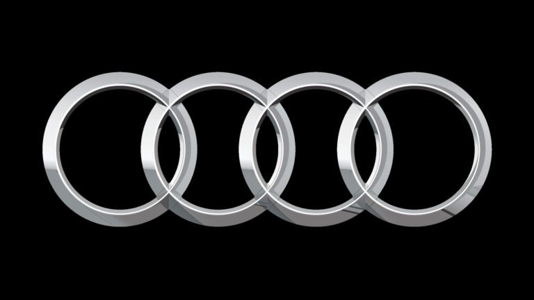
1995–2009 – 3D Chrome Rings and Red Audi Wordmark
In 1995, Audi fused its two key elements – the rings and the wordmark – into one unified logo. The four rings became shiny, three-dimensional chrome, and the Audi name appeared beneath them in a bold red custom typeface.
This combination balanced delicate, reflective metal contours with a strong, saturated logotype, emphasizing both elegance and performance. It was the emblem most people associate with the brand’s rise in the premium segment through the late 1990s and early 2000s.
2009–2016 – Refined Proportions
In 2009, designers reworked the proportions of the logo. The chrome rings grew larger and more prominent, while the wordmark became smaller and moved slightly to the left under the emblem.
The typeface was updated to a cleaner sans-serif style with slightly extended characters, aligning the overall look with Audi’s contemporary design language and digital presence.
2016–Today – Flat Black Minimalism
In 2016, Audi joined the broader trend toward flat branding. The three-dimensional effects were removed and the logo was reduced to four overlapping black rings, without any accompanying wordmark in the core version.
This minimalist symbol is incredibly flexible: it works on screens, in print, on car grilles and even in monochrome applications. Despite its simplicity, the logo still carries the full weight of Audi’s history, the four founding brands and its premium image – a perfect example of how logo heritage can be distilled into a pure, simple form.
![]()
What Do the Audi Rings Symbolize?
The meaning of the four rings is straightforward but powerful:
-
Four rings, four brands. Each ring represents one of the companies that merged in the early 1930s: Audi, Horch, DKW and Wanderer.
-
Unity and cooperation. The rings are interlocked, not just aligned. This small detail expresses cooperation, continuity and mutual support.
-
Heritage and evolution. While ownership and corporate structures have changed over time, Audi has kept the rings as a link to its origins and to one of the most important mergers in German automotive history.
Over the decades, the rings have shifted from a politically practical symbol of a union of factories into a universal sign of premium engineering and refined design.
The Audi Emblem on the Car
Today, the Audi emblem is usually seen on the front grille, rear hatch and steering wheel of the car. The horizontal layout of the rings matches the horizontal lines of the radiator grille, giving the front of the vehicle a wide, confident look.
The logo’s simple geometry makes it incredibly adaptable. It can be rendered in chrome, gloss black, satin black or even illuminated versions on certain models, without losing recognizability. The emblem’s clarity is one reason Audi can experiment with finishes and materials while maintaining a consistent visual identity.
Audi Logotype: Font Evolution
From its earliest days, Audi used a characteristic wordmark with unique letterforms. For much of the 20th century, the logo featured:
-
A notched “A”, giving the initial a distinctive, technical feel.
-
A simplified “U” with a clean curve.
-
A letter “d” with a specific shape that almost resembled a musical note.
These details created a signature look that paired well with the rings.
In 2009, Audi decided to modernize and unify its typographic identity. The wordmark was redrawn in a simpler, more neutral sans-serif font, optimized for digital and global use. The letters became more geometric, losing the earlier quirks but gaining clarity and versatility.
In the latest versions, the rings often appear without any text at all, a sign that the emblem has become strong enough to stand alone.
![]()
Color Palette of the Audi Logo
For most of its history, Audi relied on a very restrained color palette: black, white and later silver.
-
Black and white gave the logo a timeless, technical character. The early rings and wordmarks were often drawn in these classic shades.
-
In 1985, the rings turned silver while the wordmark became red. Silver emphasized technology, precision and modernity, while red added energy and visibility.
-
After 2009, the red tone grew slightly deeper, moving toward a cherry shade that looked richer in print and on screens.
Today, a flat black version of the rings has become the primary option in many applications, with silver or chrome finishes used on vehicles and physical badges. The combination of black, white, silver and sometimes red continues to convey confidence, performance and understated luxury.
FAQs About the Audi Logo
Why does the Audi logo have four rings?
The four rings represent the four companies that merged in 1932 to form Auto Union: Audi, Horch, DKW and Wanderer. Each ring stands for one brand, and their interlocking form symbolizes unity and collaboration.
What does the Audi emblem represent today?
Beyond the historical merger, the rings have come to represent Audi’s core values: technical innovation, reliability, and premium quality. The clean geometry of the rings also reflects the brand’s minimalist design philosophy.
Why did Audi switch to a flat logo?
The flat black version of the rings introduced in 2016 makes the logo easier to use across digital platforms, apps, websites and modern car interfaces. It also aligns Audi with contemporary design trends while keeping the heritage of the symbol intact.
Has the meaning of the logo changed over time?
The basic meaning – four rings for four brands – has never changed. However, as the original companies disappeared into a unified Audi identity, the logo has also come to stand for continuity, heritage and Audi’s place among the leading premium car makers.
Is the word “Audi” still part of the logo?
In many contexts, especially marketing and print, the Audi wordmark is still used alongside the rings. But on the cars and in minimal branding, the four rings alone are often enough – a sign of how strong and recognizable the emblem has become.