
VH1 Logo History: Meaning, Symbolism & Brand Heritage

When cable television entered its golden expansion era in the mid-1980s, music channels became cultural powerhouses almost overnight. While MTV dominated youth rebellion and edgy visuals, VH1 was conceived as its stylistic counterpart—smoother, more polished, and aimed at a slightly older audience. Launched in 1985 and originally standing for Video Hits One, VH1 focused on pop music, international artists, and a more refined presentation of mainstream culture.
Over time, the channel evolved far beyond music videos. Reality programming, celebrity storytelling, and shows centered on individual performers reshaped VH1’s identity, particularly during the 2000s. This evolution is clearly reflected in its visual identity. The VH1 logo history is a story of constant reinvention, experimentation, and adaptation to changing pop-culture sensibilities.
VH1 Logo Meaning and Brand Positioning
The VH1 logo meaning has always been closely tied to transition. Unlike brands that pursue strict visual consistency, VH1 embraced change as a defining characteristic. Its logos reflect shifts in music culture, television aesthetics, and audience expectations.
From striped typography to geometric abstraction and later expressive, almost chaotic lettering, VH1’s visual language mirrored the channel’s willingness to experiment with format and tone. At its core, the logo communicates accessibility and pop relevance rather than authority or permanence.
VH1 Logo History Timeline: Decades of Visual Reinvention
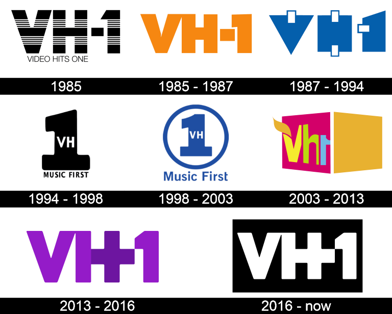
1985: The Original VH-1 Logo and Music Television Roots
The first VH1 logo appeared at launch in 1985. It featured the inscription “VH-1” rendered in a striped pattern, alternating black and white segments. Beneath the acronym, the full channel name appeared in uppercase sans-serif lettering.
This early identity clearly positioned VH1 as a music television channel, closely related to MTV but visually softer and more orderly. The striped pattern added visual rhythm, subtly referencing music without overt symbolism.

1985–1987: Bolder Forms and Color Introduction
Later in 1985, the logo was simplified. The full name was removed, the acronym became bolder, and the color shifted to orange. The numeral “1” adopted a more angular form, while the “V” and “H” were drawn closer together, visually connecting the letters.
This redesign increased legibility and visual impact, aligning VH1 more closely with emerging cable branding trends.

1987–1994: Abstract Geometry and Conceptual Design
In 1987, VH1 took a radical turn. The logo was transformed into a series of abstract blue geometric shapes: a triangle, a rectangle, and a modified rectangle representing “V,” “H,” and “1.” The only hint of letterform came from white negative-space accents embedded in the shapes.
This was one of VH1’s most experimental identities, reflecting late-1980s design trends and the channel’s growing confidence. The abstraction signaled a move away from literal music branding toward a more conceptual media presence.

1994–1998: “Music First” and Centralized Identity
With the rebranding to VH1: Music First in 1994, the logo shifted again. A large numeral “1” became the focal point, with the lowercase “vh” placed inside it. Beneath the symbol appeared the “music first” tagline in a clean sans-serif typeface.
This identity emphasized VH1’s renewed commitment to music content while maintaining a strong, centralized emblem.

1998–2003: Circular Emblem and Playful Typography
In 1998, the logo was enclosed within a blue circle, with the “music first” tagline placed above it. The typography softened, using mostly lowercase letters with selective capitalization. This version felt more approachable and pop-oriented, matching VH1’s expanding entertainment programming.

2003–2013: Expressive Letterforms and Visual Chaos
The 2003 redesign marked one of the most visually expressive periods in VH1 logo history. The channel introduced italicized, overlapping shapes in pink and orange that created optical illusions. The lettering became irregular and wavy, with a leaf-like detail extending from the “V.”
This logo captured VH1’s reality-TV era—bold, unpredictable, and personality-driven. Visual inconsistency became part of the brand’s appeal.
2013–2016: Return to the Acronym and the Plus Symbol
In 2013, VH1 returned to a cleaner acronym-based logo. The uppercase “VH1” reappeared, this time with a distinctive plus sign integrated into the “H.” This symbol suggested expansion and reinvention, hinting at a new chapter for the channel.

2016–Today: Minimalism and Platform Clarity
The current VH1 logo places the white “VH1” lettering on a solid black rectangular background. The plus sign remains integrated into the “H,” acting as a subtle marker of continuity.
This simplified identity reflects modern digital requirements and platform clarity. It is restrained, adaptable, and deliberately neutral, allowing content rather than branding to dominate.
VH1 Logo Symbolism Explained
VH1’s symbolism has shifted repeatedly, but one theme remains constant: transformation. Early stripes suggested rhythm and music. Geometric abstraction represented conceptual media. Later expressive forms echoed celebrity-driven storytelling.
The modern plus sign symbolizes addition and evolution, reinforcing VH1’s role as more than just a music channel. It signifies expanded formats, diverse voices, and cultural commentary layered onto its original foundation.
VH1 Logo Typography and Color Meaning
VH1 has experimented with typography more than most television brands. From sans-serif clarity to distorted, expressive letterforms, each era reflected contemporary design trends.
Color choices evolved accordingly. Early black-and-white palettes conveyed neutrality. Orange and blue introduced energy and accessibility. Pink, violet, and orange emphasized pop culture and emotion. Today’s black-and-white scheme signals maturity, clarity, and cross-platform consistency.
VH1 Logo Heritage and Cultural Adaptation
The VH1 logo heritage is defined not by consistency, but by responsiveness. Few media brands have reinvented themselves visually as often while remaining culturally recognizable. VH1’s logos tell the story of a channel that adapted to music trends, television formats, and audience shifts without clinging to a single identity.
In doing so, VH1 established itself as a flexible pop-culture platform—one that reflects the changing face of entertainment rather than resisting it.
VH1 Logo FAQ: Common Questions About the Channel’s Visual Identity
What does VH1 stand for?
VH1 originally stood for Video Hits One, reflecting its music-video focus at launch.
Why has the VH1 logo changed so often?
Frequent redesigns allowed VH1 to adapt to shifting pop-culture trends and programming strategies.
What does the plus sign in the VH1 logo mean?
The plus sign represents expansion, signaling VH1’s evolution beyond music videos into reality and cultural programming.
Who owns VH1 today?
VH1 is currently owned by Paramount Global.