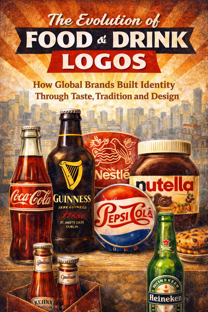
The Evolution of Food and Drink Logos
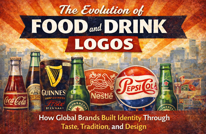
How Global Brands Built Identity Through Taste, Tradition, and Design
Food and drink logos occupy a unique position in the history of visual identity. Unlike fast food branding, which prioritizes speed and immediacy, food and beverage logos operate in a more complex emotional space. They must evoke taste, trust, quality, heritage, and consistency—often without the benefit of motion, sound, or physical experience. A logo printed on a bottle, wrapper, or package must suggest flavor before the product is ever consumed.
Over the past century, food and drink logos evolved from descriptive labels into powerful cultural symbols. They became carriers of tradition, indicators of authenticity, and markers of global lifestyle. From the handwritten elegance of early beverage brands to the minimal precision of modern packaging, these logos tell a story about how brands learned to translate sensory experience into visual language.
From Labels to Identity: Early Food and Beverage Branding
In the early twentieth century, food and drink branding was primarily functional. Logos resembled labels rather than symbols, designed to communicate product type and origin rather than emotion. Typography dominated these early identities, often inspired by handwriting, calligraphy, or traditional print styles.
Brands such as Coca-Cola established visual systems that relied heavily on distinctive scripts. The flowing typography of the Coca-Cola logo history did more than identify a beverage—it created a sense of familiarity and continuity. This approach proved so effective that the core typographic identity survived wars, cultural shifts, and technological revolutions with minimal alteration.
Similarly, early alcohol and beverage brands leaned into tradition. Guinness, Carlsberg, and Johnnie Walker developed logos that referenced craftsmanship, heritage, and national identity. These symbols communicated trust in a time when food safety and consistency were not guaranteed.
Taste, Emotion, and Visual Suggestion
Unlike industrial or technology logos, food and drink logos must suggest sensory qualities. Color, texture, and typography work together to imply sweetness, bitterness, freshness, or richness. Red often signals intensity and energy, while brown and gold suggest tradition and depth. White communicates purity and simplicity.
The Pepsi logo evolution reflects changing attitudes toward youth culture and modernity, while Sprite embraced clarity and freshness through green and white palettes. Dairy and confectionery brands such as Milka, Oreo, and Nutella relied on soft color schemes and rounded forms to convey comfort and indulgence.
These visual decisions were not aesthetic accidents. They were deliberate attempts to translate taste into design.
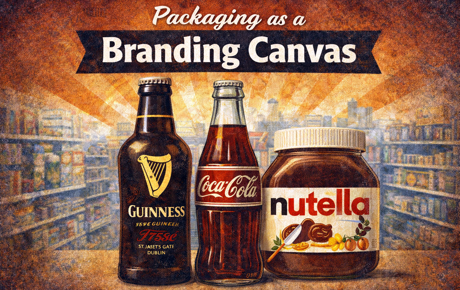
Packaging as a Branding Canvas
Food and drink logos rarely exist alone. They live on packaging, where shape, material, and layout amplify their meaning. In many cases, the logo becomes inseparable from the package itself.
The Guinness harp, the Coca-Cola bottle, and the Nutella wordmark are examples of identities strengthened through physical form. Packaging consistency reinforced recognition, while subtle refinements allowed brands to modernize without losing trust.
As global distribution expanded, packaging became a critical branding tool. Logos had to remain legible across languages, regulations, and cultural expectations. This pressure pushed brands toward clearer symbols and more disciplined visual systems.
Energy, Lifestyle, and the Rise of Attitude Branding
The late twentieth century introduced a new category of food and drink branding: lifestyle-driven identity. Energy drinks, coffee brands, and premium beverages moved beyond taste and tradition to sell attitude, performance, and aspiration.
Red Bull transformed the energy drink logo into a symbol of motion, power, and extreme performance. The Red Bull logo history demonstrates how symbolism and narrative can elevate a product into a cultural phenomenon. Monster Energy, by contrast, embraced aggression and subculture, using sharp forms and dark palettes to differentiate itself.
Coffee brands such as Starbucks, Nespresso, and Keurig adopted entirely different strategies. Their logos emphasized ritual, sophistication, and global refinement. The evolution of the Starbucks logo meaning illustrates how brands can gradually abstract their identity while maintaining emotional resonance.
Minimalism and the Modern Food Brand
In recent decades, food and drink logos have undergone widespread simplification. Digital platforms, e-commerce, and global branding demands encouraged cleaner forms and reduced detail. Flat design replaced ornament. Typography became more neutral. Color palettes were refined.
Yet, unlike fast food logos, food and beverage brands often retained elements of heritage. Nestlé, Danone, and Häagen-Dazs modernized cautiously, understanding that trust and familiarity are core assets in food branding. Radical redesigns risk alienating consumers who associate logos with personal memory and routine.
Minimalism in food logos therefore tends to be evolutionary rather than revolutionary.
Global Brands, Local Taste
One of the defining challenges of food and drink branding is balancing global consistency with local taste. A logo must function internationally while remaining culturally sensitive. This tension shaped many of the world’s most successful food brands.
Heineken and Carlsberg maintained strong national identity while expanding globally. Tropicana attempted a radical redesign that was later reversed after consumer backlash, highlighting how deeply food logos are tied to consumer trust.
These examples underscore a key truth: food and drink logos are not purely visual assets. They are emotional contracts.
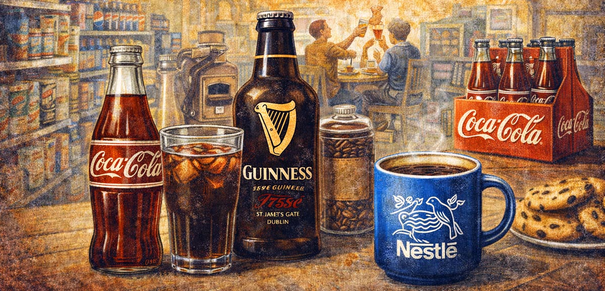
Food and Drink Logos as Cultural Memory
Over time, food and drink logos have become part of everyday cultural memory. They appear in kitchens, supermarkets, cafes, and social gatherings. They accompany moments of celebration, routine, and comfort.
Because of this intimacy, changes to food logos are scrutinized more intensely than in most industries. Consumers do not merely see these symbols; they live with them. The longevity of brands like Coca-Cola, Guinness, and Nestlé is inseparable from the stability of their visual identities.
Designing for Trust, Not Speed
The evolution of food and drink logos reveals a design philosophy rooted in trust, familiarity, and emotional continuity. While trends and technologies reshaped visual language, the most successful brands resisted radical change. Instead, they refined, simplified, and adapted while preserving core identity.
In a global marketplace defined by choice and saturation, food and drink logos remain anchors of recognition and reassurance. Their power lies not in novelty, but in consistency—a lesson that continues to shape branding today.
FAQ
Why do food and drink logos change more slowly than fast food logos?
Because they are closely tied to trust, routine, and personal memory. Sudden changes can disrupt consumer confidence.
What role does typography play in food branding?
Typography often conveys tradition, quality, or playfulness, helping consumers associate visual identity with taste and experience.
Why are beverage logos often typography-driven?
Beverage brands rely heavily on wordmarks to build recognition and maintain consistency across packaging and advertising.
Which food and drink logo is the most iconic globally?
The Coca-Cola logo is widely regarded as one of the most iconic and enduring food and drink identities in history.