How Airline Logos Balance National Symbolism and Global Recognition
Why Airline Logos Carry More Weight Than Most Brand Symbols
Airline logos occupy a rare position in the world of branding. Unlike logos created for retail, technology, or entertainment companies, airline logos are not merely commercial identifiers. They are symbols of national identity, safety, trust, and international presence. Every time an aircraft takes off, its livery and emblem become a moving representation of a country, visible in airports across continents and cultures.
For passengers, an airline logo often delivers its message long before any direct interaction with the company begins. It sets expectations about professionalism, reliability, comfort, and even hospitality. In many cases, travelers associate an airline’s logo with their first impression of a nation itself. This unique responsibility explains why airline logos are among the most carefully preserved visual identities in the global corporate landscape.
Balancing national symbolism with worldwide recognition is not a simple task. Airline branding must feel authentic to its origins while remaining accessible, neutral, and trustworthy to an international audience. This tension between cultural specificity and global clarity has shaped some of the most enduring logos in modern branding history.
The Role of National Identity in Airline Branding
From the earliest days of commercial aviation, airlines understood that they were more than transport companies. They were ambassadors. Long before digital media connected the world, airplanes carried not only passengers but also flags, languages, and national pride across borders.
As a result, national identity became deeply embedded in airline logos. Colors taken from national flags, traditional symbols, and culturally significant typography found their way into visual identities. In many countries, especially where airlines were state-owned or closely tied to government institutions, the logo served as a visual statement of sovereignty and progress.
Yet national symbolism had to be handled carefully. Too much emphasis on local imagery risked alienating international travelers. Too little risked stripping the brand of authenticity. The most successful airline logos learned to suggest identity rather than shout it, using refined visual cues that could be recognized worldwide without requiring cultural explanation.
How Airline Logos Became Global Symbols of Trust
Trust plays a larger role in aviation branding than in almost any other industry. Passengers place their safety in the hands of airlines, often for long hours and across unfamiliar territories. A logo, in this context, becomes a reassurance device.
Over time, airline logos evolved to prioritize clarity, consistency, and stability. Sudden visual changes were avoided because they could create uncertainty. Unlike fast-moving consumer brands that regularly refresh their look, airlines learned that familiarity builds confidence. A logo seen repeatedly over decades signals experience, reliability, and operational maturity.
This explains why many airline logos have remained structurally similar for generations. Adjustments are usually subtle, focusing on refinement rather than reinvention. The goal is not to surprise the audience, but to reassure it.
Flag Colors, Cultural Symbols, and Visual Heritage
Color plays a central role in airline branding, often acting as the primary link to national identity. Blues, reds, whites, and greens frequently appear, echoing flag palettes while also benefiting from strong psychological associations. Blue suggests stability and calm. Red communicates strength and confidence. White conveys clarity and professionalism.
Symbols, when used, are typically simplified and abstracted. Birds, wings, or national animals appear in stylized forms that emphasize motion and freedom rather than literal representation. This abstraction allows logos to travel well across cultures, remaining recognizable without requiring local knowledge.
Typography is treated with similar restraint. Fonts are chosen for legibility at a distance, consistency across physical and digital environments, and neutrality across languages. Decorative typefaces are rare, replaced by clean, modern letterforms that support global readability.
Translating Identity Into Airline Logo Design
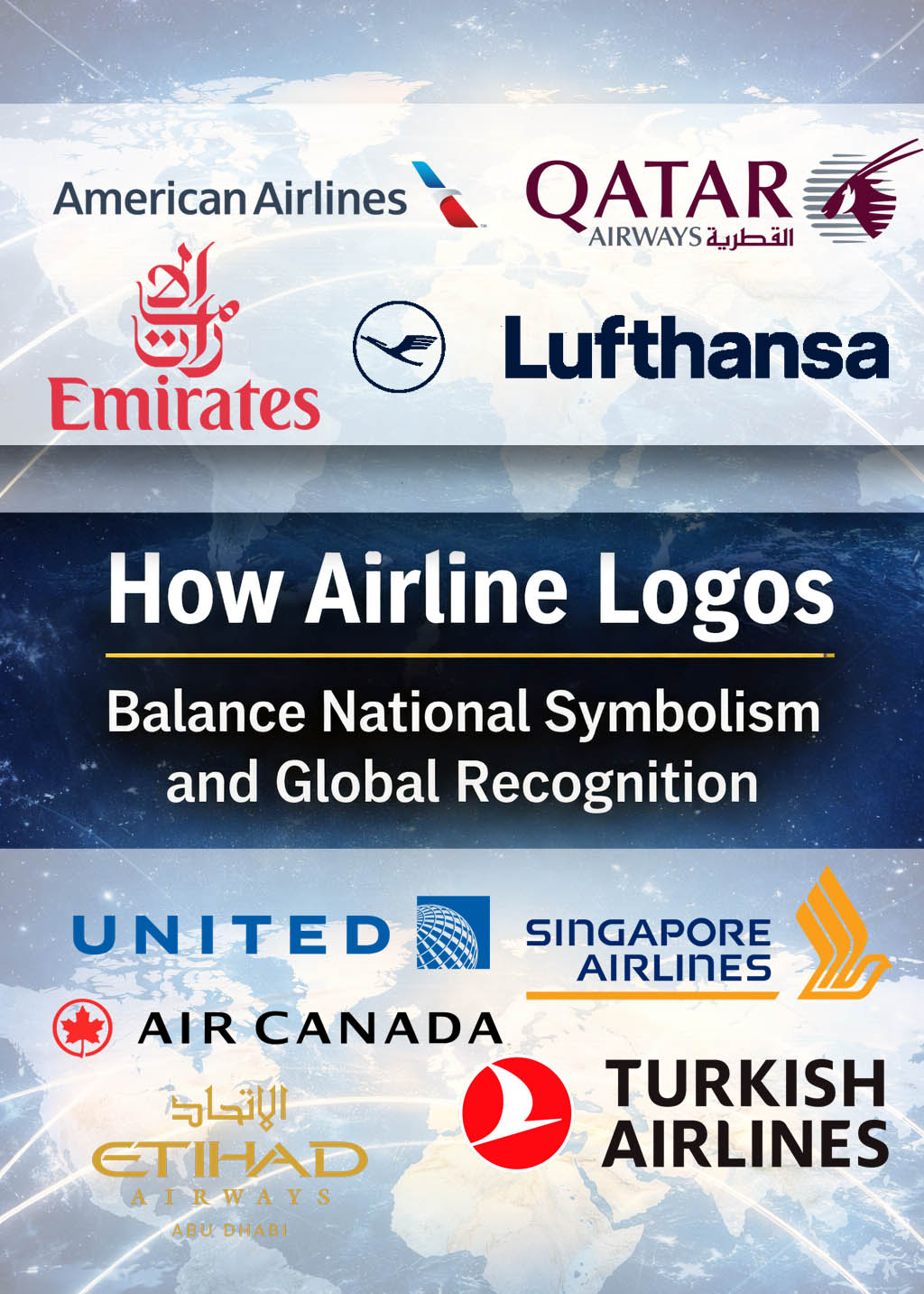
Emirates: Heritage, Luxury, and Cultural Confidence
The Emirates logo demonstrates how strong cultural identity can coexist with global appeal. Its use of Arabic calligraphy reflects regional heritage without compromising legibility or elegance. The red color communicates confidence and premium positioning, while the typography remains restrained and modern.
Through consistent application across aircraft, airports, and digital platforms, the logo has become a symbol of luxury air travel worldwide. Its success lies in presenting cultural authenticity as a mark of quality rather than difference.
Lufthansa: Precision and Visual Discipline
Lufthansa’s logo reflects the values commonly associated with German design: precision, order, and reliability. The iconic crane symbol has remained largely unchanged for decades, reinforcing a sense of continuity and operational stability.
The restrained color palette and balanced proportions communicate seriousness and professionalism. Lufthansa’s visual identity avoids trend-driven changes, reinforcing trust through familiarity and consistency.
British Airways: National Pride Without Excess
British Airways offers a refined approach to national symbolism. Rather than relying heavily on literal flag imagery, its logo integrates national colors through abstract movement and typography.
This approach allows the brand to feel distinctly British while remaining approachable to international travelers. The logo balances heritage with modernity, reinforcing the airline’s position as a global carrier with deep national roots.
Air France Logo: Elegance as a Visual Language
Air France has long embraced elegance as a core brand value. Its logo reflects this through understated typography and controlled color use. Rather than overt national symbols, the design relies on subtle cues associated with French culture, such as refinement, balance, and confidence.
The result is a logo that communicates national identity through tone rather than imagery, aligning seamlessly with France’s global reputation for style and sophistication.
American Airlines: Modernizing National Identity
American Airlines’ visual identity demonstrates how national symbolism can evolve. Its modern logo references the American flag through color and form, but avoids traditional or nostalgic imagery.
The design emphasizes forward movement and openness, reflecting both national identity and a contemporary global outlook. This balance allows the logo to resonate with domestic audiences while remaining relevant internationally.
Qatar Airways: Symbolism as Global Prestige
Qatar Airways uses a national symbol, the oryx, as the centerpiece of its logo. Rendered in a refined, minimalist style, the animal conveys strength, endurance, and cultural heritage.
Rather than limiting the brand, this strong symbolic choice elevates it. The logo positions Qatar Airways as both culturally rooted and globally prestigious, reinforcing its premium market position.
Ryanair: Visibility Over Romance
Ryanair’s logo illustrates a fundamentally different branding philosophy from legacy flag carriers. As a low-cost airline, Ryanair does not aim to evoke luxury or emotional warmth. Instead, its visual identity prioritizes instant recognition and functional clarity.
The use of strong blue and yellow directly references the European Union flag rather than Irish national colors alone, reinforcing Ryanair’s positioning as a pan-European carrier. The harp symbol, traditionally associated with Ireland, is rendered in a simplified, almost emblematic form, signaling origin without sentimentality.
This approach aligns with Ryanair’s operational model: efficiency, scale, and consistency. The logo does not promise comfort or prestige; it promises availability and reach. In that sense, it functions as a utilitarian trust marker rather than an aspirational symbol.
United Airlines: Network, Scale, and Continuity
United Airlines’ logo centers on the globe, a symbol that directly communicates network reach and international connectivity. Rather than emphasizing national iconography, the design speaks to scale and operational scope.
The restrained color palette and clean typography reinforce professionalism and consistency, essential for an airline operating one of the world’s largest route networks. While the logo carries subtle references to American corporate modernism, it avoids overt patriotic imagery.
This choice reflects United’s identity as a global connector rather than a cultural ambassador. The logo reassures passengers through familiarity and repetition, signaling logistical strength and institutional reliability over emotional storytelling.
Royal Air Maroc: Royal Authority and Cultural Symbolism
Royal Air Maroc presents one of the clearest examples of monarchy-linked airline branding. Its logo incorporates the crown and national star, immediately signaling state affiliation and royal patronage.
The deep red color ties directly to Morocco’s flag, while the typography balances formality with approachability. Unlike more abstract global brands, Royal Air Maroc leans into cultural specificity, positioning itself as a gateway to Morocco rather than a neutral transit operator.
Despite its strong national symbolism, the logo remains legible and composed, avoiding excessive ornamentation. This balance allows it to function internationally while preserving its identity as a national institution.
Singapore Airlines: Precision, Craft, and Silent Luxury
Singapore Airlines’ logo is widely regarded as one of the most refined in global aviation. The stylized bird, inspired by traditional Southeast Asian motifs, conveys motion, grace, and craftsmanship without literal representation.
The gold and navy palette signals premium positioning, while the logo’s restrained geometry reflects Singapore’s broader national reputation for efficiency, order, and excellence. Cultural identity is present, but it is translated into form rather than narrative.
This subtlety mirrors the airline’s service philosophy: luxury expressed through precision rather than excess. The logo feels timeless, reinforcing trust through quiet confidence.
Turkish Airlines: Motion as National Identity
Turkish Airlines uses a stylized wild goose, a symbol deeply rooted in Turkish folklore, to represent migration, endurance, and connection between continents. Rendered in clean, modern lines, the symbol avoids folkloric heaviness.
The red-and-white palette directly references the Turkish flag, anchoring the brand in national identity. At the same time, the circular emblem suggests continuity and global motion, reinforcing Istanbul’s role as a bridge between East and West.
The logo successfully merges cultural heritage with modern aviation symbolism, positioning Turkish Airlines as both a national carrier and a global hub airline.
Etihad Airways: Modern Prestige and Geometric Heritage
Etihad Airways approaches branding through contemporary luxury rather than traditional symbolism. Its logo relies on geometric typography and a refined gold palette to communicate exclusivity and modernity.
Arabic heritage is expressed subtly through letterforms and pattern-inspired structure, rather than explicit symbols. This abstraction allows the brand to feel internationally sophisticated while remaining culturally grounded.
Etihad’s logo reflects a younger flag carrier intent on positioning itself as a design-forward, premium airline, aligning national ambition with global aesthetics.
Air Canada: National Symbol as Global Mark
Air Canada’s logo demonstrates how a national symbol can be transformed into a globally recognizable brand mark. The maple leaf, one of the most identifiable national emblems in the world, is simplified into a bold, geometric form.
The restrained red, black, and white palette communicates clarity and confidence, while the symmetry of the design reinforces balance and reliability. Rather than appearing patriotic, the logo feels authoritative and composed.
Air Canada’s visual identity succeeds because it presents national symbolism as structure rather than decoration, allowing the logo to scale across international contexts without losing meaning.
Why Airline Logos Rarely Change Drastically
In aviation, visual stability is closely linked to trust. Passengers associate familiar logos with proven safety records and operational experience. Radical redesigns can disrupt this perception, creating uncertainty where reassurance is needed most.
Additionally, airline logos must function across an enormous range of applications, from aircraft fuselages to boarding passes and digital interfaces. Consistency reduces confusion and strengthens recognition in complex environments such as international airports.
As a result, airline rebrands tend to focus on refinement rather than reinvention. Adjustments are gradual, preserving core elements while improving clarity, scalability, and digital performance.
Typography in Airline Logos: Clarity Over Decoration
Typography in airline branding prioritizes legibility above all else. Logos must remain readable at a distance, at speed, and across languages. Sans-serif fonts dominate the industry due to their clean structure and adaptability.
Letter spacing, weight, and proportion are carefully calibrated to ensure consistency across physical and digital touchpoints. Decorative elements are minimized to avoid distraction and misinterpretation.
This disciplined approach to typography reinforces the perception of professionalism and operational competence.
Color Psychology and Emotional Messaging
Color choices in airline logos are rarely arbitrary. Blue dominates the industry because it conveys calm, reliability, and safety. Red, when used, signals confidence and strength, while gold or metallic tones suggest premium positioning.
These color decisions are reinforced through consistent application across uniforms, interiors, and marketing materials. Over time, passengers associate these colors with specific emotional responses, strengthening brand loyalty and recognition.
Airline Logos in the Digital Era
Digital transformation has added new demands to airline branding. Logos must now function seamlessly across mobile apps, online booking platforms, and digital boarding passes.
This shift has encouraged simplification, cleaner lines, and improved scalability. Transparency, flat design elements, and adaptable color systems ensure logos remain effective on screens of all sizes.
Despite these changes, the core principles remain unchanged. Stability, clarity, and trust continue to guide airline logo evolution, even in a digital-first environment.
When a Logo Carries a Nation Across Borders
Airline logos are among the most powerful visual symbols in modern branding. They represent not only companies, but countries, cultures, and shared expectations of safety and professionalism. By carefully balancing national symbolism with global recognition, successful airline logos achieve something rare: they feel personal without being exclusive, and authoritative without being distant.
Their endurance is not accidental. It is the result of deliberate design choices that prioritize trust, clarity, and continuity over fleeting trends. In an industry where confidence matters as much as performance, airline logos remain steady anchors, carrying national identity across borders with every flight.
FAQ – Airline Logos
What makes airline logos different from other company logos?
Airline logos represent safety, national identity, and global trust simultaneously, making them more symbolically complex than most commercial logos.
Why do airline logos change so rarely?
Frequent visual changes can undermine passenger confidence. Stability reinforces trust and long-term brand recognition.
Do airline logos always include national symbols?
Not always explicitly, but most incorporate national identity through color, typography, or symbolic references.
Which airline logos are considered the most iconic worldwide?
Logos that balance heritage, consistency, and global clarity tend to achieve lasting recognition across cultures.