
Valentino Logo History: Meaning, Symbolism & Brand Heritage

Few names in contemporary fashion evoke elegance with the same effortless confidence as Valentino.
Founded in 1960 by Valentino Garavani, the house quickly became synonymous with Roman haute couture, refined glamour, and an unmistakable Italian sensibility. Valentino was never merely a designer; he engineered a visual and emotional universe built on purity of line, theatricality without excess, and an enduring devotion to beauty. From the halls of the Roman Palazzo Gabrielli-Mignanelli to red carpets across the globe, Valentino’s imprint is unmistakably timeless.
This sense of permanence extends to the brand’s visual identity. The Valentino logo has never chased trends nor sought dramatic reinventions. Instead, it has evolved calmly, with the same discipline and grace that define the brand’s creations. Its typographic precision, its balanced geometry, and the iconic “V” symbol form one of the most recognizable signatures in the history of luxury fashion.
Meaning & Symbolism
The Valentino identity is anchored in a single idea: elegance as simplicity. Unlike ornate monograms or baroque heraldry found in many fashion houses, Valentino conveys its entire universe through a carefully sculpted serif wordmark and a letterform that has transcended typography to become a global symbol.
The wordmark, with its classical proportions and the interplay between thick and thin strokes, recalls the sophistication of old Roman letter carving. This connection is not accidental. Valentino has always positioned itself as a custodian of Roman heritage — not literal antiquity but the spiritual tradition of beauty, structure, and poise. The brand’s clothing, from the flowing gowns to the rigorously constructed tailoring, embodies this same duality of strength and delicacy.
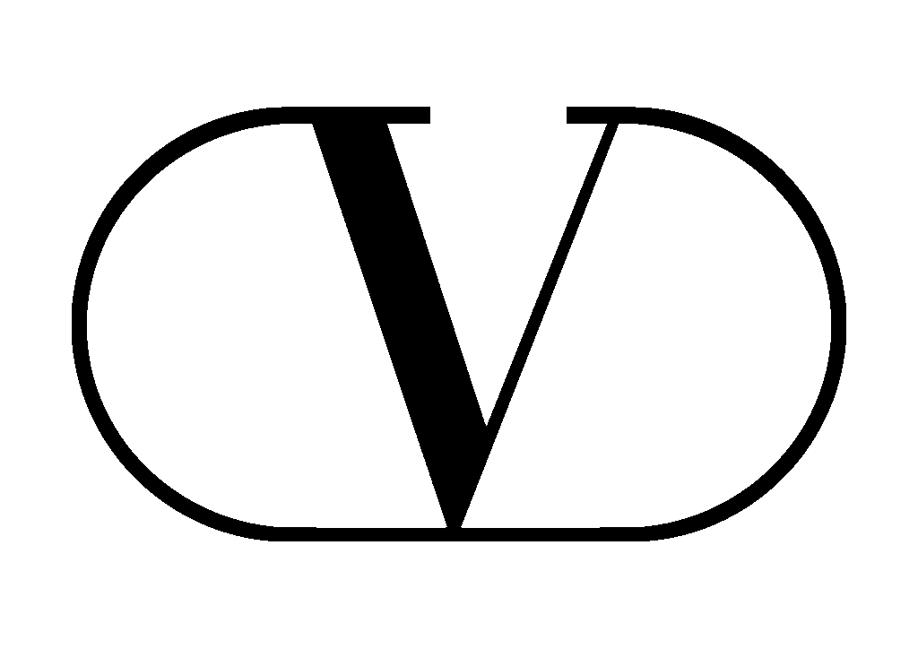
The “V” symbol captures everything in a single shape. Part letter, part emblem, part architectural silhouette, it reflects eternity, symmetry, and continuity. The extended serifs trace the outer boundary of an open ellipse, creating a shape that feels almost like a crest without being one — modern, minimal, yet unmistakably regal.
Logo Evolution Timeline
![]()
1960–1979: Valentino Garavani Enters the Stage
The earliest Valentino visual identity bore the full signature of its founder: Valentino Garavani. This logotype represented the foundation era of the brand, when the designer’s personal prestige was part of the house’s power.
“Valentino” appeared prominently in an elegant serif typeface with classical proportions, already very close to the refined lettering used today. “Garavani,” however, appeared beneath it in a lighter, more subdued sans-serif font. This typographic contrast served a symbolic purpose: the surname was present, but secondary. The hero was always Valentino — the name, the persona, the aesthetic.
This early logo reflects the house’s emergence into the world of haute couture in Rome, where Valentino became celebrated for his crisp lines, his sense of proportion, and his now-legendary use of red, later known as Valentino Rosso.
![]()
1979–Today: The Modern Valentino Identity
The redesign of 1979 introduced the version that would eventually become iconic. The surname “Garavani” was removed, marking the shift from a designer’s signature into a brand with its own independent aura. The word “Valentino” stood alone, and its presence became stronger than ever.
The emblem featuring the stylized “V” was enlarged, repositioned, and refined. Its design gained a new equilibrium: a perfect balance between the open ellipse and the sculpted serif letter. This combination created a visual harmony that has since become one of the most recognizable emblems in global fashion.
Through the decades that followed, while the ready-to-wear lines, creative directors, and artistic directions evolved, the logo remained almost untouched — a testament to its timelessness.
The Symbol: The Stylized Valentino “V”
The Valentino “V” is one of the most elegant monograms in fashion history. Its serifs extend outward to form an open ellipse — not fully closed, not fully circular — suggesting openness, continuity, and movement. The inner space mirrors the architectural symmetry of classical Italian forms, giving the letter a quiet, structural power.
Unlike the monograms of some other maisons, the Valentino “V” is never overly ornate or decorative. It functions as an icon, a stamp, a minimalistic crest. It represents the house’s devotion to beauty and restraint, while also emphasizing the central role of Valentino’s name in the brand’s DNA.
Typography & Color
The Valentino logotype is executed in a serif typeface with distinctly Italian character. The contrast between thick and thin strokes echoes classical Roman inscriptions carved into stone, where elegance, precision, and balance were essential. The letterforms are tall, with slightly condensed proportions, giving the name a sense of grandeur and vertical lift.
The color palette — nearly always black on white — reflects formality, purity, and timelessness. Valentino collections may experiment with bold hues, but the logo remains minimalistic and untouched. In rare cases, especially within the haute couture realm or special packaging, the “V” may appear in softer tones, such as ivory or muted gold, reinforcing its association with luxury.
A Logo as Eternal as Italian Elegance
The Valentino logo is a triumph of restraint and refinement. It has endured for decades without the need for radical reinvention, because it was conceived with a timeless sensibility. Like the gowns, the craftsmanship, and the aesthetic vision of the house, the logo is an emblem of poise — a visual identity capable of bridging tradition and modernity with ease.
From its debut in the 1960s to its global presence today, the Valentino wordmark and the iconic “V” have remained symbols of elegance, clarity, and Italian excellence. In a world of shifting trends and constantly evolving fashion languages, Valentino’s logo stands unwavering, proving once again that true sophistication does not age — it simply becomes legacy.
FAQ — Valentino Logo & Brand Identity
What does the Valentino logo represent?
The Valentino logo symbolizes timeless Italian elegance, using a refined serif wordmark and a stylized “V” emblem that conveys balance, sophistication, and classical beauty.
Why does Valentino use a “V” symbol?
The “V” is both the initial of the brand and a carefully designed monogram representing harmony, symmetry, and the heritage of Roman craftsmanship.
Has the Valentino logo changed over the years?
The logo has remained nearly unchanged since 1979, aside from removing “Garavani” from the original 1960 composition and refining the stylized “V” emblem.
Who owns Valentino today?
Valentino is owned by Mayhoola for Investments, a Qatar-based luxury investment group.
What is Valentino best known for?
Valentino is celebrated for couture craftsmanship, elegant tailoring, iconic red gowns, and luxury accessories, embodying Italian sophistication.