NVIDIA Logo History: Meaning, Symbolism & Brand Heritage
![]()
Few modern technology companies have reshaped computing, gaming, and visual innovation as profoundly as NVIDIA. Founded in 1993, the company began as a daring startup betting on a future where graphics processing would become essential to human-computer interaction.
Three decades later, NVIDIA stands at the center of the AI revolution, powering everything from autonomous vehicles to scientific supercomputing, with a brand identity instantly recognized across the globe.
While NVIDIA’s hardware has evolved at lightning speed, its visual identity has remained remarkably consistent. At its heart lies an abstract symbol built around one powerful idea: vision.
The NVIDIA logo has always represented more than technology — it embodies foresight, awareness, and the relentless pursuit of innovation. Known informally as the “all-seeing eye,” this emblem has become a visual shorthand for cutting-edge graphics, intelligence, and breakthrough computation.
The following is a detailed journey through the heritage, meaning, and evolution of the NVIDIA logo — a symbol that has grown from a small graphics startup’s mark into one of the most iconic identities in modern technology.
Origins of a Vision: The First NVIDIA Logo (1993–2006)
![]()
When NVIDIA was founded in the early 1990s by Jensen Huang, Chris Malachowsky, and Curtis Priem, the company needed a visual identity that reflected its mission: pushing visual computing into a new era. The result was a bold, high-contrast emblem built around an abstract “eye,” split between a white field and a black square, with a flash of vivid green slicing through the design.
This first NVIDIA logo felt raw and experimental, echoing the spirit of the young company itself. The eye — presented in heavy, hand-drawn strokes — suggested watchfulness, perception, and the ability to see what others could not yet imagine. Half of the eye rested on a blank white space, while the other half overlapped a black grid, creating a symbolic tension between order and organic creativity.
Below this emblem appeared the original NVIDIA wordmark, an unusual mix of uppercase serif letters paired with a lowercase cursive “n.” This quirky detail was a signature of early ’90s tech branding — expressive, slightly unconventional, and unmistakably rooted in the intellectual culture of Silicon Valley at the time.
Despite its rough edges, the logo was deeply symbolic and conceptually rich. It perfectly conveyed NVIDIA’s identity as a company obsessed with visual intelligence, and its core metaphor — the eye that “sees everything” — would become the foundation of all future versions.
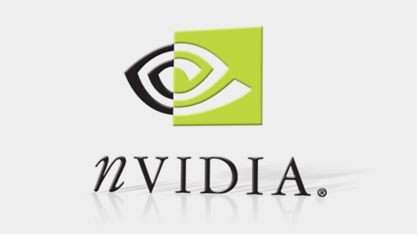
Modernization & Refinement: The 2006 Redesign
By 2006, NVIDIA had transformed from a promising graphics startup into the undisputed leader in GPU technology. With the launch of the GeForce line, the company entered mainstream global recognition, and its visual identity was ready for refinement.
The redesign preserved the iconic “eye,” but modernized it with cleaner geometry, smoother lines, and a brighter, more assertive shade of green. The black fill was removed entirely, giving the symbol a more optimistic, forward-looking character. The green — now a signature NVIDIA hue — represented growth, innovation, and the company’s increasing dominance in the tech landscape.
The wordmark underwent an equally significant transformation. The old serif typeface was replaced with a bold, modern, all-caps sans-serif. The lowercase italic “n” was retired in favor of a confident uppercase “N,” signaling both maturity and precision. The new typography was angular, heavy, and unmistakably industrial — a perfect match for a brand building the world’s most powerful processors.
This redesign marked the moment NVIDIA’s visual identity entered its fully modern form. Clean, futuristic, and unmistakable, the 2006 version refined the company’s heritage without abandoning its roots. To this day, it remains the foundation of NVIDIA’s global brand presence.
![]()
Symbolism: The Meaning Behind the NVIDIA Eye
The NVIDIA logo has always been more than decorative — its symbolism is deeply intertwined with the company’s philosophy. The eye evokes vision, perception, and heightened awareness, echoing NVIDIA’s role in enabling machines and humans to see more clearly through technology.
In the context of GPUs and AI, the logo’s meaning has gained even more relevance. Today, NVIDIA products power everything from neural networks to autonomous vehicle vision systems. The idea of “seeing everything” is no longer metaphorical — it’s the literal function of NVIDIA’s technology.
Key symbolic interpretations include:
-
Vision & Clarity: The eye represents the company’s commitment to enhancing graphical and computational perception.
-
Discovery & Innovation: The asymmetrical, abstract form suggests constant exploration and boundary-pushing creativity.
-
Progress & Growth: The vivid green has become an international symbol of NVIDIA’s role in the evolution of graphics, gaming, and artificial intelligence.
This is logo heritage at its finest: an emblem designed at the birth of a company that has grown organically into a timeless symbol of its values and breakthroughs.
Typography & Color: The Visual DNA of NVIDIA
The modern NVIDIA wordmark is defined by a custom sans-serif typeface with thick strokes, sharp edges, and geometric stability. It is engineered to convey reliability, performance, and technical mastery — the qualities expected from a global semiconductor powerhouse.
The signature NVIDIA green is more than a stylistic choice. It is now inseparable from the brand, symbolizing energy, growth, uniqueness, and the futuristic nature of NVIDIA’s field. Paired with white or black backgrounds, it creates a striking visual contrast that reinforces clarity and strength.
Together, the eye symbol, the bold typography, and the vivid green create a cohesive identity that is modern, technical, and unmistakably NVIDIA.
The Lasting Heritage of the NVIDIA Logo
A Vision That Defined an Industry
The NVIDIA logo stands today as one of the most distinctive and meaningful symbols in the technology world. From its early hand-drawn roots to its refined modern form, the emblem has always embodied the same core idea: vision. More than a logo, it is a representation of the company’s ability to anticipate change, pioneer new fields, and lead the future of computing.
As NVIDIA reshapes AI, graphics, robotics, and scientific research, the “all-seeing eye” remains a reminder of the company’s foundational belief in the power of sight, insight, and innovation. Its logo heritage is not simply historical — it continues to evolve with each breakthrough, each GPU generation, and each new milestone in the age of artificial intelligence.
FAQs About the NVIDIA Logo
1. Why does the NVIDIA logo use an eye symbol?
The eye represents vision, awareness, and the forward-looking innovation at the core of NVIDIA’s mission. It symbolizes both visual computing and the broader idea of “seeing into the future.”
2. When was the NVIDIA logo created?
The original NVIDIA logo debuted in 1993 and featured a stylized black-and-white eye with a green accent. A refined, modernized version replaced it in 2006.
3. What does the NVIDIA green color represent?
NVIDIA’s signature green symbolizes growth, uniqueness, creativity, and technological progress — values central to the company’s identity.
4. Has the NVIDIA logo changed much over the years?
No. The logo has been refined visually, but its core symbol — the “all-seeing eye” — has remained consistent since 1993, preserving strong brand heritage.