
Activision Logo History: Meaning, Symbolism & Gaming Brand Heritage

Activision is one of the most influential video game companies in the history of interactive entertainment. Founded in 1979 in the United States, the publisher became globally recognized through major franchises such as Call of Duty, Tony Hawk’s Pro Skater, and Crash Bandicoot. Much like explored in PlayStation Logo History and Xbox Logo History, the company’s visual identity evolved alongside the gaming industry itself. Within the broader category of video game company logos, Activision stands out for its aggressive typography, minimalist structure, and instantly recognizable “V” design.
The Activision logo history reflects the transformation of gaming from a niche hobby into a global entertainment industry. Across decades, the brand maintained a strong focus on sharp geometry, technological symbolism, and visual consistency.
Activision Logo Meaning and History: The Origin of a Gaming Giant
The origin of Activision dates back to 1979, when former Atari developers founded the company to create games independently.
From the beginning, Activision positioned itself as a modern and innovative gaming studio. This ambition strongly influenced the company’s visual identity.
The Activision logo meaning revolves around progress, technology, and impact. The sharp typography and enlarged geometric elements create a sense of movement and authority.
Unlike entertainment brands built around mascots or icons, Activision relied almost entirely on typography to establish recognition. This minimalist approach helped the company appear more futuristic and professional.
Over time, this consistency became central to Activision logo heritage, making the wordmark one of the most recognizable symbols in gaming culture.
Activision Logo Symbolism: Technology, Precision, and Power
The Activision logo symbolism is rooted in geometry and balance.
The most important element is the letter “V,” whose elongated arms extend outward toward neighboring characters. This structure creates visual tension and movement, turning the central character into the focal point of the logo.
The pointed “A” and sharp diagonal cuts throughout the lettering reinforce themes of speed, precision, and technological innovation.
The monochrome palette strengthens the identity further. Black symbolizes authority, professionalism, and power, while the minimalist composition reflects confidence and stability.
Together, these elements create a logo description perfectly aligned with the competitive and high-energy world of gaming.
Activision Logo History Timeline: Evolution of a Gaming Industry Identity
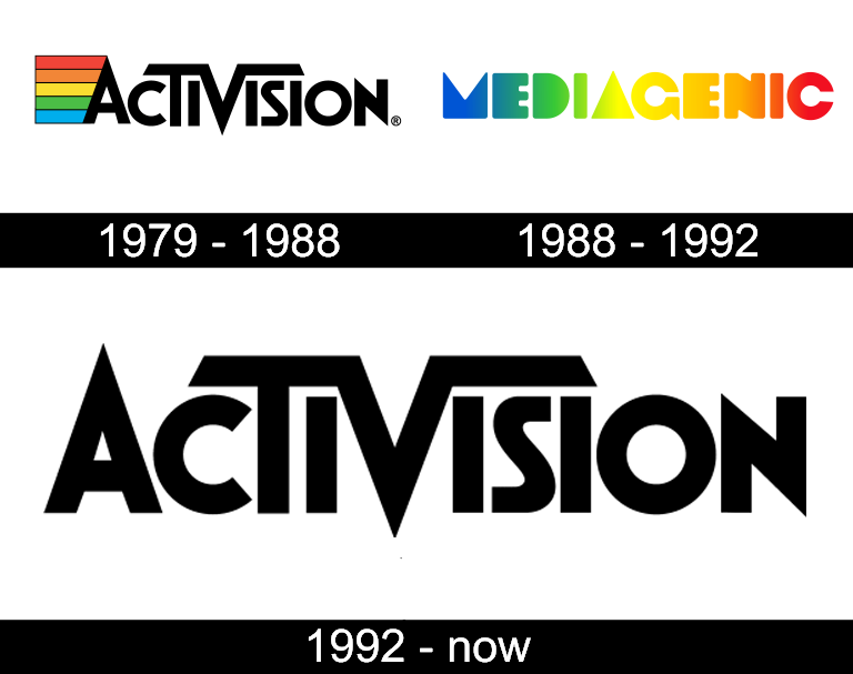
1979–1988: Original Activision Logo and Rainbow Emblem
The first Activision logo debuted in 1979 and established the foundation of the company’s visual identity.
The wordmark featured a bold uppercase sans-serif typeface with the elongated “V” already functioning as the central visual element. The sharp structure and extended lines gave the logo a futuristic appearance for its era.
Alongside the lettering, the company introduced a rainbow-striped trapezoid graphic emerging from the letter “A.” The colorful stripes reflected creativity, energy, and experimentation during the early days of gaming.
This version became one of the earliest recognizable identities in the video game industry.

1988–1992: Mediagenic Era and Gradient Typography
In 1988, the company temporarily rebranded under the name Mediagenic.
The logo adopted a softer and more experimental visual style, featuring bold uppercase lettering filled with bright gradient colors transitioning between blue, green, yellow, and red.
Compared to the original Activision identity, this version felt more playful and visually complex.
Although the redesign marked a significant departure from the original branding, the company later returned to the Activision name and visual philosophy.
1992–Present: Modern Activision Logo and Iconic Wordmark
The return to the Activision identity in 1992 introduced the modern logo still recognized worldwide today.
The redesigned wordmark refined the geometric structure established in the original version. The typography became cleaner, sharper, and more balanced.
The enlarged “A,” “T,” and especially the “V” became defining elements of the composition. The extended arms of the “V” connected visually with surrounding letters, creating a unified and highly recognizable structure.
The monochrome black-and-white palette reinforced professionalism and timelessness.
This redesign established the definitive Activision logo heritage that continues to represent the company today.
Activision Logo Typography and Color: Minimalism for Gaming Recognition
Typography is the defining feature of the Activision logo design.
The custom sans-serif typeface combines bold proportions with sharp geometric cuts, giving the logo a futuristic and aggressive appearance.
The pointed apex of the “A” and the extended bars of the “V” create strong visual rhythm and balance throughout the composition.
Color usage remains extremely restrained. The black wordmark against a white background emphasizes clarity and confidence without relying on visual effects or decorative elements.
This minimalist approach allows the logo to remain adaptable across games, esports branding, consoles, digital platforms, and merchandise.
Activision Logo Heritage: One of Gaming’s Most Recognizable Wordmarks
The Activision logo history demonstrates how a purely typographic identity can become iconic through consistency and strong design structure.
While the gaming industry constantly evolves through new technologies and visual trends, Activision maintained a recognizable identity built around geometry, simplicity, and sharp visual balance.
Its logo heritage reflects the company’s role in shaping modern gaming culture, from early console titles to blockbuster global franchises.
Today, the Activision wordmark remains one of the most recognizable symbols in the entertainment and gaming industries.
Activision Logo History FAQ: Meaning, Symbolism, and Evolution
What does the Activision logo symbolize?
It symbolizes innovation, precision, technology, and gaming entertainment.
Why is the “V” important in the Activision logo?
The elongated “V” acts as the central visual element and defines the logo’s structure.
When was the Activision logo introduced?
The original Activision logo debuted in 1979.
Why did Activision use a rainbow emblem in the early logo?
The rainbow stripes symbolized creativity, experimentation, and energy during the early gaming era.
What colors are associated with the Activision logo today?
Primarily black and white, emphasizing professionalism and modernity.