
Dolce & Gabbana Logo History: Meaning, Symbolism & Brand Heritage
![]()
Dolce & Gabbana is one of the most iconic luxury fashion houses in the world, a brand synonymous with bold Italian identity, craftsmanship, and timeless elegance. Founded in 1985 by Domenico Dolce and Stefano Gabbana, the label quickly became a defining force in high fashion. Much like explored in Versace Logo History and Ermenegildo Zegna Logo History, its visual identity reflects a deep connection between heritage and modernity. Within the broader landscape of luxury fashion brand logos, Dolce & Gabbana stands out for its disciplined minimalism and strong typographic presence.
The Dolce & Gabbana logo history is not about constant reinvention. Instead, it is built on consistency, clarity, and precision — qualities that mirror the brand’s approach to fashion.
Dolce & Gabbana Logo Meaning and History: The Power of a Name
The origin of Dolce & Gabbana’s visual identity is rooted in its founders. Unlike many fashion brands that rely on symbols, the label chose to build its identity entirely around its name.
The Dolce & Gabbana logo meaning is closely tied to partnership. The ampersand connecting the two surnames is more than a typographic element — it represents the collaboration between Domenico Dolce and Stefano Gabbana.
From the very beginning, the brand adopted a minimalist approach. This decision allowed the name itself to become the focal point, reinforcing recognition and authority.
Over time, the logo remained remarkably consistent. This continuity defines Dolce & Gabbana logo heritage, where identity is preserved through simplicity and discipline.
Dolce & Gabbana Logo Symbolism: Minimalism, Partnership, and Authority
The Dolce & Gabbana logo symbolism is subtle yet powerful. It does not rely on visual metaphors or hidden elements. Instead, it communicates meaning through structure and composition.
The use of uppercase letters conveys strength and confidence. The clean lines of the typeface reflect precision and modernity.
The ampersand plays a central role in the logo description. Its reduced size compared to the surrounding letters introduces balance and elegance, while symbolizing unity.
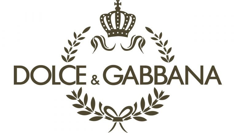
In some variations, the brand introduces a laurel wreath and crown. These elements add a layer of symbolism associated with victory, prestige, and luxury.
However, the core identity remains rooted in typography, reinforcing the idea that the name itself carries the brand’s value.
Dolce & Gabbana Logo History Timeline: Evolution of a Minimalist Luxury Identity
1985–Present: Original Wordmark and Timeless Brand Identity
Since its foundation in 1985, Dolce & Gabbana has maintained a consistent visual identity centered around its wordmark.
The logo features the brand name written in uppercase letters, set in a clean and geometric sans-serif typeface. The spacing between letters is carefully balanced, creating a sense of order and refinement.
The ampersand is slightly smaller than the rest of the characters, introducing a subtle variation that enhances the overall composition.
In addition to the full name, the brand has occasionally used the “D&G” monogram as a secondary mark. This variation maintains the same typographic principles while offering flexibility for different applications.
Despite minor refinements over time, the core structure of the logo has remained unchanged. This stability highlights the strength of Dolce & Gabbana logo history.
![]()
Dolce & Gabbana Logo Typography and Color: Strength in Simplicity
Typography is the defining feature of the Dolce & Gabbana logo design. The typeface, often associated with geometric sans-serif styles like Futura, emphasizes clarity and precision.
The use of uppercase letters creates a strong visual presence, while the even spacing ensures readability and balance.
Color is deliberately minimal. The black-and-white palette reinforces sophistication, confidence, and timeless appeal.
This restrained approach allows the logo to adapt across different contexts without losing its identity. Whether on clothing, packaging, or advertising, the design remains consistent and recognizable.
Dolce & Gabbana Logo Heritage: Consistency as a Luxury Strategy
The Dolce & Gabbana logo history demonstrates how consistency can become a defining feature of a brand.
In an industry where trends change rapidly, the brand has chosen to maintain a stable visual identity. This decision reinforces trust and recognition.
Its logo heritage is built on the idea that luxury does not require constant change. Instead, it is expressed through precision, quality, and attention to detail.
By focusing on typography and structure, Dolce & Gabbana created a logo that feels both modern and timeless.
The result is an identity that continues to stand strong in the competitive world of high fashion.
Dolce & Gabbana Logo History FAQ: Meaning, Symbolism, and Design
What does the Dolce & Gabbana logo represent?
It represents partnership, luxury, and Italian craftsmanship through minimalist typography.
Why is the Dolce & Gabbana logo so simple?
To emphasize the brand name and reflect confidence and elegance.
What does the ampersand mean in the logo?
It symbolizes the collaboration between the two founders.
Has the Dolce & Gabbana logo changed over time?
No, it has remained largely consistent since 1985.
What colors are used in the Dolce & Gabbana logo?
Primarily black and white, reflecting sophistication and timeless style.