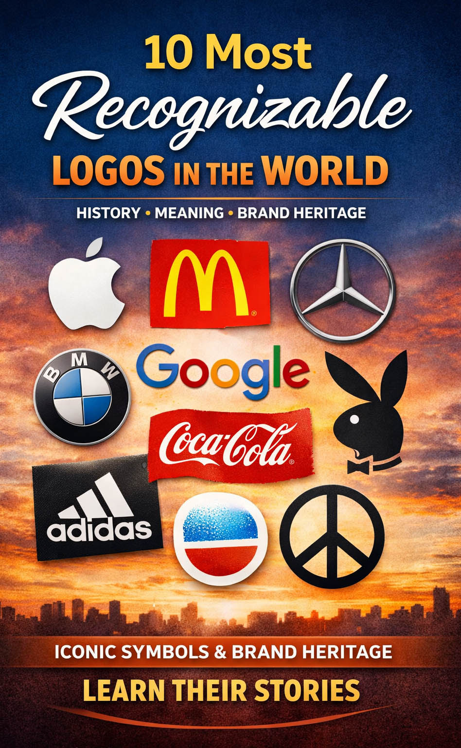
10 Most Recognizable Logos in the World: History, Meaning & Brand Heritage
Creating a truly recognizable logo is one of the most difficult challenges in branding. While many companies invest heavily in strategy and design systems, some of the most iconic logos in history emerged from simple ideas, unexpected decisions, or even accidents. Over time, these symbols evolved into global identifiers, shaping how we perceive brands across industries.
From technology giants to automotive pioneers, the most successful logos share a common trait: they communicate instantly. Much like explored in Apple Logo History and Nike Logo History, these identities are not just visual marks but powerful representations of brand heritage and cultural impact. Within the broader landscape of global brand logos, these designs demonstrate how simplicity, symbolism, and consistency can define generations.
The following logos are among the most recognizable in the world, each with a unique origin, distinct symbolism, and a lasting place in visual culture.
Apple Logo Meaning and History: Simplicity That Changed Technology Branding
The Apple logo began its journey in the 1970s, when designer Rob Janoff created the now-famous bitten apple. The original version featured colorful stripes, emphasizing accessibility and creativity at a time when personal computing was still emerging.
Over time, the design was simplified, transitioning into the monochrome version recognized today. Despite these changes, the core concept remained untouched. The Apple logo meaning revolves around knowledge, innovation, and simplicity, making it one of the strongest examples of logo heritage in modern branding.
![]()
Google Logo Symbolism and Evolution: Playfulness and Digital Identity
The Google logo originated from a mathematical term, “googol,” representing a number with one hundred zeros. Interestingly, the misspelling was intentional and ultimately became part of the brand’s identity.
The early logo was designed by Sergey Brin, one of the company’s founders. Over time, it evolved into a cleaner and more modern wordmark, while maintaining its playful color palette.
The Google logo symbolism reflects accessibility, innovation, and the vast scale of information. Its consistent use of color reinforces recognition, making it one of the most familiar logos in the digital world.
![]()
McDonald’s Logo History: The Golden Arches and Global Recognition
The McDonald’s logo is one of the most recognizable symbols in the world. Designed in the early 1960s, the iconic Golden Arches form the letter “M,” representing the brand name.
Originally inspired by the architecture of early McDonald’s restaurants, the arches quickly became a standalone symbol of fast food culture. Over time, the design was refined, but its core structure remained unchanged.
The McDonald’s logo meaning is tied to accessibility, consistency, and global reach, making it a cornerstone of modern brand identity.
![]()
Nike Logo Meaning: Motion, Speed, and the Power of Simplicity
The Nike logo, known as the Swoosh, was created by Carolyn Davidson in the early 1970s. Designed for a modest fee, it went on to become one of the most valuable symbols in branding history.
The curved shape represents movement and speed, aligning perfectly with the brand’s focus on athletic performance. Despite its simplicity, the logo communicates energy and direction with remarkable clarity.
The Nike logo symbolism demonstrates how a minimal design can carry powerful meaning, reinforcing the importance of form and concept in logo design.
![]()
Adidas Logo Heritage: Three Stripes and Brand Consistency
The Adidas logo is built around a simple yet distinctive concept: three stripes. Introduced in the 1960s, this visual element became the foundation of the brand’s identity.
While the logo has undergone several variations, the three-stripe motif has remained constant. This consistency is central to Adidas logo history, ensuring instant recognition across different product lines and markets.
The design represents strength, performance, and endurance, aligning with the brand’s athletic positioning.
Coca-Cola Logo History: Timeless Script and Cultural Influence
The Coca-Cola logo is one of the oldest and most enduring brand identities in the world. Created in the late 19th century by Frank Robinson, the script-style wordmark has remained largely unchanged.
Its flowing typography conveys warmth and familiarity, making it instantly recognizable across generations. The Coca-Cola logo meaning is closely tied to tradition, nostalgia, and emotional connection.
Few logos demonstrate the power of consistency as effectively as Coca-Cola, where minimal change has reinforced long-term brand loyalty.
![]()
Playboy Logo Symbolism: Cultural Icon and Visual Identity
The Playboy logo, featuring the iconic rabbit head, was created in the 1950s by Art Paul. Designed quickly, it became one of the most recognizable symbols in media and fashion.
The logo’s clean lines and distinctive shape allow it to function across various contexts, from print to apparel. Its symbolism blends sophistication with playfulness, creating a strong cultural identity.
Over time, the Playboy logo evolved beyond publishing, becoming a global lifestyle emblem.
Peace Symbol Logo Meaning: Simplicity with Global Impact
Often associated with peace movements worldwide, the peace symbol was created in the late 1950s by designer Gerald Holtom. Originally designed for nuclear disarmament campaigns, it quickly became a universal sign.
The simple geometric structure allows for easy reproduction and recognition, contributing to its widespread adoption.
The peace symbol demonstrates how a logo can transcend branding and become part of global culture.

BMW Logo History: Aviation Roots and National Identity
The BMW logo is often associated with a rotating propeller, reflecting the company’s early involvement in aircraft engine production. The blue and white color scheme represents the Bavarian flag, linking the brand to its regional origins.
Over time, the logo has been refined, but its core structure has remained consistent. The BMW logo meaning combines engineering precision with heritage, reinforcing the brand’s identity in the automotive industry.
![]()
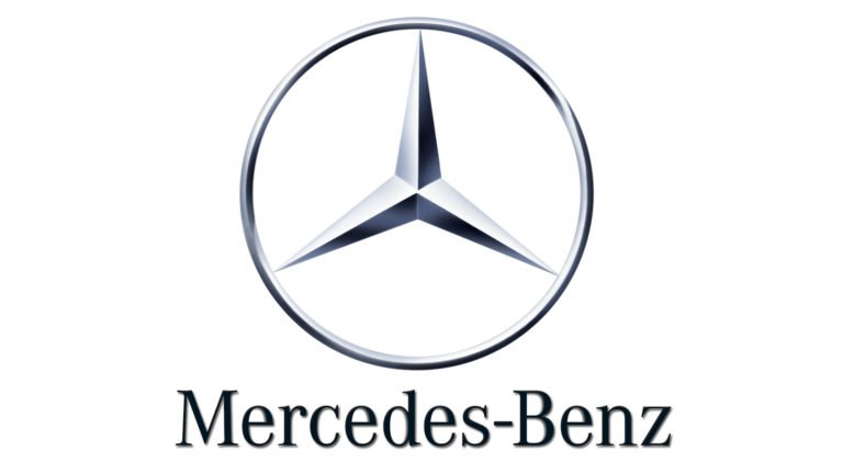
Mercedes-Benz Logo Symbolism: Power Across Land, Sea, and Air
The Mercedes-Benz logo, featuring the three-pointed star, symbolizes dominance across land, sea, and air. Introduced in the early 20th century, the design has remained largely unchanged.
Its clean and balanced structure reflects luxury, performance, and engineering excellence. The Mercedes-Benz logo heritage demonstrates how a simple symbol can communicate a powerful vision.
Today, it stands as one of the most prestigious emblems in the automotive world.
The Power of Logo Heritage in Global Brand Identity
The most recognizable logos in the world share a common principle: they are built on clarity, meaning, and consistency. Whether created intentionally or by chance, these designs have evolved into symbols that define entire industries.
The history of these logos shows that strong visual identity does not require complexity. Instead, it relies on a clear concept, executed with precision and maintained over time.
From Apple to Mercedes-Benz, each logo represents more than a brand. It reflects a story, a purpose, and a legacy that continues to shape global culture.
FAQ: Most Recognizable Logos in the World
What makes a logo recognizable?
A recognizable logo combines simplicity, consistency, and strong visual meaning.
Why do simple logos work better?
Simple logos are easier to remember and adapt across different platforms.
Can a logo become iconic by accident?
Yes, many famous logos started as simple ideas that gained meaning over time.
What role does color play in logo recognition?
Color helps reinforce identity and makes logos easier to distinguish.
Why do some logos never change?
Because consistency builds trust and strengthens brand recognition.