Zarina Logo History: Meaning, Symbolism & Brand Heritage
In the landscape of Eastern European fashion retail, Zarina occupies a distinctive position. Launched in the early post-Soviet era, the brand emerged at a moment when Russian consumers were beginning to redefine their relationship with fashion, femininity, and identity. Over the decades, Zarina evolved from a straightforward clothing label into one of the most recognizable womenswear brands in the country, supported by a visual identity that reflects both stability and refinement.
Within broader conversations around logo history, logo meaning, and brand heritage, Zarina represents a case where typography-led branding played a crucial role in establishing trust and continuity. Much like Massimo Dutti logo heritage, COS brand identity, or Uniqlo logo history in other markets, Zarina’s logo evolution mirrors a gradual shift from functional retail branding to a more expressive, lifestyle-oriented identity.
Meaning and History: A Brand Born in Transition
Zarina was founded in 1993 and is owned by Melon Fashion Group, a major Russian fashion holding that also operates brands such as Befree, Love Republic, and Sela. The early 1990s were a period of rapid economic and cultural change in Russia, and Zarina was conceived as part of a new wave of domestic fashion labels addressing a growing demand for modern women’s clothing.
The name “Zarina” is derived from the word tsarina, meaning “queen.” This etymology is central to the brand’s identity. Rather than referencing royalty in a literal sense, the name evokes dignity, confidence, and feminine authority. From the beginning, the logo meaning aligned with this concept, favoring elegance and restraint over trend-driven visual experimentation.
Zarina Logo History Timeline
![]()
1993–2021: Typographic Restraint and Retail Clarity
The original Zarina logo, introduced in 1993, was purely typographic. It featured the brand name set in uppercase letters using a simple serif typeface. The letterforms were balanced and conservative, designed for clarity rather than expressiveness.
Color usage was minimal. The wordmark typically appeared in black on white or white on black, depending on application. This high-contrast approach was well suited to storefront signage, labels, and print materials, reinforcing legibility and reliability.
For nearly three decades, this logo remained unchanged. Its longevity reflected the brand’s focus on consistency and accessibility rather than constant reinvention. In terms of logo heritage, this era established Zarina as a stable and trustworthy presence in the Russian womenswear market.
![]()
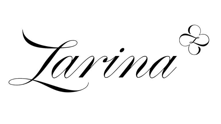
2021–Today: Soft Feminine Expression
In 2021, Zarina introduced its first major logo redesign. While the brand retained its name as the sole focal point, the typographic language changed significantly.
The new logo features a custom typeface with softer curves and refined loops. The transformation is especially noticeable in the letter “Z,” whose flowing form introduces a sense of movement and delicacy absent from the previous version. Accompanying the wordmark is a small stylized flower with four petals, positioned at the upper right.
This floral element functions as a subtle accent rather than a dominant symbol. It reinforces femininity and care without overwhelming the typographic core. The overall composition appears hand-drawn and intentionally imperfect, signaling a shift toward emotional connection and artisanal sensibility.
Logo Symbolism: From Authority to Warmth
The symbolism of the Zarina logo evolved alongside the brand’s positioning. The original serif wordmark communicated authority, order, and maturity, aligning with a retail strategy focused on reliability and broad appeal.
The 2021 redesign softened this message. Rounded letterforms suggest approachability and comfort, while the floral detail introduces associations with growth, elegance, and individuality. Rather than emphasizing hierarchy or power, the new logo symbolism centers on self-expression and confidence.
This transition reflects a broader trend in fashion logo evolution, where brands move away from rigid minimalism toward warmer, more human-centered identities.
Typography and Visual Language
Typography has always been the foundation of Zarina’s visual identity. The initial serif typeface drew from classic editorial traditions, ensuring legibility across physical retail environments.
The current custom lettering remains restrained but expressive. Its curves and spacing create a sense of rhythm, allowing the logo to function effectively across packaging, digital platforms, and storefronts. By avoiding excessive ornamentation, Zarina maintains a clean, contemporary presence while differentiating itself from mass-market competitors.
Color Strategy and Brand Perception
Zarina’s color strategy has remained intentionally minimal. Black and white dominate the logo’s applications, allowing the brand to adapt seamlessly to different collections and seasonal palettes.
This neutrality ensures that the logo never competes with the garments themselves. Instead, it frames the product, reinforcing the brand’s role as a reliable foundation rather than a fashion statement in its own right.
A Controlled Evolution of Identity
The Zarina logo heritage illustrates how restraint can become a long-term strength. By maintaining typographic continuity for nearly thirty years and introducing change only when cultural expectations shifted, the brand avoided unnecessary disruption.
Within the wider context of logo history, brand heritage, and fashion retail identity, Zarina’s evolution aligns with brands that value longevity over spectacle. Much like COS, Uniqlo, or Massimo Dutti, Zarina demonstrates that a logo does not need to dominate visually to be effective. It needs to be consistent, meaningful, and aligned with the brand’s understanding of its audience.
FAQ: Zarina Logo Meaning and History
What does the Zarina logo represent?
The logo represents femininity, confidence, and elegance through typographic restraint and subtle symbolism.
What does the name Zarina mean?
Zarina is derived from the word “tsarina,” meaning “queen.”
When was the Zarina logo redesigned?
The brand introduced a new logo in 2021.
What is the meaning of the flower in the new logo?
The flower symbolizes femininity, care, and refinement.