
Los Angeles Lakers Logo History: Meaning, Symbolism & Brand Heritage
Few names in global sports carry the same weight as the Los Angeles Lakers. More than a basketball franchise, the Lakers represent glamour, excellence, and continuity at the highest level of professional sports. From Minneapolis to Hollywood, the team’s journey mirrors the evolution of the NBA itself, transforming from a regional powerhouse into one of the most valuable and recognizable sports brands in the world.
In the broader landscape of NBA logo history, the Lakers occupy a unique space. Their visual identity balances tradition with motion, elegance with intensity. Much like the restrained authority of the Chicago Bulls logo history or the cultural symbolism embedded in the Boston Celtics logo history, the Lakers emblem reflects far more than wins and losses. It reflects an era-spanning mythology.
Meaning and History: The Origin of the Lakers Identity
The franchise was founded in 1947 as the Minneapolis Lakers, a name inspired by Minnesota’s nickname, “The Land of 10,000 Lakes.” From the beginning, basketball imagery was central to the team’s identity, reinforcing the sport itself as the brand’s core symbol.
When the team relocated to Los Angeles in 1960, the name was retained despite losing its geographical literal meaning. By then, “Lakers” had evolved beyond location. It stood for prestige, star power, and a style of play rooted in speed and showmanship. The logo meaning shifted accordingly, becoming less regional and more aspirational.
As the Lakers entered their most celebrated eras, from the Showtime years to the dynasties led by icons like Magic Johnson, Kobe Bryant, and later LeBron James, the logo remained a visual constant. It adapted subtly, but its core concept never changed.
Los Angeles Lakers Logo History Timeline
![]()
1947 – 1960: Minneapolis Origins
The original Lakers logo featured a bright yellow basketball with blue lines, overlaid by the team’s name and a white outline of the state of Minnesota. Typography framed the ball from above and below, reinforcing geographic identity. This design established the basketball motif that would define every future iteration.
![]()
1960 – 1967: Arrival in Los Angeles
Following the move west, the Lakers introduced a new emblem. Red-purple lettering spelling “Lakers” and “Los Angeles” appeared over a gold basketball. This version introduced the iconic motion streaks extending from the letters, a design element symbolizing speed and fast-paced play.
![]()
1967 – 1976: Prototype of a Classic
The late 1960s brought the foundation of the modern Lakers logo. A greenish basketball and italicized purple wordmark formed a cohesive unit. While the colors and proportions were still evolving, the identity’s future direction became clear.
![]()
1976 – 2001: Refinement and Balance
In the late 1970s, the logo was refined for clarity and impact. A black outline was added to the basketball, improving contrast. Gold shifted toward a brighter yellow, while purple softened into a lighter lilac tone. This era coincided with the Lakers’ rise as a dominant force, both competitively and culturally.
![]()
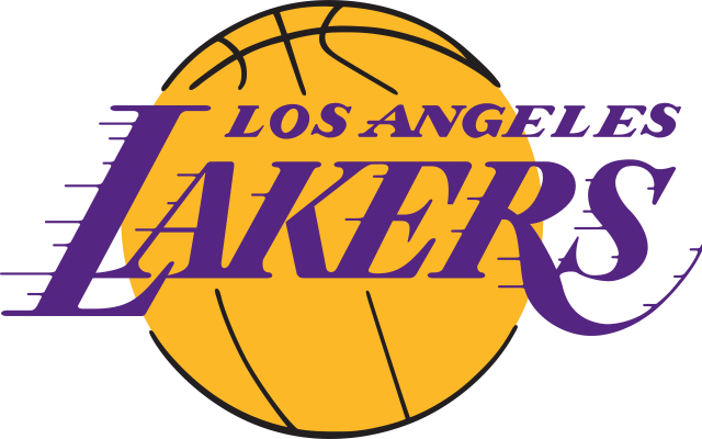
2001 – Today: Iconic Stability
The current Lakers logo preserves the exact structure established decades earlier. Dark purple lettering sits atop a gold basketball, outlined in black. Colors were intensified to improve digital visibility and merchandising impact, but the form remained untouched.
This commitment to consistency reinforced brand recognition across generations. The logo does not chase trends. It reinforces identity.
Logo Symbolism: Speed, Prestige, and Motion
At its core, the Lakers logo is about movement. The italicized wordmark and horizontal streaks evoke speed, transition, and offensive flow. The basketball remains the anchor, grounding the emblem in the sport itself.
Purple symbolizes royalty, excellence, and ambition. Gold represents success, victory, and legacy. Together, they form one of the most recognizable color pairings in sports branding.
Unlike mascots or aggressive imagery, the Lakers logo communicates confidence without confrontation. It assumes authority rather than demanding it.
Typography and Color Palette
The Lakers wordmark is custom-designed, with elongated strokes and slanted forms that emphasize motion. The typeface feels fluid and dynamic, reinforcing the team’s historical association with fast-paced, visually exciting basketball.
The color palette of purple, gold, white, and black has remained largely unchanged since the late 1960s. Minor tonal adjustments improved contrast and modern usability, but the emotional impact stayed consistent.
Los Angeles Lakers Logo Heritage and Cultural Impact
The Los Angeles Lakers logo heritage demonstrates the power of visual continuity. Rather than reinventing itself, the franchise refined an already strong identity, allowing success and storytelling to elevate the brand organically.
Within the wider discussion of sports logo heritage, the Lakers represent the pinnacle of balance between evolution and tradition. Their logo is not just a mark—it is a signature, instantly associated with greatness.
For anyone exploring how design, legacy, and performance converge, the Lakers stand as one of the clearest examples in modern sports.
FAQ: Los Angeles Lakers Logo Meaning and History
Why is the Lakers logo based on a basketball?
The basketball symbolizes the sport itself and has been central to the team’s identity since its founding.
When was the current Lakers logo introduced?
The current version dates back to 2001, with its structure unchanged since the 1970s.
What do the streaks on the Lakers logo represent?
They symbolize speed, motion, and dynamic play.
Has the Lakers logo changed often?
The logo has evolved subtly, but its core design has remained consistent for decades.