
Tidal Logo History: Meaning, Symbolism & Brand Heritage
![]()
When music streaming became a mass-market commodity, most platforms competed on convenience, price, and algorithmic discovery. TIDAL chose a different path. Launched in 2014 by the Norwegian company Aspiro and later associated closely with high-profile artists, the platform positioned itself as a premium alternative—one that emphasized sound quality, artist compensation, and cultural prestige.
Today, TIDAL operates in more than 60 countries, offering access to over 70 million tracks and hundreds of thousands of music videos. Its catalog spans mainstream hits and niche releases alike, but its identity has always been rooted in exclusivity and refinement. That philosophy is clearly reflected in its visual identity. The TIDAL logo is not loud, playful, or decorative. Instead, it is calculated, symbolic, and deliberately architectural.
TIDAL Logo Meaning and Brand Positioning
The TIDAL logo meaning is built around contrast. On one level, it is stark and restrained, using only black and white. On another, it carries layered symbolism tied to luxury, movement, and cultural capital. Unlike many music platforms that rely on soft curves or friendly typography, TIDAL communicates seriousness and intent.
The logo does not attempt to mimic sound waves, musical notes, or headphones. Instead, it abstracts the brand’s initial into a geometric form that feels closer to architecture or fashion branding than consumer tech. This choice reinforces TIDAL’s positioning as a service for listeners who value quality, authorship, and artistry.
TIDAL Logo History: A Singular Identity from Launch
2014–Present: The Original TIDAL Logo and Lasting Consistency
Since its introduction in 2014, TIDAL has used a single, consistent logo. Unlike many digital platforms that iterate rapidly on branding, TIDAL arrived with a fully formed visual identity that has required no structural redesign.
The logo lockup consists of two elements: a distinctive geometric emblem and a restrained wordmark. This separation of roles is intentional. The emblem carries symbolic weight, while the wordmark provides clarity and legibility.
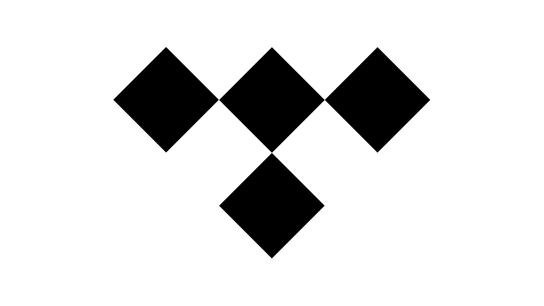
The emblem is immediately recognizable as a stylized letter “T,” constructed from four identical squares. Each square is rotated so that it rests on one of its corners, forming a diamond-like arrangement. Though they may initially appear as rhombuses, the shapes are, in fact, perfect squares.
This construction is central to the logo’s psychological impact. Squares traditionally symbolize stability, order, and trust. However, by rotating them, TIDAL introduces tension and dynamism. The shapes feel active rather than static, suggesting movement, rhythm, and energy—qualities inherent to music itself.
TIDAL Logo Symbolism Explained
The symbolism of the TIDAL emblem operates on multiple levels. At its most direct, it is a typographic abstraction of the letter “T.” Beyond that, the diamond-like composition evokes associations with luxury and prestige. Diamonds are visual shorthand for value, exclusivity, and status, aligning with TIDAL’s premium positioning.
The emblem can also be interpreted as a reference to stage lighting, reflections, and spectacle—the way light fractures and moves during live performances. This subtle connection to performance culture reinforces TIDAL’s close relationship with artists rather than purely with listeners.
Equally important is what the logo avoids. There is no explicit reference to waves, sound, or technology. This absence makes the symbol timeless and adaptable, allowing it to exist comfortably alongside album art, fashion imagery, and editorial visuals.
TIDAL Wordmark, Typography, and Visual Balance
In contrast to the emblem’s complexity, the TIDAL wordmark is deliberately understated. Set in an uppercase sans-serif typeface with uniform stroke weight, it serves as a neutral counterpart to the expressive symbol above it.
The typography is often compared to the Keep Calm font family, itself inspired by a rediscovered 1939 British wartime poster. This lineage brings subtle associations of authority, composure, and restraint. The wordmark does not compete with the emblem; it supports it.
This imbalance—where the symbol is more visually charged than the text—is intentional. It reflects a branding strategy in which recognition is driven by form rather than name, a hallmark of confident, high-end brands.
Color Palette and Brand Expression
The TIDAL logo uses a strictly monochrome color palette. Black and white are not decorative choices here; they are functional and symbolic. Black conveys depth, seriousness, and authority, while white introduces clarity and openness.
This binary palette allows the logo to invert seamlessly depending on context, making it highly adaptable across digital interfaces, merchandise, and editorial layouts. It also reinforces TIDAL’s alignment with fashion, art, and luxury branding, where monochrome identities are often preferred for their timelessness.
TIDAL Logo Heritage and Intentional Design
The TIDAL logo heritage is defined by intention rather than evolution. From its launch, the brand committed to a visual identity that matched its philosophy: premium, artist-focused, and culturally aware. By avoiding trend-driven aesthetics and embracing geometric symbolism, TIDAL created a logo that feels as relevant today as it did at its debut.
In a crowded streaming landscape, the TIDAL logo does not shout for attention. Instead, it signals discernment. It is a mark designed not for everyone, but for those who notice—and appreciate—what it represents.
TIDAL Logo FAQ: Common Questions About the Streaming Service Identity
What does the TIDAL logo represent?
The TIDAL logo represents a stylized letter “T” built from geometric shapes, symbolizing balance between structure, movement, and artistic expression.
Why is the TIDAL logo made of four squares?
The four squares form a diamond-like “T,” combining stability with dynamism through their rotated orientation.
Why does TIDAL use only black and white in its logo?
The monochrome palette emphasizes clarity, luxury, and adaptability across different visual environments.
Has TIDAL ever changed its logo?
No. TIDAL has retained the same logo since its launch in 2014, reinforcing consistency and brand recognition.