
LinkedIn Logo History: Meaning, Symbolism & Brand Heritage
![]()
From a hiring and job-search platform launched in the early 2000s to the world’s most influential professional social network, LinkedIn has fundamentally changed how people build careers, recruit talent, and present their professional identities. Founded in 2002 and officially launched in 2003, LinkedIn anticipated a digital future where reputation, trust, and professional visibility would matter as much as résumés and interviews.
Today, LinkedIn counts more than one billion registered users worldwide, with over 220 million monthly active visitors. Executives, recruiters, entrepreneurs, and professionals across every industry rely on the platform to exchange ideas, track industry trends, and establish authority. In such a reputation-driven environment, visual identity plays a critical role. The LinkedIn logo, unchanged in concept for more than two decades, reflects stability, credibility, and quiet confidence—qualities essential to a professional network operating at a global scale.
LinkedIn Logo Meaning and Brand Philosophy
The LinkedIn logo meaning is grounded in connection and trust. Unlike entertainment-driven social platforms, LinkedIn positions itself as a serious space for professional interaction. Its logo communicates that purpose with restraint rather than spectacle.
The name itself is divided visually into two parts: “Linked” and “in.” Together, they represent people being connected within a trusted network. The blue square containing the white “in” reinforces the idea of inclusion, membership, and belonging, while the clean sans-serif typography conveys clarity, professionalism, and reliability.
LinkedIn Logo History: A Minimal Evolution Built on Consistency
![]()
2003–2011: The Original LinkedIn Logo and Foundational Identity
The original LinkedIn logo, introduced in 2003, established the visual framework that still defines the brand today. The design featured the black word “Linked” followed by a blue square containing the white lowercase letters “in.” The typography was bold, confident, and highly legible, similar in style to fonts such as Radiate Sans Bold and LCT Picón Bold.
The color palette of black, blue, and white was carefully chosen. Black communicated seriousness and authority, white symbolized clarity and transparency, and blue represented trust, safety, and professional growth. This combination aligned perfectly with LinkedIn’s mission to serve as a credible business-focused platform.
![]()
2011–2019: Refinement, Avenir Typography, and Strategic Growth
In 2011, LinkedIn introduced its first subtle redesign. The overall structure of the logo remained intact, but the typeface was updated to Avenir Pro, giving the lettering a more contemporary and refined appearance. The blue square was brightened slightly, adding freshness without compromising professionalism.
This period coincided with significant platform growth. LinkedIn surpassed 135 million users, expanded its product offerings, and went public on the New York Stock Exchange. The refined logo reflected a company entering a new phase of maturity while maintaining visual continuity.
![]()
2019–2021: Unified Blue Wordmark and Visual Balance
The 2019 redesign focused on color unification. The previously black “Linked” portion of the wordmark was recolored to match the same blue used in the “in” square. This change created a more cohesive visual identity and reduced contrast within the logo.
Additional refinements were made to spacing and proportions, including adjustments to the dots above the lowercase “i” letters, which were positioned slightly higher to create a lighter and more open appearance. The result was a cleaner, more harmonious logo suited to modern digital interfaces.
![]()
2021–Present: Stronger Blue and Digital Clarity
The most recent update, introduced in 2021, further intensified LinkedIn Blue. The deeper, more saturated shade improved contrast against white backgrounds and enhanced readability across screens. While subtle, this change reinforced the brand’s authority and visual presence in an increasingly competitive digital environment.
Importantly, LinkedIn did not alter the structure of the logo. The enduring concept proved that some identities benefit more from refinement than reinvention.
LinkedIn Logo Symbolism Explained
The LinkedIn symbol exemplifies modern minimalism. Its strength lies in what it omits rather than what it adds. There are no decorative elements, gradients, or illustrative metaphors. Instead, meaning is conveyed through composition and typography.
The blue square with rounded corners softens the rigid geometry of the lettering, balancing professionalism with approachability. This visual harmony reflects LinkedIn’s positioning as both a serious business platform and a social network built on human relationships.
The Short LinkedIn Emblem and App Icon
In situations where space is limited, LinkedIn uses a shortened version of its logo. This “short” emblem consists solely of the blue square with the white lowercase “in.” Despite its simplicity, this element has become one of the most recognizable digital symbols in the world.
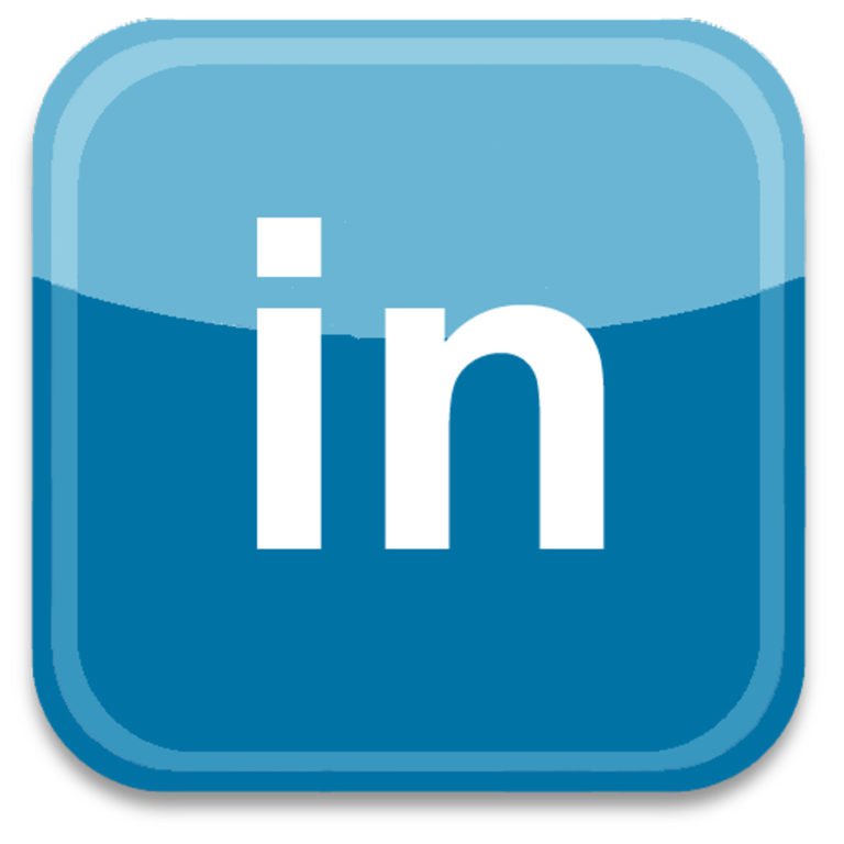
The emblem is widely used as the LinkedIn app icon, profile links, and embedded badges across personal websites and corporate pages. Its widespread adoption significantly contributes to LinkedIn’s brand recognition and reinforces its logo heritage across the web.
LinkedIn Logo Typography and Font System
The current LinkedIn wordmark uses Source Sans, a modern sans-serif typeface designed for clarity and versatility. The company recommends Light and Semi-Bold weights for most applications, ensuring readability across interfaces and content types.
For extended text and technical content, LinkedIn also employs Source Serif and Source Code. Comparable fonts include Avenir Pro 95 Black and Neology Bold, though LinkedIn’s custom spacing and letterforms maintain a distinct brand voice.
LinkedIn Logo Color Meaning and Brand Palette
LinkedIn’s corporate color palette consists of blue, black, and white, with LinkedIn Blue serving as the brand’s core identifier. The choice of blue aligns with psychological associations of intellect, authority, trust, and success.
The color also subtly references the platform’s origins, as several of LinkedIn’s early leaders had professional ties to PayPal, another brand strongly associated with blue. Gray tones frequently used in the interface reinforce neutrality and professionalism, allowing user content to remain the focal point.
LinkedIn Logo Heritage and the Power of Stability
The LinkedIn logo heritage is a testament to the power of consistency. In more than twenty years, the platform has resisted radical visual change, choosing instead to refine an already strong identity. This approach mirrors LinkedIn’s role in the professional world: dependable, credible, and built for the long term.
By maintaining a clear, minimal, and purposeful logo, LinkedIn has created a visual identity that supports trust at scale, a rare achievement in the fast-moving world of digital branding.
LinkedIn Logo FAQ: Common Questions About the Professional Network’s Identity
What does the LinkedIn logo represent?
The LinkedIn logo represents professional connection, trust, and inclusion within a global business network.
Why has LinkedIn changed its logo so little over time?
LinkedIn has made only subtle refinements to preserve brand recognition and reinforce stability, which is essential for a professional platform.
What is LinkedIn Blue?
LinkedIn Blue is the platform’s signature color, symbolizing trust, authority, intelligence, and career growth.
What font does LinkedIn use in its logo?
The LinkedIn logo uses Source Sans, a modern sans-serif typeface designed for clarity and consistency.