
Lexus Logo History: Meaning, Symbolism & Brand Heritage
![]()
The story of Lexus begins not with a logo, but with a bold ambition. In the early 1980s, Toyota challenged its design, engineering, and marketing teams to build a world-class luxury automobile capable of competing head-to-head with the most prestigious brands in Europe and the United States. The internal project, known as F1, ultimately shaped a new identity in the automotive world—one that emphasized craftsmanship, silence, precision, and innovation at a level Toyota had never pursued before.
By the time Lexus officially launched in 1989, its philosophy was already set: effortless luxury built through meticulous engineering and an unwavering commitment to quality. The brand quickly expanded its presence beyond its initial U.S. market, becoming one of the world’s most respected premium carmakers and operating in more than eighty countries.
The logo created for Lexus at launch reflected this new direction in a refined, timeless way. It became a central part of the brand’s heritage—an emblem of modern luxury that remains instantly recognizable across the globe. The Lexus logo has always celebrated understated elegance rather than extravagance, leaning into precision engineering rather than decorative flourish. For a brand whose reputation rests on refinement and performance, its visual identity needed to express the same balance.
Meaning and Symbolism of the Lexus Logo
The Lexus logo is defined by a single sculpted letter enclosed within a purposeful geometric form. The design’s simplicity is not accidental—it reflects the Japanese conceptual approach of achieving beauty through restraint and clarity. The emblem’s polished metallic finish recalls the surfaces of precision-engineered components, reinforcing the brand’s message of technical mastery.
Symbolically, the oval represents harmony, symmetry, and a complete design philosophy. Lexus has often described its design language as a pursuit of perfection, and the oval’s smooth continuity underscores this message. The stylized “L” resembles a stroke of calligraphy, connecting the modern identity of Lexus with the elegance of Japanese artistic heritage. It is slightly italicized, suggesting motion, progress, and aerodynamic form—all qualities associated with Lexus engineering.
The emblem also subtly references Toyota’s own logo structure, preserving a heritage connection while still presenting Lexus as an independent luxury marque with its own design and performance philosophy.
Brand Heritage: Lexus as a Global Symbol of Refined Luxury
From its earliest days, Lexus defined itself through craftsmanship. The brand’s Takumi master artisans, its reputation for quiet cabins, and its precision-built powertrains helped establish a new standard of reliability and refinement within the luxury segment. Over the decades, Lexus expanded beyond sedans to develop performance divisions, advanced hybrid systems, and flagship vehicles like the LS and LC, each reinforcing the brand’s dedication to innovation.
This heritage naturally extends into the Lexus visual identity. More than a badge, the Lexus logo functions as a symbol of the brand’s engineering ethos. Its design expresses the same qualities Lexus builds into its vehicles: clarity, symmetry, restrained confidence, and technological sophistication.
The result is a logo that communicates luxury without excess, modernity without abandoning tradition, and innovation grounded in heritage.
Lexus Logo History & Evolution Timeline
![]()
1989 – Present: The Foundational Lexus Emblem
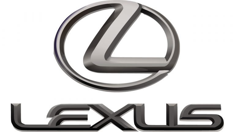
The original Lexus emblem debuted with the launch of the LS 400 in 1989 and has remained remarkably consistent. It features a stylized, elongated “L” placed inside a precisely shaped oval frame. This design balances elegance with mechanical strength, making it especially suited for display on a luxury automobile.
The emblem was engineered carefully to retain visual integrity whether cast in chrome on a grille, embossed on leather, or printed on digital interfaces. Its geometry, proportions, and stroke weights reflect meticulous attention to detail, reinforcing the brand’s association with precision.
![]()
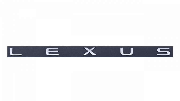
2023: A New Wordmark for a New Design Era
For the first time in Lexus history, the brand introduced a fully redesigned logotype in 2023. While the classic emblem remains unchanged and continues to serve as the iconic badge on vehicles, the standalone wordmark signals a modernized visual direction.
The updated wordmark features uppercase characters spaced widely apart, creating a sense of technical confidence and calm refinement. The letters are constructed with smooth arcs and balanced widths, echoing Lexus’s evolving design language and commitment to progressive luxury. The new typographic identity aligns with the brand’s shift toward electrification and advanced mobility technologies.
Typography and Color
The Lexus typographic identity is entirely custom, developed to reflect the precision and sophistication synonymous with the brand. The lettering features distinctive geometric construction with subtly tapered lines, creating a sense of motion even when standing still. One of the brand’s signature visual traits is the negative-space arrow formed between the “E” and the “X,” a design flourish that subtly communicates direction, progress, and innovation.
On vehicles, the logo commonly appears in a polished silver-gray metallic finish. This color palette conveys engineering excellence and mechanical purity, while also complementing a wide range of automotive exterior colors. In print and digital applications, Lexus often uses a monochrome black-and-white version to maintain clarity and visual sophistication.
The restrained use of color plays a significant role in the brand’s identity: Lexus leans toward clarity and elegance rather than ornamentation.
The Enduring Legacy of the Lexus Logo
The Lexus logo stands today as one of the most distinctive marks in the global luxury automotive landscape. Its strength lies not in complexity, but in the precision of its form and the clarity of its symbolism. The emblem successfully unites heritage with innovation, tradition with advanced engineering, and understated elegance with a forward-looking spirit.
Across more than three decades, Lexus has continuously evolved its vehicles, technologies, and global presence, yet its logo has remained deeply tied to its identity. From its original oval-and-L emblem to its refined modern wordmark, the brand’s visual identity tells the story of a company dedicated to luxury that is engineered, not embellished.
Lexus Logo FAQ: History, Meaning, Symbolism, and Brand Heritage
What does the Lexus logo represent?
The Lexus logo symbolizes luxury through precision, featuring a stylized “L” inside a harmonious oval that reflects balance, craftsmanship, and the brand’s pursuit of perfection.
Why is the Lexus emblem shaped like an oval?
The oval echoes Toyota’s heritage while emphasizing harmony and continuity, values central to Lexus design philosophy.
Is the Lexus logo the same worldwide?
Yes. While the brand introduced a new wordmark in 2023, the iconic “L inside an oval” emblem remains universal across all markets.
Does the Lexus logo have hidden symbolism?
The emblem subtly references Japanese minimalism and calligraphic form, while the wordmark incorporates an arrow-like negative space that suggests progress and motion.
Why did Lexus introduce a new logo in 2023?
The updated logotype reflects the brand’s evolution toward electrification, modern luxury, and a more progressive design language, while retaining the iconic emblem to preserve heritage.