
FreezeNova Logo History: Meaning, Symbolism & Brand Heritage
FreezeNova has become one of the most recognizable names in the world of unblocked browser games. From fast-paced shooters to chaotic simulators and open-ended sandbox titles, the studio has built a massive presence across online gaming platforms. Yet beyond its portfolio, one element has played a crucial role in shaping its identity: the FreezeNova logo. Vibrant, playful and instantly memorable, it has become a symbol of energy, instant access and the unmistakable character of the games behind it.
This is not a logo that tries to blend into minimalist trends. Instead, it asserts itself through color, shape and attitude. It is a visual signature created for a generation that consumes games quickly, directly in the browser and across any device. Its bright, icy aesthetic reflects the dynamic style of FreezeNova’s catalogue and turns the logo into a defining mark in a highly competitive digital arena.
Origins: The Rise of FreezeNova in the Unblocked Games Era
FreezeNova emerged with a clear purpose: to make games accessible instantly, without downloads, without barriers and without dependency on powerful hardware. As Flash disappeared and HTML5 rose to dominance, students and casual players increasingly searched for lightweight games that could run anywhere — from school computers to office networks. FreezeNova understood this shift early and positioned itself perfectly within it.
The studio knew that its audience wasn’t looking only for fast gameplay but also for character. As a result, FreezeNova shaped a distinct visual aesthetic that blended humor, digital edge and cartoon energy, making the brand instantly recognizable. Its logo needed to express that same accessibility and intensity: bold shapes, icy tones and a confident style that could stand out even at small sizes in game menus and thumbnails.
Logo Evolution: From Early Concepts to the Modern FreezeNova Identity
The earliest versions of the FreezeNova logo explored a visual language rooted in browser-era platformers and internet cartoon culture. Oversized letters, thick outlines and cool colors created a youthful and energetic presence. As the studio expanded, the logo was refined, gaining clarity, depth and a more polished finish.
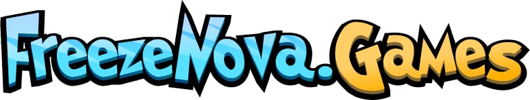
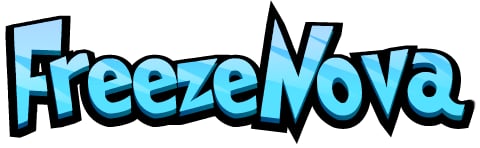
The current form represents the most mature evolution of the design. The gradient blue lettering mimics the reflective surface of ice, while the sharp angles and playful curvature of the letters create a sense of movement and immediacy. A bold black outline frames the shape and enhances readability, ensuring the logo remains crisp on any device, background or resolution.
Symbolism Behind the FreezeNova Logo
Every element of the FreezeNova logo is intentional. The icy blue palette signals speed, coolness and a digital atmosphere that matches the style of the games themselves. The exaggerated shapes and cartoon-like curves communicate accessibility and light-heartedness. At the same time, the strong outline helps the logo function like a game asset, distinct and expressive.
FreezeNova did not pursue the corporate neutrality seen in many modern game studios. The brand instead embraced a lively and youthful aesthetic aligned with browser culture, memes, and mobile gaming energy. This choice set the brand apart, making the logo impossible to confuse with any other developer in the unblocked-games ecosystem.
FreezeNova and the Expansion of Unblocked Browser Games
The rise of FreezeNova parallels the explosion of unblocked browser gaming. In environments where players often encounter network restrictions, FreezeNova provided reliable alternatives that were lightweight, fast and fully compatible with Chromebooks and desktop browsers.
Its titles shared key traits: instant loading, streamlined controls, fast action, stable performance and broad accessibility. These elements helped games such as Motor Wars 2, Armed Forces, Zombie Clash 3D and Sandbox City gain massive popularity. Wherever players saw the FreezeNova logo, they learned to expect a game that would launch instantly and deliver exactly the type of adrenaline they were looking for.
Typography and Character Design
The letters used in the FreezeNova logo appear to be fully custom, not extracted from an existing font. Their combination of sharp corners, curved motion and hand-drawn personality gives the wordmark an animated, energetic quality. This style aligns perfectly with the studio’s creative direction, where the games themselves mix realism with arcade action.
Color Palette and Visual Tone
The cool blue gradient upholds the central theme of “freeze,” reinforcing both the studio’s name and identity. Combined with the thick black outline, the contrast remains strong and readable even at small sizes. The palette evokes precision, clarity and a sense of digital speed — all essential elements for a brand whose games are built for rapid engagement.
The Strength of the FreezeNova Identity
The impact of the FreezeNova logo lies in its balance between character and clarity. It is expressive without becoming chaotic, playful without losing authority, modern without abandoning its cartoon roots. It captures the spirit of browser gaming at a time when simplicity, speed and unfiltered fun define user expectations.
FreezeNova successfully crafted a visual identity unique within the unblocked gaming sphere. This consistency has played a significant role in building trust and recognition among millions of players.
A Modern Icon of Browser Gaming
The FreezeNova logo stands as a symbol of an entire era of browser gaming, marked by accessibility, immediacy and creativity. Its icy aesthetic, bold shapes and distinctive attitude reflect a brand that has helped shape the unblocked-games landscape.
As browser-based gaming continues to evolve, FreezeNova remains a key player in defining its future. And its logo — playful, sharp and visually striking — will continue to be recognized by players worldwide as a promise of instant entertainment.
FAQ – FreezeNova Logo
What is FreezeNova?
FreezeNova is a major developer of browser-based unblocked games, known for fast-loading and action-focused HTML5 titles played worldwide.
Why is FreezeNova so popular?
Its games load instantly, work on Chromebooks and restricted networks, and offer fast, fun gameplay suited for all ages.
What does the FreezeNova logo represent?
The icy gradient and bold outline reflect speed, energy and the playful arcade-style design of FreezeNova’s gaming catalogue.
How has the logo evolved?
The logo progressed from early cartoon-style lettering to a polished, modern design with refined gradients and improved clarity.
Which games is FreezeNova best known for?
Top titles include Motor Wars 2, Armed Forces, Zombie Clash 3D and Sandbox City.