
Bosch Logo History: Meaning, Symbolism & Brand Heritage
![]()
Few industrial brands have carried their visual identity across more than 120 years with the consistency and clarity of Bosch. While the company grew from a small Stuttgart workshop into one of the world’s leading technology and engineering giants, its logo evolved in a way that mirrors its founding values: precision, reliability, and technological progress.
From its earliest Art Nouveau emblem to the clean, modern mark in use today, the Bosch logo has remained an unmistakable symbol of German engineering and industrial craftsmanship.
A Brand Forged in Engineering Excellence
The Bosch story begins in 1886, when Robert Bosch opened a small “Workshop for Precision Mechanics and Electrical Engineering.” What started as a modest entrepreneurial venture soon developed into a company whose innovations shaped entire industries. Bosch introduced breakthrough automotive ignition systems, pioneered electrical devices for early automobiles, and eventually became the world’s leading supplier of automotive technology.
What distinguishes Bosch is not just its engineering legacy, but the extraordinary continuity in its visual identity. Unlike many global corporations that reinvented themselves multiple times, Bosch refined its logo rather than replacing it, preserving the symbolic heart of its earliest designs. The result is one of the world’s longest-standing industrial emblems — a logo that has remained rooted in its origins while adapting to changing eras, styles, and market expectations.
Logo History and Evolution Timeline
![]()
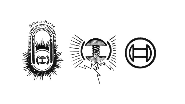
1900–1907: The Art Nouveau Origins
The first official Bosch logo appeared in 1900, at a moment when the company was preparing to expand internationally. Its design reflected the artistic trends of the era, adopting the organic curves and ornamental detailing associated with Art Nouveau. At its center stood a burning magnet — the technological breakthrough that defined Bosch’s early success in automotive ignition systems. Surrounding the magnet, radiating lines suggested power, energy, and innovation.
The wordmark “Robert Bosch” appeared in decorative uppercase lettering, a direct nod to the founder whose name was becoming synonymous with reliability in mechanical and electrical engineering. The entire emblem was detailed, expressive, and unmistakably crafted to stand out against the ornate design landscape of the early 20th century.
![]()
1907–1914: A Stronger Industrial Identity
As Bosch expanded across continents, the elaborate Art Nouveau aesthetic gave way to a more functional design. The 1907 logo replaced the oval with a simplified circular frame, retaining the burning magnet but stripping away decorative elements.
The wordmark was shortened to “Bosch,” signaling the company’s transition from a founder-centric workshop to a global industrial brand. The Fraktur-inspired typeface gave the logo a distinctly German identity at a time when Bosch was establishing its reputation abroad. The redesign emphasized clarity, industrial strength, and national confidence.
![]()
1914–1925: Towards Modernism and Precision
The industrial world was changing rapidly, and Bosch aligned its visual identity with emerging modernist principles. The 1914 logo introduced a minimalist representation of the magnet, enclosed by a precise circular outline. The earlier flames, sparks, and ornamental rays were removed, leaving behind a simple, functional emblem.
The wordmark adopted a bold slab-serif style, tightly kerned and compact. This early embrace of modernism created a timeless composition that would remain central to Bosch identity for more than a century.
![]()
1925–1981: A Signature Emblem Takes Shape
In 1925, Bosch introduced a design that essentially established the modern Bosch logo. The magnet inside a circle — now rendered in strong, consistent linework — became the company’s signature symbol. For the first time, the logo featured color. The emblem was paired with a bold red sans-serif wordmark that offered strong contrast against the black symbol.
This was the moment Bosch adopted the graphic language that defined its identity for decades: clean engineering precision set against a modern, efficient typographic voice.
Throughout the mid-20th century, the Bosch mark remained stable, gaining subtle refinements while the company diversified into automotive systems, consumer appliances, industrial technology, communications devices, and power tools.
![]()
1981–2002: Gentle Refinement for a Global Brand
As Bosch moved firmly into its role as a world leader in technology and engineering, the logo underwent a measured but meaningful update. The 1981 redesign introduced a narrower, taller typeface, tightening the proportions while preserving the recognizable red wordmark. Kerning was adjusted, and the letters became more compact and engineered in feel.
The emblem itself was lightly refined. The circular frame grew more balanced, and the magnet was redrawn with precise linearity. These changes were subtle, yet they helped the brand appear sharper and more contemporary without sacrificing the strength of its established visual language.
![]()
2002–2018: A Three-Dimensional Interpretation
The early 2000s brought a trend toward three-dimensional logos, and Bosch briefly adopted this design language. The emblem was rendered with gradient shading to create a metallic, rounded effect — a visual choice that echoed Bosch’s identity as a manufacturer of precision-engineered components.
This version maintained the reliability of the classic composition but added a sense of depth and modernity that aligned with digital interfaces and product branding of the time.
![]()
2018–Today: A Return to Purity and Modern Simplicity
Bosch introduced its current logo in 2018, returning to a flat, clean, and timeless aesthetic. The emblem — the magnet in the circle — remains unchanged in form, but now appears in a sophisticated dark grey. The iconic red wordmark anchors the design with immediacy and authority, just as it has for nearly a century.
This contemporary iteration reflects the brand’s modern role in mobility, smart homes, industrial automation, software, and sustainable technologies, all while honoring the lineage of a symbol unchanged in essence since 1914.
![]()
Meaning & Symbolism
At the core of the Bosch logo lies the burning magnet — a reference to the company’s first major innovation: the low-voltage magneto ignition system. This symbol represents Bosch’s engineering roots and stands as a tribute to the invention that propelled the company from a small workshop into an international pioneer of automotive technology.
The circle enclosing the magnet reinforces ideas of protection, precision, and technical harmony. It communicates completeness and reliability, qualities that Bosch cultivated through decades of technological advancement.
The red wordmark introduces a sense of strength, urgency, and forward momentum, while the bold geometry underscores the confidence and solidity associated with the brand. Together, the symbol and wordmark embody Bosch’s promise: engineered performance, meticulous craftsmanship, and innovation built to last.
Font & Typography
Bosch has relied on strong sans-serif typography since the 1920s. The contemporary wordmark uses a custom variation inspired by industrial grotesque fonts with clean, disciplined geometry. The tall, bold lettering conveys stability and modernity, while the tight kerning maintains a cohesive, engineered feel.
The typeface is deliberately neutral and timeless, matching the brand’s positioning as a global technology leader whose identity must remain relevant across sectors ranging from automotive systems to smart home solutions.
![]()
Color Palette
Bosch’s long-standing visual palette centers on red and dark grey. Red serves as the emotional anchor — energetic, bold, and instantly visible. It communicates urgency, innovation, and the decisive engineering approach for which Bosch is known. The accompanying grey is technical, restrained, and modern, grounding the logo in an industrial and professional aesthetic.
Together, the colors create a high-contrast identity that performs exceptionally in print, digital, and product branding environments.
Conclusion: A Logo Engineered for Eternity
The Bosch logo is one of the most enduring industrial symbols of the past century. Its evolution is not a story of reinvention, but of refinement — a gradual honing of form that mirrors the company’s engineering philosophy.
From the expressive Art Nouveau emblem of 1900 to today’s clean, modern mark, the Bosch logo has carried forward the same visual DNA: a burning magnet that embodies innovation, precision, and technological mastery. This continuity is rare in the world of corporate identity and is a testament to the strength of Bosch’s brand, its heritage, and its unwavering commitment to quality.
FAQ — Bosch Logo
Why does the Bosch logo include a magnet?
The circular magnet is a reference to Bosch’s first major invention, the magneto ignition system, which revolutionized early automotive engineering. It symbolizes the company’s technological origins and long-standing commitment to innovation.
What does the Bosch logo represent today?
Today, the magnet in a circle represents continuity, engineering precision, and the reliability that has defined Bosch for more than a century.
Why is the Bosch wordmark red?
Red has been part of Bosch identity since the 1920s. It conveys energy, visibility, and the brand’s forward-looking engineering spirit.
Who designed the Bosch logo?
The earliest versions were created internally, with the 1925 signature form emerging under Bosch’s design department. The current flat interpretation from 2018 was refined to align with contemporary digital standards while preserving the historic emblem.
Has the Bosch logo changed much over time?
Although many refinements have occurred, the core components — the magnet and circle, along with the red wordmark — have remained consistent for nearly 100 years.