Prada Logo History: Heritage, Meaning & Symbolism
![]()
Prada stands among Italy’s most influential luxury fashion houses, celebrated for its minimalist sophistication, architectural silhouettes, and subtle approach to branding. Founded in 1913 by Mario Prada, the company evolved from a leather goods shop in Milan into a global fashion empire. While the brand’s aesthetics have continually transformed, one element has remained remarkably stable throughout its history: the Prada wordmark.
Unlike many luxury houses that rely on ornate heraldic imagery or elaborate monograms, Prada has cultivated a distinct identity through restraint. Its logo is understated, timeless, and unmistakable — a perfect reflection of the brand’s philosophy.
Meaning and History
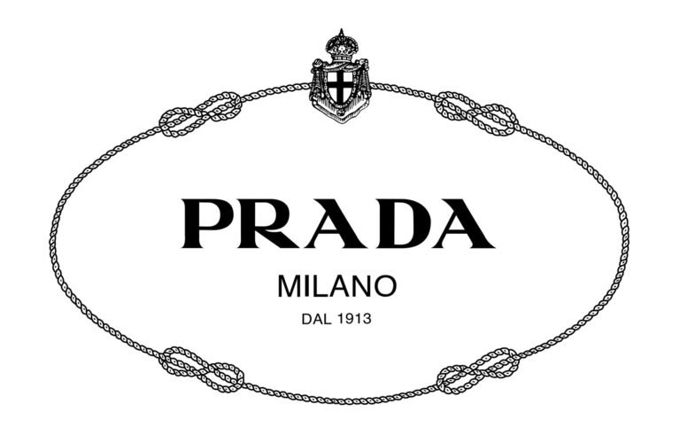
The heritage of the Prada logo began taking shape in 1919, when the company received one of the highest honors in Italian society: it was named the official supplier to the Italian Royal House, the Savoys. This recognition granted Prada the privilege of incorporating elements from the Savoy coat of arms into its identity.
For many years, the Prada logo featured:
-
the Savoy royal coat of arms
-
decorative rope designs
-
a banner frame
-
the classic Prada wordmark
These elements highlighted the brand’s exclusivity and elevated status, setting it apart from competitors such as Gucci, who did not share the same royal endorsement. Including these regal motifs was both a strategic and symbolic move, aligning Prada with aristocratic heritage.
However, as the decades passed and the fashion house grew more global, the visual identity shifted. The royal elements were gradually phased out. The rope, the shield, and the banner disappeared, leaving behind a pure, refined wordmark. This transition reflected Prada’s emerging creative direction — understated elegance rooted in quiet luxury rather than overt symbolism.
![]()
Prada Logo History: Evolution
2002 – Today: The Modern Prada Wordmark
By the early 2000s, Prada embraced the minimalist identity that defines the brand today. The current logo, introduced around 2002, consists of the uppercase word “PRADA” in a sharply constructed serif typeface. The black wordmark sits on a white background, creating a timeless contrast synonymous with luxury fashion.
The distinctive shapes of the letters — especially the pointed apex of the “A” and the elegant diagonal leg of the “R” — give the wordmark its iconic character. Through slight updates and refinements, Prada maintained the soul of its original 1919 typography while adapting it to contemporary aesthetics.
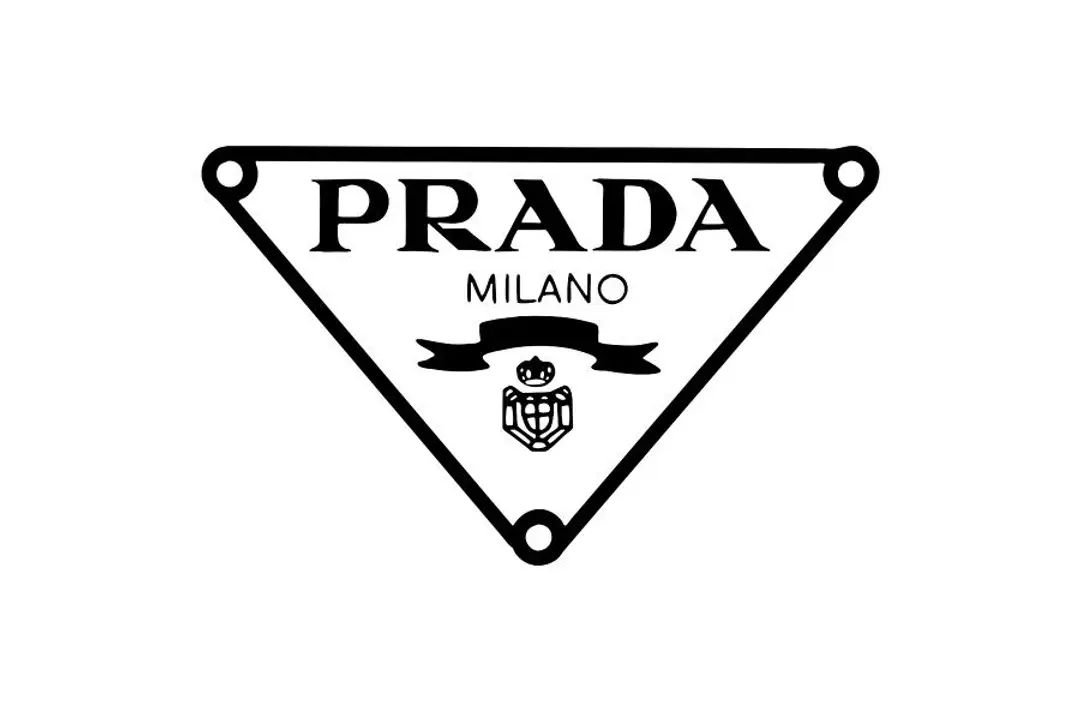
Prada uses variations of its logo depending on each collection or product. Some handbag plates employ a triangular badge, others display “Prada Milano,” and some add a subtle decorative curve beneath the wordmark. These variations reinforce brand identity while allowing creative flexibility.
Current Symbol and Design Characteristics
The Prada wordmark is defined by a mix of thick and thin strokes — a hallmark of traditional serif craftsmanship. Its typography is instantly recognizable, largely because Prada has preserved it for more than a century.
The letterforms carry distinct traits:
-
The “R” has an elegant, extended leg that gives the logo movement.
-
Both “A”s have a pronounced angular top that contributes to the logo’s sculptural feel.
These details differentiate Prada from other luxury brands and embody its balance between tradition and modern refinement.
While many fashion houses exaggerate their logos for recognition, Prada takes a different approach. Often referred to as “anti-status branding,” Prada prefers subtle placement: small metal plaques, discreet embossing, or understated fabric labels. This quietness is intentional — a rejection of flashy luxury and an embrace of intellectual, minimalist design.
What’s the Idea Behind the Emblem?
Prada’s emblem reflects the brand’s unique philosophy: luxury does not need to announce itself loudly. The absence of ornate elements is deliberate, emphasizing craftsmanship, form, and texture over conspicuous branding.
This understated visual identity communicates:
-
confidence without excess
-
heritage without nostalgia
-
modernity without abandoning tradition
In this sense, the Prada logo itself becomes a symbol of refined restraint, a concept deeply embedded in Italian high fashion.
Font
The Prada logo uses a custom serif typeface closely related to the one introduced in 1919. Characterized by its tall proportions and alternating thick–thin strokes, the typeface resembles styles such as Garamond or Didot, but it is distinguished by sharper, more architectural details.
The font’s longevity is remarkable in the fashion world: Prada has never felt the need to radically redesign its logotype, which is a testament to the strength of the original design.
![]()
Prada Logo and the Language of Minimal Luxury
Prada’s understated logo communicates intellectual luxury and restraint. This minimalist approach aligns with broader luxury branding principles discussed in Luxury Fashion Logos Explained: Brand Origins and Meaning.
Color
Prada’s color palette is grounded in simplicity. The logo is almost always presented in black on a white background, reinforcing the brand’s minimalist and refined aesthetic.
Occasionally, depending on the product or context, the logo may appear in:
-
white (on darker materials)
-
gold metal embossing (on leather goods)
These variations are subtle and do not deviate from the brand’s overall identity.
FAQ
What is the Prada logo today?
The current Prada logo is a minimalist black serif wordmark. While variations exist—such as triangular badge versions or “Prada Milano”—the essence remains unchanged.
Why was the Prada logo originally connected to Italian royalty?
In 1919, Prada became the official supplier to the Italian Royal House. This allowed the brand to integrate elements of the House of Savoy’s heraldry into its logo.
Does Prada still use royal symbols?
No. Over time, Prada removed the coat of arms, rope details, and banner, simplifying the logo to its modern wordmark.
What makes the Prada wordmark unique?
Its custom serif letterforms—especially the sharp “A” and the elegant “R”—create a distinctive typographic identity that has endured for over a century.
5 Facts About Prada You Probably Didn’t Know
1. Prada began not as a fashion house but as a prestigious leather goods shop specializing in luxury travel trunks and accessories.
2. Mario Prada believed women shouldn’t be involved in business, yet the brand was ultimately saved and expanded by his granddaughter, Miuccia Prada.
3. Miuccia’s background is in political science and mime—unlikely beginnings for a fashion icon who transformed Prada into a global luxury powerhouse.
4. The famous Prada nylon bags were initially inspired by military-grade parachute nylon, repurposed into luxury accessories.
5. Prada once owned a stake in a luxury yacht company, reflecting the brand’s fascination with refined engineering and design.