Car Logos by Country: How National Identity Shapes Automotive Branding
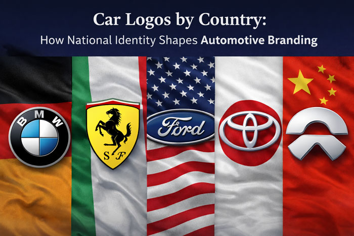
Car logos rarely emerge in isolation. Behind every emblem lies a cultural context shaped by history, industry, and national identity. While globalization has blurred many distinctions between markets, automotive branding remains deeply influenced by the countries where brands were born. From German precision to Italian passion, American scale, Japanese balance, and China’s forward-looking ambition, car logos offer a visual map of national character.
Understanding car logos through the lens of geography reveals why automotive symbols look the way they do. These emblems are not arbitrary design exercises; they are reflections of how different cultures approach engineering, aesthetics, and progress. Examined closely, car logos become cultural artifacts, encoding values that extend far beyond the vehicles themselves.
Germany: Precision, Discipline, and Engineering Authority
German car logos are among the most disciplined and structurally consistent in the world. Rooted in a national tradition of engineering excellence, German automotive branding prioritizes clarity, balance, and technical confidence. Logos from Germany rarely rely on emotional symbolism or dramatic imagery. Instead, they communicate trust through restraint.
The BMW logo history and meaning exemplifies this approach. Its circular roundel, derived from the Bavarian flag, reflects regional pride while maintaining geometric discipline. Over more than a century, BMW has refined its logo without altering its core structure, reinforcing the idea that progress comes through precision rather than reinvention.
![]()
A similar philosophy defines the Mercedes-Benz logo symbolism. The three-pointed star is conceptually simple yet symbolically rich, representing dominance across land, sea, and air. Encased in a circle, the emblem conveys authority and universality, with only subtle refinements across decades.

The Audi rings logo meaning communicates unity and technical collaboration, originating from the Auto Union alliance. Volkswagen, meanwhile, reflects Germany’s industrial pragmatism. The Volkswagen logo evolution shows a steady move toward simplicity and digital clarity, aligning with the brand’s mass-market reliability.
Across German car logos, visual excess is avoided. The emphasis lies on legibility, balance, and enduring structure—qualities that mirror Germany’s engineering culture.
Italy: Emotion, Heritage, and Visual Drama
Italian car logos tell a very different story. Where German branding values discipline, Italian automotive identity celebrates emotion, heritage, and expressive design. Italy’s long tradition of art, craftsmanship, and racing culture is deeply embedded in its automotive symbols.
The Ferrari logo history and symbolism stands as one of the most emotionally charged identities in automotive branding. Rooted in racing heritage and personal history, the prancing horse represents speed, pride, and national identity. Ferrari’s decision to preserve its emblem almost unchanged allowed its meaning to deepen organically over time.
![]()
In contrast, the Lamborghini logo meaning emphasizes confrontation and raw power. The charging bull, rendered in gold against black, communicates aggression and exclusivity, perfectly aligning with the brand’s dramatic design philosophy.
The Alfa Romeo logo history blends heraldic symbolism, regional identity, and historical mythology, resulting in one of the most complex automotive emblems ever created. Maserati’s trident, explored in the Maserati logo meaning, draws from Roman iconography, reinforcing themes of strength and nobility.
Italian car logos rely heavily on color, symbolism, and narrative. They are designed to be felt as much as recognized.
United States: Scale, Confidence, and Mass Recognition
American car logos are shaped by a culture of scale, optimism, and industrial expansion. Developed alongside mass production, American automotive branding prioritizes clarity, accessibility, and recognizability.
The Ford logo history illustrates this approach perfectly. Its iconic blue oval and script typography convey trust and continuity, reinforcing Ford’s foundational role in automotive history. The emblem’s stability reflects the brand’s long-term reliability.
![]()
The Chevrolet logo meaning remains debated, but its bowtie symbol has proven highly effective through simplicity and repetition. Dodge, explored through the Dodge logo evolution, traditionally emphasized muscularity and performance, aligning with American ideals of power and individuality.
Tesla marks a departure from traditional American branding. The Tesla logo symbolism aligns more closely with technology companies than legacy car manufacturers, signaling disruption, innovation, and a software-driven future.
![]()
Overall, American car logos balance heritage with reinvention, prioritizing instant recognition across a broad consumer base.
Japan: Balance, Reliability, and Subtle Symbolism
Japanese car logos reflect cultural values of balance, harmony, and understated confidence. These brands avoid overt drama, instead favoring abstract symbolism and geometric clarity.
![]()
The Toyota logo meaning represents the relationship between customer and company, as well as global reach. Its overlapping ovals communicate trust and continuity rather than dominance. Honda’s identity, explored in the Honda logo history, emphasizes engineering confidence through a bold yet restrained “H”.
Mazda’s winged emblem, detailed in the Mazda logo symbolism, suggests motion and aspiration, while the Nissan logo evolution reflects continuity and modernity through circular form.
![]()
Japanese car logos are designed for universality. Their neutrality allows them to function seamlessly across cultures, reinforcing reliability and long-term trust.
China: Aspiration, Modernity, and Global Ambition
Chinese car logos represent one of the fastest-evolving areas in automotive branding. As China’s automotive industry expands globally, its visual identity increasingly reflects ambition, innovation, and future-oriented thinking.
Brands such as BYD logo meaning, NIO logo symbolism, and Geely logo history demonstrate a move toward abstraction and minimalism. These logos often emphasize energy flow, motion, and connectivity rather than mechanical power.
Unlike European brands, Chinese manufacturers are less constrained by legacy. This allows experimentation, but also places greater emphasis on establishing credibility and trust quickly through visual identity.
As Chinese car brands gain international recognition, their logos play a critical role in shaping perception in global markets.
Globalization and the Convergence of Car Logo Design
As automotive brands expand worldwide, visual borders continue to blur. Digital platforms encourage minimalism and adaptability, leading to greater visual convergence. Yet national identity remains visible beneath the surface.
German precision, Italian emotion, American confidence, Japanese balance, and Chinese ambition still influence how car logos are designed and perceived. These cultural foundations provide authenticity, even in a globalized market.
Car Logos as Cultural Signatures
Car logos are visual expressions of national identity translated into global symbols. Through disciplined evolution, symbolism, and cultural context, automotive logos have become far more than brand identifiers. They are cultural signatures that communicate trust, heritage, and ambition.
By examining car logos through the lens of geography, we gain deeper insight into how branding reflects culture—and why certain company logos endure for generations. As the automotive industry continues to evolve, these symbols will remain central to how brands are recognized, remembered, and trusted worldwide.
FAQ — Car Logos by Country
How do car logos reflect national identity?
Car logos often reflect the design traditions and cultural values of the countries where brands were founded. German car logos tend to emphasize precision and geometry, Italian car logos often highlight heritage and emotion, American car logos focus on bold recognition, Japanese car logos prioritize balance and clarity, and Chinese car logos increasingly signal modernity and future-forward ambition.
Why do German car logos look more minimal and geometric?
German automotive branding is closely tied to engineering discipline and technical credibility. Many German car logos rely on symmetrical shapes, circles, and restrained typography to communicate precision, reliability, and long-term consistency.
Why do Italian car logos use more dramatic symbols like animals and crests?
Italy has a strong tradition of heraldry, racing culture, and expressive design. Italian car logos frequently use powerful symbols—such as horses, bulls, and tridents—to communicate emotion, performance, and heritage.
What makes American car logos different from European ones?
American car logos developed alongside mass production and consumer marketing, so they often prioritize bold, simple recognition. Many emphasize strong shapes or iconic typography designed to be instantly familiar to a broad audience.
Why are Japanese car logos often more abstract?
Japanese brands tend to favor understated symbolism and universal clarity. Abstract shapes and clean geometry help Japanese car logos remain adaptable across global markets while reinforcing values like reliability and balance.
How are Chinese car logos changing as brands expand globally?
As Chinese manufacturers grow internationally, their logos are shifting toward cleaner, minimalist, digital-ready designs. Many modern Chinese car logos emphasize motion, connectivity, and technological progress rather than traditional mechanical symbolism.
Does globalization make car logos look more similar over time?
Yes. Digital platforms and global branding systems encourage simplification and flat design. However, national identity still influences how logos are structured, what symbols they use, and how they communicate brand values.