Heinz Logo History: Meaning, Symbolism & Brand Heritage
![]()
Few names in global food culture carry the same weight as Heinz. Founded in 1869, the brand has become synonymous with consistency, trust, and everyday quality—most famously through its ketchup, which dominates the U.S. market. Unlike many consumer brands that constantly reinvent themselves, Heinz built its reputation on continuity. That philosophy is clearly reflected in its visual identity.
The Heinz logo is not a product of frequent redesigns or trend-driven experimentation. Instead, it is a carefully preserved symbol of heritage, refined only when necessary. This restraint transformed the logo into one of the most recognizable and enduring marks in food branding history.
Meaning and History: The Origin of the Heinz Logo
The H. J. Heinz Company was founded in 1869 by Henry John Heinz, during a period when packaged food was still earning consumer trust. From the very beginning, branding played a crucial role in differentiating Heinz products from unregulated competitors.
The original logo relied entirely on typography. There were no mascots, illustrations, or decorative frames—only a strong wordmark designed to communicate honesty and visibility. This decision reflected Heinz’s core values: transparency, quality, and reliability.
As the company grew into one of the world’s largest food producers—eventually merging with Kraft in 2015 to form Kraft Heinz—the logo remained anchored to its 19th-century foundations. Its evolution is therefore a study in controlled refinement rather than reinvention.
Heinz Logo History Timeline
![]()
1869–1957: The Original Red Wordmark
The first Heinz logo, introduced in 1869, consisted of a bold, all-capital wordmark set in a custom rounded sans-serif typeface. The letters were widely spaced, solid, and highly legible, emphasizing clarity over decoration.
Rendered in bright red on a white background, the logo immediately stood out on store shelves. This specific shade of red—later formalized as Heinz Red—became inseparable from the brand. The simplicity and visual strength of this mark were so effective that it remained unchanged for nearly 90 years.
![]()
1957–Today: The Arched Monochrome Identity
In 1957, Heinz introduced its first official redesign. The new logo featured an arched wordmark, still in uppercase letters, executed in a thicker, more structured custom typeface. The ends of the letters became slightly pointed, adding a subtle elegance while preserving familiarity.
This version was primarily used in monochrome applications and coexisted with later designs rather than fully replacing them. Its purpose was not to modernize aggressively, but to adapt the logo for broader packaging and printing needs.
![]()
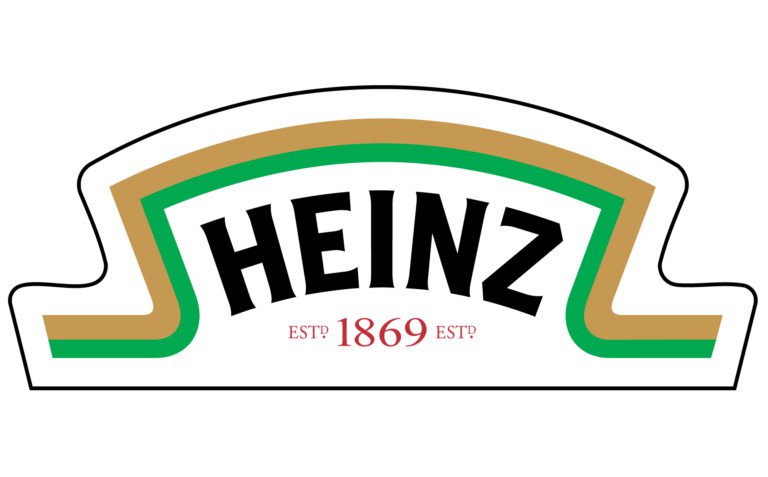
1989–Today: The Keystone Banner Logo
The most recognizable Heinz logo appeared in 1989. This version introduced a title-case wordmark placed inside a red keystone-shaped banner. The lettering became slightly italicized, warmer, and more human in tone, while maintaining excellent legibility.
The keystone shape was a deliberate reference to the brand’s long-standing connection to Pennsylvania, known as the “Keystone State,” where Heinz has been headquartered since 1890. This subtle geographic symbolism added depth to the brand’s visual storytelling without overwhelming the design.
Notably, this logo did not replace earlier versions entirely. Heinz continues to use multiple logo forms depending on context, reinforcing the idea that heritage is layered rather than linear.
Logo Symbolism: The Keystone and Trust
The central symbol of the modern Heinz logo—the keystone—carries both literal and metaphorical meaning. Architecturally, a keystone is the central stone that holds an arch together. Symbolically, it represents stability, support, and reliability.
By adopting this shape, Heinz positioned itself as a foundational brand—one that consumers can rely on across generations. The symbolism aligns seamlessly with the company’s market role as a staple of everyday cooking.
The absence of unnecessary imagery further reinforces trust. Heinz relies on its name alone, confident that recognition and reputation are already established.
Typography and Color in the Heinz Logo
Typography has always been the cornerstone of Heinz’s visual identity. The custom lettering evolved gradually from rigid, industrial forms to smoother, slightly italicized characters that feel more approachable. Despite these refinements, the wordmark has never lost its authority or clarity.
Color is equally significant. Heinz Red (Pantone 485) is not just a branding choice—it is a product reference, echoing the color of ripe tomatoes. Alternative versions in black, gray (Pantone 409), or Pickle Green are permitted, but red remains the dominant and most emotionally resonant color.
Heinz Logo Heritage and Brand Consistency
The Heinz logo heritage is built on discipline. Over more than 150 years, the brand has implemented only two major visual shifts. This consistency fostered deep consumer trust and made the logo a visual shortcut for quality.
Even as product lines expanded and corporate structures evolved, Heinz resisted the urge to modernize aggressively. Instead, it allowed its logo to age naturally, reinforcing the perception of authenticity.
Heinz Logo Meaning and Evolution: Conclusion on Brand Heritage
The Heinz logo history is a masterclass in restraint. Its meaning and symbolism—clarity, trust, and stability—were established in the 19th century and remain relevant today.
By treating its logo as an asset rather than a trend, Heinz built one of the strongest examples of logo heritage in the global food industry. The result is a visual identity that does not need to shout to be heard—it simply endures.
FAQ: Heinz Logo Meaning, Symbolism, and History
What does the Heinz logo represent?
The logo represents trust, stability, and product quality through simple typography and the keystone symbol.
Why is the Heinz logo shaped like a keystone?
The keystone references Pennsylvania, the company’s longtime home, and symbolizes structural reliability.
Has the Heinz logo changed often?
No. Heinz has introduced only two major redesigns since 1869.
What color is officially used in the Heinz logo?
The primary color is Heinz Red (Pantone 485), inspired by ripe tomatoes.
Who founded Heinz?
The company was founded by Henry John Heinz in 1869.