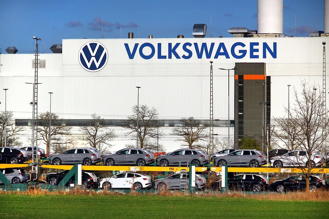
Volkswagen Logo History: Meaning, Symbolism & Brand Heritage
![]()
Few automotive emblems carry a story as complex and historically charged as the Volkswagen logo. Created in 1937 under the German Labour Front, Volkswagen was envisioned as a national industrial project: a brand that would build affordable cars for the masses and modernize the country’s transportation landscape. Although its early foundations are tied to one of the darkest chapters in European history, Volkswagen managed to reinvent itself in the postwar era, transforming into one of the world’s largest and most innovative automakers.
The company’s visual identity follows the same trajectory. From a symbol shaped by political influence to a globally recognized icon of engineering and design, the Volkswagen badge has undergone decades of refinement. Yet its structure remained constant: two letters — V and W — interlocked within a circle, representing “Volks” (people) and “Wagen” (car). Over more than eighty years, the Volkswagen logo evolved from an industrial cogwheel to a minimalist geometric emblem that embodies precision, balance and modern German design.
Volkswagen Logo Evolution: A Timeline of Transformation
![]()
1937–1939: An Industrial Beginning
The first Volkswagen logo, created in 1937, was composed of a stacked “V” and “W” enclosed within a cogwheel. The gear border was meant to symbolize industrial power and mechanization, while the internal composition subtly echoed the swastika motifs of the regime that commissioned the brand. It was a utilitarian, rigid and unmistakably political mark — an emblem born from propaganda rather than design.
![]()
1939–1945: Mechanized Symmetry
A redesign in 1939 removed the overt political symbolism but kept the cogwheel frame, preserving the brand’s industrial character. The monogram became more balanced, the lines cleaner, and the proportions more harmonious. This version accompanied Volkswagen through the wartime years and reflected the mechanical, pragmatic purpose of the brand at the time.
![]()
1945–1948: Rebirth Under Allied Control
After the fall of the Nazi regime, Volkswagen came under British military administration. With this transition came a new emblem — the first version to resemble today’s logo. The cogwheel disappeared entirely, replaced by a clean circular frame around the initials. Simple, graphical and stripped of political connotations, this logo marked Volkswagen’s rebirth as a civilian automaker positioned for global markets.
![]()
1948–1960: Strong Lines and Monochrome Precision
The 1948 badge refined the 1945 version by tightening the spacing between the letters and strengthening the contours. Drawn in crisp black and white, the badge adopted a modernist aesthetic consistent with postwar European design. This sleek version helped establish Volkswagen’s identity during the worldwide rise of the Beetle.
![]()
1960–1967: The Square Emblem
As Volkswagen expanded globally, it experimented with a striking square version of the logo in 1960. The emblem, still monochrome, represented stability and structure — symbolic of Volkswagen’s growing presence in international markets. The square frame gave the brand a distinctive geometric identity unlike any other automaker of the era.
![]()
1967–1978: Return to the Circle
By 1967, the square frame was abandoned. The circle returned, cleaner and more minimal. Blue and white made their debut, replacing the monochrome palette. The blue background signified precision, reliability and confidence — values Volkswagen wanted to project during a period of remarkable commercial success.
![]()
1978–1989: Double Frame and Modern Refinement
In the late 1970s, the logo gained a double circular frame and a slightly adjusted monogram. The letter “V” became more compact, and the white-on-blue contrast became sharper. This variation was bold, contemporary and well-suited to the brand’s design language of the late twentieth century.
![]()
1989–1995: A Brighter Blue
By 1989, Volkswagen adopted a brighter, lighter blue, and refined the badge’s proportions once more. The brand was entering a new technological era, and the refreshed palette projected clarity and optimism.
![]()
1995–1999: Deep Blue Professionalism
A darker, more reserved shade of blue was adopted in 1995. This version felt more serious and sophisticated, aligning with Volkswagen’s increasingly premium positioning.
![]()
1999–2000: The Transitional Gloss
In 1999, Volkswagen embraced a transitional design with subtle gradients, adding depth and a slight metallic sheen. It served as a bridge between flat graphics and the high-gloss 3D logo that would follow.
![]()
2000–2012: The Silver 3D Icon
The 2000 redesign introduced a fully three-dimensional emblem. Silver replaced white, the blue became deeper and calmer, and gradients created the illusion of light and shadow. The logo appeared engineered, polished and powerful — perfectly in sync with the design language of early 2000s automotive branding.
![]()
2012–2019: Sharper, Sleeker, More Technical
Volkswagen pushed the 3D design further in 2012. The metallic contours became sharper, the lighting effects stronger, and the proportions more compact. The result was a technical, futuristic emblem reflecting Volkswagen’s expanding portfolio of advanced vehicles.
![]()
2019–Today: The Flat Electric Era
In 2019, with the launch of its electric mobility platform, Volkswagen returned to a two-dimensional design. The modern emblem is ultrathin, geometric and minimalistic — a flat interpretation that feels refined, digital and timeless. This logo accompanies the brand’s transition toward electrification, sustainability and a clean visual future.
![]()
The Emblem: Geometry, Precision and the People’s Car
The Volkswagen emblem has always been defined by its structure: a V placed above a W, both integrated seamlessly within a perfect circle. The simplicity of the design makes it instantly recognizable and universally legible.
Blue symbolizes trust, engineering discipline and German reliability.
White (or silver) represents clarity, innovation and purity of design.
Despite decades of redesign, the essence of the emblem never changed — a testament to the power of its original composition.
Font: Neutral, Functional, Global
Volkswagen uses a clear, functional sans-serif wordmark with even line weights, echoing the Bauhaus-inspired design principles that shaped modern German typography.
The font is intentionally neutral: readable, international and industrial.
It reinforces the emblem’s message — practical design, engineered precision, and universal accessibility.
Color: Blue, White and the Psychology of Trust
Volkswagen built its identity on blue and white — a palette synonymous with precision, professionalism and calm reliability.
Blue suggests stability and engineering excellence; white symbolizes honesty and clarity.
Across decades, these colors became inseparable from the brand’s global image.
A Logo That Outgrew Its Origins
Volkswagen’s visual identity tells a story of reinvention. Born from an era of political manipulation, the emblem evolved into a symbol of worldwide trust, engineering brilliance and democratic mobility. The VW monogram, once constrained by its origins, has become a timeless mark recognized across continents — a perfect circle containing a promise of simplicity, precision and the enduring idea of the “people’s car.”
Volkswagen Logo FAQ: History, Meaning, Symbolism and Evolution
How did Volkswagen get its logo?
The first VW logo was created in the late 1930s and featured a cogwheel-inspired frame with political symbolism. Over time, the emblem shed its original associations and evolved into the minimalist circular monogram used today.
What does the Volkswagen logo mean?
The VW monogram represents “Volks” (people) and “Wagen” (car), expressing the brand’s fundamental concept: a car designed for ordinary people.
Why did Volkswagen change its logo?
Volkswagen updates its logo to reflect design trends, technological progress and strategic direction. The latest 2019 redesign introduced a clean 2D look to align with the brand’s shift toward electric mobility.
Is Volkswagen still the “people’s car”?
Yes. While the brand now produces vehicles across price segments, Volkswagen maintains its philosophy of accessible, well-engineered automobiles for a global audience.