Total Logo History: Meaning, Symbolism & Brand Heritage
![]()
Few corporate transformations are as visually striking — or as emblematic of shifting global energy narratives — as the logo evolution of Total. Born in France in 1924 and now operating as TotalEnergies, the company has moved from traditional petroleum iconography to a vivid, future-leaning identity embracing multiple forms of energy. Its visual journey mirrors the brand’s transformation from a national oil enterprise into one of the world’s most diversified energy supermajors.
What began as simple typographic banners eventually grew into geometric ribbons and color-layered spheres — until Total’s most recent identity shift ushered in a new era of expressive, multi-energy symbolism. The company’s logo history is, in many ways, a chronicle of the energy industry itself: bold, ambitious, always expanding.
Before exploring its modern incarnation, it’s important to trace the heritage behind one of the world’s most recognizable corporate identities.
Logo History and Evolution Timeline
![]()
1954–1955: The First Total Wordmark
The earliest known Total logo was introduced in 1954, and it embraced a straightforward but impactful visual system. A dark blue rectangular field served as the background, crossed diagonally by a wide white band that carried the vivid red TOTAL lettering. The bold sans-serif wordmark, slightly narrowed in shape, communicated reliability and strength in a modern, efficient language—very much in line with European industrial design of the mid-20th century.
It was a simple emblem, but it established the brand’s lifelong association with the tricolor palette: blue, white, and red.
![]()
1955–1963: A Radical Modernist Break
One year later, Total ventured into strikingly modern territory. The 1955 redesign introduced a geometric symbol: a blue ring intersected vertically by a sharp red bar reminiscent of a fuel gauge indicator. Abstract, bold, and unexpected, the symbol embraced mid-century modernist aesthetics and hinted at technological precision.
This era marked the company’s first attempt to build a visual identity beyond typography alone.
![]()
1963–1970: A Return to Familiar Forms
In 1963, Total returned to its diagonal-banner layout, though refined and made more elegant. A white frame — arched on the horizontal sides and straight on the verticals — enclosed the blue field, while the typography softened and brightened. This redesign balanced tradition with a new sense of corporate maturity, preserving brand recognition while updating the visual system.
![]()
1970–1980: Stronger Lines, Stronger Presence
Total’s 1970 logo embraced heavier lines and deeper colors. The frame became red, the diagonal band was replaced with a horizontal one, and the red wordmark gained increased density. The letters were drawn so closely that their edges touched, reinforcing unity and stability.
The darker, richer palette aligned with the design language of the 1970s — bold, authoritative, and unmistakably corporate.
![]()
1980–2003: The Tricolor Stripes and the Energy of Motion
The 1980 redesign presented a more contemporary, dynamic identity. The TOTAL wordmark sat atop three broad diagonal bands — blue, red, and orange — arranged like a forward-moving flag. The bright white stripe behind the wordmark added contrast and legibility, while the vivid colors conveyed energy, speed, and momentum.
This design was widely used during the global expansion of Total, making it one of the brand’s most recognizable historical logos.
![]()
2003–2021: The Multicolor Sphere of a New Global Identity
In 2003, Total introduced a completely reimagined identity reflecting its evolution into a global energy powerhouse. The new logo consisted of a color-layered spherical emblem — made of swirling red, blue, and orange ribbons — symbolizing interconnectedness, planetary reach, and diversified energy sectors.
The new Total logotype, written in a confident red sans-serif, appeared beneath the emblem. This marked a dramatic shift from fuel-centric branding toward a broader, more modern corporate identity.
![]()
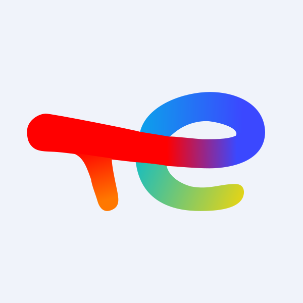
2021–Today: TotalEnergies and the Era of Multicolored Transition
With the 2021 rebrand, Total officially transitioned to TotalEnergies, aligning its identity with a future built around renewable, electric, and transitional energy systems. The new emblem is a fluid, ribbon-like monogram combining “T” and “E,” painted in a gradient rainbow palette. It symbolizes a multi-energy vision: solar, wind, biofuel, hydrogen, electricity, and traditional fuels.
The accompanying wordmark, written in bright red softened by rounded contours, reinforces accessibility and innovation. The new logo is expressive, optimistic, and deliberately unconventional — signaling the brand’s commitment to a diverse energy future.
![]()
Meaning & Symbolism
Total’s logo history is a mirror of the company’s evolution — from a traditional petroleum enterprise to a modern multi-energy corporation.
The original diagonal-band logos emphasized clarity and industrial confidence. The abstract 1955 geometric version expressed precision and technological advancement. The 1970s logo emphasized scale and strength, reflecting Total’s growing global presence. By 2003, the swirling sphere captured the planet and its interconnected energies — an abstract globe expressing movement and worldwide operations.
Today’s TotalEnergies emblem carries even deeper symbolic meaning. The multicolored “TE” monogram represents the spectrum of energies the company now works with, blending multiple hues into a single flowing shape. The curves suggest flexibility, transition, and coexistence — a direct reflection of the company’s stated mission to evolve toward sustainable and renewable energy solutions.
What began as a fuel-company identity has become a visual narrative of innovation, transformation, and adaptability.
Font & Typography
For decades, Total relied on narrow, bold sans-serif letterforms that reflected consistency and industrial modernity. The typography evolved alongside each redesign:
• The early wordmarks were compact and assertive, with tall, narrow shapes that communicated mechanical precision.
• In the 1980s, the type grew thicker and more geometric, aligning with global branding trends toward clarity and boldness.
• The 2003 redesign softened the forms while increasing legibility; its lettering resembled the proportions and feel of Artegra Sans Extended with rounded strokes and wide apertures.
• Today’s TotalEnergies typography embraces rounded, friendly contours. The red title-case logotype feels contemporary, accessible, and intentionally humanized — signaling the company’s forward-looking ethos.
The typographic evolution reflects the brand’s shift from industrial identity to a consumer-facing, global energy provider.
Color Palette
Color has always played a central role in Total’s identity. The earliest logos used only three hues: dark blue, white, and red — a nod both to the French tricolor and to the energy sector’s bold visual language.
Through the decades, the palette deepened, brightened, or intensified depending on the visual style:
• The 1980s embraced vivid orange as a color of warmth and energy.
• The 2003 sphere introduced layered gradients to express movement and complexity.
• The 2021 TotalEnergies logo uses a full spectrum of rainbow colors, symbolizing diversity, clean energy, technological adaptability, and environmental awareness.
The progression from three colors to a full prismatic palette illustrates the expansion of Total’s corporate mission.
A Century of Change, Captured in a Logo
The story of Total’s visual identity began with simple industrial lettering and grew into one of the most recognizable multi-energy symbols in the world. Across almost seven decades, the brand has used its logo to chronicle a journey from petroleum to renewables, from national oil producer to global energy pioneer. Few corporate identities reflect such clear transformations in business strategy and ideology.
Today, the TotalEnergies logo stands as a bold declaration: energy is evolving — and so is the company that once defined itself through fuel alone.
FAQ — Total Logo: History, Meaning & Design
What does the Total logo mean?
The Total logo symbolizes energy, innovation, and global presence. Earlier logos highlighted fuel and industrial power, while the modern TotalEnergies emblem represents a full spectrum of energies — from oil and gas to solar, wind, hydrogen, and electricity.
Why did Total change its name to TotalEnergies?
In 2021, the company rebranded to TotalEnergies to reflect its strategic shift toward renewable and multi-source energy solutions beyond petroleum.
What do the colors in the TotalEnergies logo represent?
The multicolor palette symbolizes multiple forms of energy. Red stands for energy and dynamism; blue for technology and reliability; green and yellow for renewables; and orange for transition and momentum.
Who designed the TotalEnergies logo?
The 2021 visual identity was developed internally with collaboration from leading global design agencies specialized in corporate transformation branding.
When was the first Total logo introduced?
The very first Total logo was created in 1954, featuring a diagonal white banner and bold red wordmark.