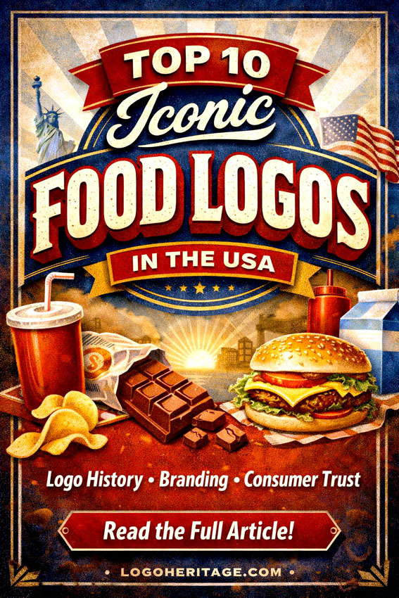
Top 10 Iconic Food Logos in the USA
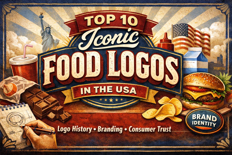
A Deep Dive into Logo History, Branding, and Consumer Trust
The American food industry is one of the most competitive markets in the world, but beyond pricing, distribution, and product innovation, there is another decisive battlefield — visual identity. In a space where shelves are saturated with options, food logos often determine which product ends up in a consumer’s cart.
From breakfast cereals to frozen meals and indulgent snacks, the brands that dominate the U.S. market are not just successful because of taste. They are remembered because of how they look. Their company logos have evolved into symbols of trust, familiarity, and emotional connection.
This is where logo history becomes essential. A logo is never just a design — it is the result of years, sometimes decades, of refinement. It reflects changing consumer expectations, cultural shifts, and strategic positioning. In many cases, these identities have become so strong that they transcend the products themselves.
Interestingly, the rise of younger consumers, especially Millennials and Gen Z, has intensified the importance of branding. These audiences are highly visual, brand-aware, and influenced by aesthetics more than previous generations. As a result, companies invest heavily in refining their food logos and even drawing inspiration from adjacent categories like fast food logos, where visual impact is critical.
In this comprehensive analysis, we explore ten of the most iconic food logos in the United States — not just how they look, but why they work, how they evolved, and what they reveal about modern branding.
1. Oreo — The Power of Consistency in Logo History
The Oreo logo is one of the clearest examples of how consistency builds global recognition. At first glance, it appears simple: bold white lettering with a blue outline. But this simplicity is precisely what makes it effective.
Over time, Oreo has refined its typography, smoothing edges and enhancing depth, but it has never abandoned its core visual identity. This continuity plays a critical role in logo history, where gradual evolution often proves more successful than radical redesign.
The rounded letterforms create a sense of softness and approachability, aligning perfectly with the product itself. Meanwhile, the blue color palette communicates reliability and freshness, reinforcing consumer trust.
Among modern food logos, Oreo stands as a benchmark for timeless design.
![]()
2. Lay’s — Color Psychology and Instant Recognition
Lay’s represents a masterclass in color psychology within company logos. The combination of yellow, red, and white is not accidental — it is engineered to trigger appetite, warmth, and positivity.
The circular yellow element subtly references a potato chip, while the red banner adds energy and contrast. The script-style lettering softens the composition, making the brand feel friendly and accessible.
Compared to many fast food logos, Lay’s achieves a similar emotional effect but with a more refined and retail-oriented approach. It captures attention instantly, even from a distance, which is essential in crowded supermarket environments.
![]()
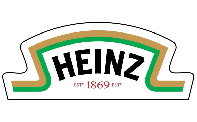
3. Heinz — Heritage as a Visual Strategy
Few brands embrace their history as effectively as Heinz. The keystone-shaped label is more than a design choice — it is a direct reference to Pennsylvania, the company’s birthplace.
This is where logo history becomes storytelling. The shape itself communicates authenticity and origin, while the red and white palette reinforces appetite appeal and clarity.
The serif typography adds a layer of tradition, making the brand feel established and trustworthy. Unlike trend-driven designs, Heinz remains rooted in its heritage, which strengthens its position in the market.
Among food logos, it is one of the strongest examples of how tradition can be a competitive advantage.
4. Doritos — Aggressive Design for a Bold Identity
Doritos takes a completely different approach. Instead of tradition, it embraces intensity and movement.
Sharp angles, dynamic shapes, and a high-contrast palette of black, red, and orange create a sense of energy and excitement. The triangular motif mirrors the product itself, reinforcing brand recognition through form.
This design strategy aligns closely with fast food logos, where boldness and immediacy are key. Doritos doesn’t aim for subtlety — it aims for impact.
The result is a logo that appeals to younger audiences and stands out in a visually saturated category.
![]()
5. Reese’s — Typography That Feels Like the Product
Reese’s demonstrates how typography alone can define a brand. The rounded, flowing script mimics the smooth, indulgent nature of chocolate and peanut butter.
The orange and yellow color combination enhances this perception, creating warmth and playfulness. The brown outline adds contrast, ensuring readability while subtly referencing chocolate.
In the context of company logos, Reese’s shows that you don’t need complex symbols to create a strong identity. The lettering itself becomes the brand.
![]()
6. M&M’s — Simplicity with Personality
The M&M’s logo is deceptively simple. Lowercase lettering, a chocolate-brown color, and a slightly oversized ampersand create a playful yet balanced composition.
What makes it effective is its adaptability. The logo works seamlessly across packaging, advertising, and digital platforms, maintaining clarity at any scale.
This is a crucial aspect of modern food logos — versatility. As brands expand across multiple channels, simplicity often becomes a strategic advantage.
M&M’s proves that minimalism, when done right, can be incredibly powerful.
![]()
7. Pillsbury — Trust Built Through Classic Design
Pillsbury’s logo leans heavily on tradition. The serif typography, circular badge, and deep blue color create a sense of reliability and authority.
The dotted border resembles a quality seal, reinforcing the idea of consistency and trust. This approach is common in older company logos, where credibility is often communicated through structure and formality.
Unlike more modern brands, Pillsbury does not chase trends. Instead, it reinforces its legacy, appealing to consumers who value familiarity and dependability.
![]()
8. Kit Kat — Bold Simplicity That Scales Globally
Kit Kat’s logo is a study in balance. The bold red background commands attention, while the white lettering ensures clarity and contrast.
The oval framing adds cohesion, making the logo feel complete and contained. This structure allows it to remain consistent across different markets and packaging variations.
Among global food logos, Kit Kat stands out for its ability to maintain a strong identity while adapting to local contexts.
It is simple, but never generic.
![]()
9. Betty Crocker — Emotional Branding Through Form
The Betty Crocker logo is one of the most distinctive in the industry, largely due to its spoon-shaped background.
This design choice is deeply symbolic. It connects the brand directly to home cooking, warmth, and tradition. The cursive script enhances this emotional appeal, making the logo feel personal and inviting.
In terms of logo history, Betty Crocker represents a shift from purely functional branding to emotional storytelling. It is not just about recognition — it is about connection.
![]()
10. Hershey — Minimalism with a Signature Twist
Hershey’s logo combines modern simplicity with a unique visual element: the Hershey’s Kiss icon.
The bold uppercase typography communicates strength and authority, while the chocolate-brown color reinforces the product category. The small Kiss symbol adds personality, preventing the design from feeling too corporate.
This balance between minimalism and distinctiveness is what makes Hershey’s one of the most effective company logos in the food industry.
![]()
The Evolution of Food Logos: Recognition as a Form of Trust
Across all these brands, a clear pattern emerges. The most successful food logos are not necessarily the most complex or the most artistic. They are the most consistent.
In logo history, consistency leads to recognition. Recognition builds familiarity. And familiarity creates trust.
This is especially important in the food industry, where purchasing decisions are often quick and emotionally driven. A well-established logo reduces uncertainty. It reassures the consumer before they even read the label.
Some brands rely on bold colors and dynamic shapes. Others focus on tradition and typography. Many borrow principles from fast food logos, where clarity and speed of recognition are essential.
But regardless of style, all of them share the same goal: to be remembered at the exact moment it matters.
Why Food Logos Continue to Shape Consumer Trust
The American food market is a visual battlefield, and logos are the weapons brands use to compete.
From the timeless elegance of Heinz to the energetic boldness of Doritos, each of these logos represents a strategic approach to branding. They are not just designs — they are carefully constructed identities shaped by decades of evolution.
Understanding logo history, analyzing company logos, and recognizing patterns across food logos and fast food logos reveals a simple truth: the brands that win are the ones that stay consistent, relevant, and emotionally connected to their audience.
In the end, a great logo doesn’t just sell a product. It builds a relationship.
Everything You Need to Know About Food Logos (FAQ)
What makes food logos effective?
Effective food logos combine simplicity, strong color psychology, and consistent design. They must be instantly recognizable and emotionally appealing.
Why is logo history important in branding?
Logo history shows how a brand evolves while maintaining its identity. It helps build trust and long-term recognition.
How are fast food logos different from regular food logos?
Fast food logos tend to be more bold, colorful, and immediate, designed for quick recognition. Traditional food logos may focus more on heritage and trust.
Do company logos really influence buying decisions?
Yes. Company logos play a major role in consumer behavior, especially in crowded markets where decisions are made quickly.
Why do many food logos use red and yellow?
These colors stimulate appetite and attract attention, which is why they are widely used in both food logos and fast food logos.