The Heritage of the Starbucks Logo
![]()
Few brand symbols carry as much global recognition—or as much storytelling power—as the Starbucks Siren. From her origins as a detailed maritime woodcut to the sleek green icon seen on millions of cups each day, the Starbucks logo reflects a remarkable evolution in design, culture, and brand identity. More than a mark on a coffee cup, it’s a symbol shaped by decades of ambition, reinvention, and powerful logo heritage.
![]()
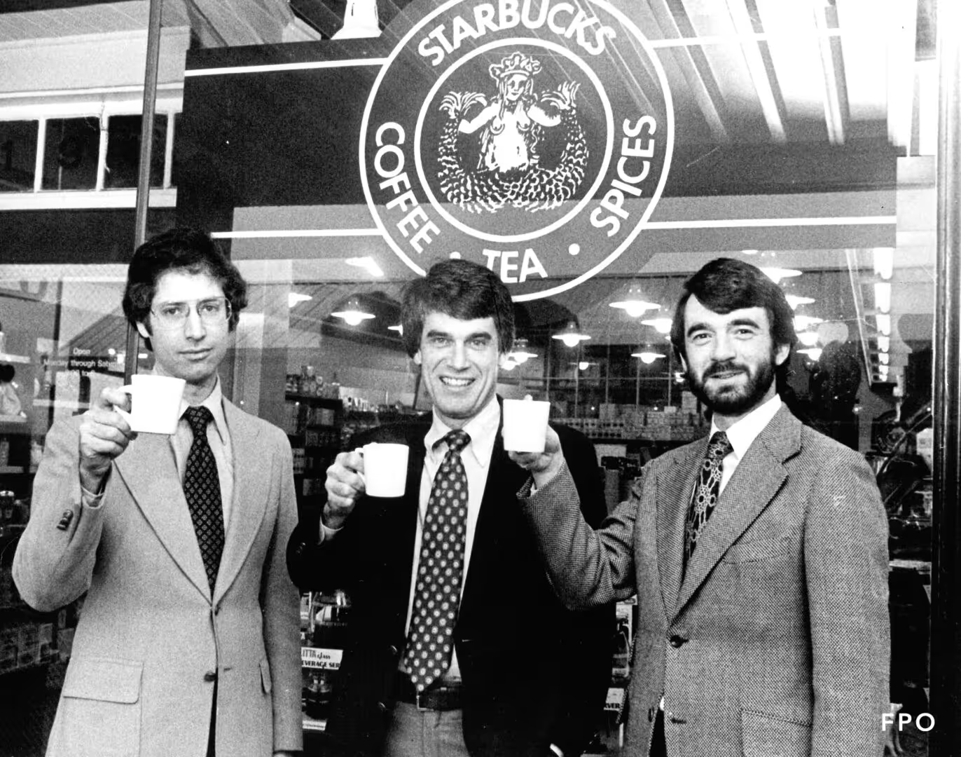
When Starbucks opened its doors in Seattle in 1971, founders Jerry Baldwin, Zev Siegl, and Gordon Bowker imagined a welcoming space where coffee lovers could explore premium beans, brewing gear, and exotic spices. The now-famous Siren—originally topless, intricate, and framed by the words “Starbucks Coffee, Tea, and Spices”—set the tone for a brand steeped in seafaring history and artisanal quality. Over the decades, that symbol transformed from a local curiosity into an icon of global culture.
This is the full story behind the Starbucks logo: its origins, its bold reinventions, and the design principles that make the Siren unforgettable.
1971: The Original Siren Emerges
Starbucks logo origin
Starbucks’ first logo, created by designer Terry Heckler, was rooted in a 16th-century Norse woodcut depicting a two-tailed siren. She was raw, mythical, and unapologetically bold—an embodiment of Seattle’s maritime history and the adventurous spirit the founders wanted to bring to their small Pike Place Market shop. Rendered in a deep brown, the logo emphasized heritage and authenticity. The encircling words “Starbucks Coffee, Tea, and Spices” signaled the brand’s wide offerings and commitment to quality.![]()
This original symbol was less corporate logo and more craft-inspired emblem—one that captured the curiosity of early customers.
![]()
1987: A New Era, A New Color
Starbucks logo history
When Howard Schultz acquired Starbucks in 1987, the company stood at the threshold of its next chapter. With the merger of Starbucks and Il Giornale—Schultz’s espresso-forward venture inspired by Italian coffee bars—came a comprehensive rebrand that introduced the green color now synonymous with Starbucks worldwide.
Green conveyed renewal, growth, and an elevated coffee experience. The Siren was modestly redrawn: her torso hidden by flowing hair, her expression softened, and the brand name simplified to “Starbucks Coffee.” The brown maritime identity made way for a brighter, more modern aesthetic—one designed for a brand no longer confined to Seattle, but ready to expand nationally and beyond.
This pivotal redesign marked Starbucks’ shift from artisan shop to emerging industry leader.
![]()
1992: A Close-Up That Defined a Decade
Starbucks logo evolution
With Starbucks rapidly expanding across the United States in the early 1990s, maintaining consistency became crucial. The 1992 redesign zoomed in on the Siren, cropping the logo to focus on her face and twin tails. This closer, cleaner view brought clarity and simplicity while preserving the character that made the original design so distinctive.
The green-and-white palette remained, reinforcing recognition during a time when the brand was becoming a fixture in American cities. With its increased popularity, this version of the logo became one of the most imitated marks in the world—a sign of global influence but also a challenge in battling counterfeits.
Still, this close-up Siren became the foundation of Starbucks’ iconic look.
![]()
2008: A Brief, Stylized Experiment
Starbucks logo history
For Starbucks’ 40th anniversary, the brand attempted a modernized, stylized version of the Siren. Sleeker and more graphic, this design aimed to capture a contemporary vibe. However, it faced significant pushback from devoted customers who felt the logo wandered too far from the familiar Starbucks green identity.
Though short-lived, this experimental phase helped pave the way for the decisive shift that came next.
2011: The Modern Icon Takes Center Stage
Starbucks modern logo
In 2011, Starbucks unveiled a bold reinvention: the Siren alone, free from the ring of text, stars, and framing elements. For the first time, the logo carried no wording. The message was clear—Starbucks had become so globally recognizable that its symbol could stand on its own.
The updated Siren featured refined lines, smoother shapes, and a carefully crafted asymmetry that added warmth and human nuance to her face. This minimalist approach perfectly aligned with global design trends and reinforced Starbucks’ confidence in its unmistakable brand identity.
![]()
It remains the Starbucks logo in use today—a masterstroke in modern branding and a defining moment in the company’s logo history.
Behind the Design: What Makes the Starbucks Logo So Compelling?
The Starbucks logo is more than a decorative mark—it’s a meticulously crafted visual identity built on centuries-old mythology and contemporary design strategy. Here’s what makes it work so well.
The Fonts: A Legacy of Bold Expression
Though the modern mark uses no text, Starbucks still relies on proprietary typography across its packaging and marketing.
-
Sodo Sans Black—a custom sans-serif typeface—embodies the brand’s confident, modern tone.
-
Lander—a clean serif—adds refinement.
-
Pike—another sans-serif—helps maintain consistency across materials.
These fonts maintain the brand’s voice even when the logo itself remains type-free.
The Color Palette: From Earthy Browns to Energizing Greens
The original brown logo reflected warmth, earthiness, and the natural tones of roasted coffee.
After the 1987 rebrand, green became Starbucks’ defining hue—symbolizing growth, freshness, renewal, and accessibility. Today, Starbucks green carries one of the strongest emotional associations in modern branding.
The Shape: A Timeless Circle
Like a coffee cup rim, a compass, or a ship’s wheel, the circular shape has remained constant through decades of redesigns. It represents unity, continuation, and community—visual qualities that echo Starbucks’ mission of connection.
![]()
The Siren: Mythical Allure, Modern Meaning
The Starbucks logo – siren
Inspired by maritime stories and Seattle’s nautical history, the Siren symbolizes irresistible appeal—inviting customers with the allure of a great cup of coffee. While the original Siren was raw and mythical, the modern version feels warm, familiar, and subtly human.
A small but meaningful design secret: the 2011 redesign intentionally introduced slight asymmetry in her features to avoid a cold, too-perfect appearance. This subtle imperfection adds approachability—an insight into the thoughtful craft behind the logo.
Why the Starbucks Logo Works So Well
The Starbucks logo is a triumph of consistency, evolution, and emotional resonance.
-
It maintains core elements while adapting to modern aesthetics.
-
It uses color, shape, and symbolism to create instant recognition.
-
It balances mythology with approachability.
-
And it reflects the company’s transformation from a small Seattle shop to a global cultural icon.
The logo’s journey offers a powerful lesson in branding: heritage matters—but so does the courage to evolve.
Conclusion
The Starbucks Siren is more than a logo; she’s a symbol of discovery, craftsmanship, and connection. Her evolution mirrors Starbucks’ rise from a local roastery to a worldwide phenomenon. Each redesign carries a piece of the brand’s past while embracing the future—an ideal blend of tradition and innovation.
If you’re exploring your own brand identity, Starbucks is a masterclass in how thoughtful visual storytelling can help shape a global icon. Continue exploring our guides and brand deep-dives to see how logo heritage shapes some of the world’s most influential companies.
FAQ
1. Why does Starbucks use a siren in its logo?
The siren reflects Seattle’s maritime roots and symbolizes allure—inviting customers into the Starbucks experience.
2. When did Starbucks switch to the green logo?
In 1987, after Howard Schultz acquired the company and merged it with Il Giornale.
3. Why did Starbucks remove the text from its logo in 2011?
Because the brand had become globally recognizable; the Siren alone was strong enough to represent Starbucks.
4. What inspired the asymmetry in the Siren’s face?
Designers intentionally added slight imperfections to make her look more human and relatable.
5. What color was the original Starbucks logo?
It was brown, connecting to coffee beans and the brand’s artisanal origins.
6. How has Starbucks’ logo helped its global expansion?
Through consistent symbolism, simple shapes, and a design that remains effective across cultures and languages.