Royal Canin Logo History: Meaning, Symbolism & Brand Heritage
![]()
Among science-driven pet nutrition brands, Royal Canin holds a distinctive position shaped by veterinary expertise and visual consistency. Founded in France and built around a medical understanding of animal health, the brand developed an identity that balances emotional reassurance with scientific authority. Within pet food logo history, Royal Canin stands out for maintaining a recognizable visual core while subtly refining its expression over decades.
Much like the evolution seen in Hill’s Pet Nutrition logo history or the veterinary-first positioning explored in 1st Choice Nutrition logo heritage, Royal Canin’s logo reflects a brand philosophy rooted in care, specialization, and long-term trust rather than mass-market appeal.
Meaning and History: The Origins of Royal Canin
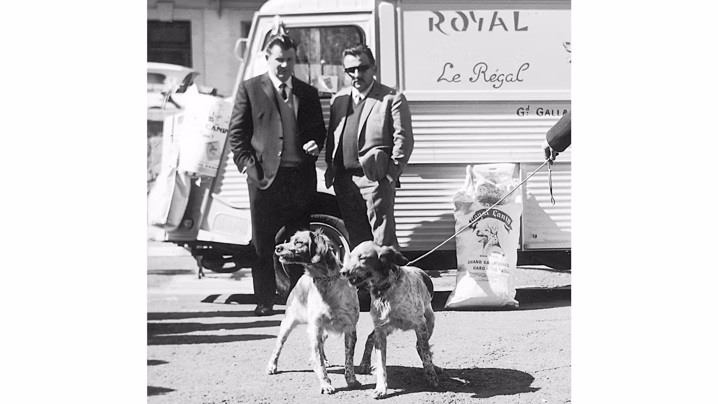
Royal Canin was founded in 1968 by French veterinary surgeon Jean Cathary. The brand emerged from practical veterinary experience rather than commercial ambition. Cathary believed nutrition could play a decisive role in treating and preventing health issues in pets, a philosophy that would shape both product development and brand identity.
From the beginning, Royal Canin positioned itself as a professional solution rather than a lifestyle product. Early branding reflected this mindset, combining traditional symbols of quality with visual references that suggested heritage and authority. The logo meaning evolved alongside the brand’s growing understanding of animal-specific nutrition, gradually shifting from ornamental cues toward clarity and modernity.
As Royal Canin expanded beyond France into international markets, its visual identity adapted carefully, ensuring recognition while reinforcing credibility among veterinarians and pet owners worldwide.
Royal Canin Logo History Timeline
1968 – Early 1970s: Heritage and Veterinary Authority
The earliest Royal Canin logo, visible in archival materials, leaned heavily on traditional European heraldic imagery. The brand name appeared in a typeface inspired by Old English scripts, conveying heritage and seriousness. The wordmark was placed across an arched banner, visually reminiscent of medieval coats of arms.
This design established the “royal” theme from the outset, signaling authority, tradition, and trust. While decorative by modern standards, it aligned with the brand’s early positioning as a professional, veterinarian-led enterprise.
1970s: Transition Toward Modern Simplicity
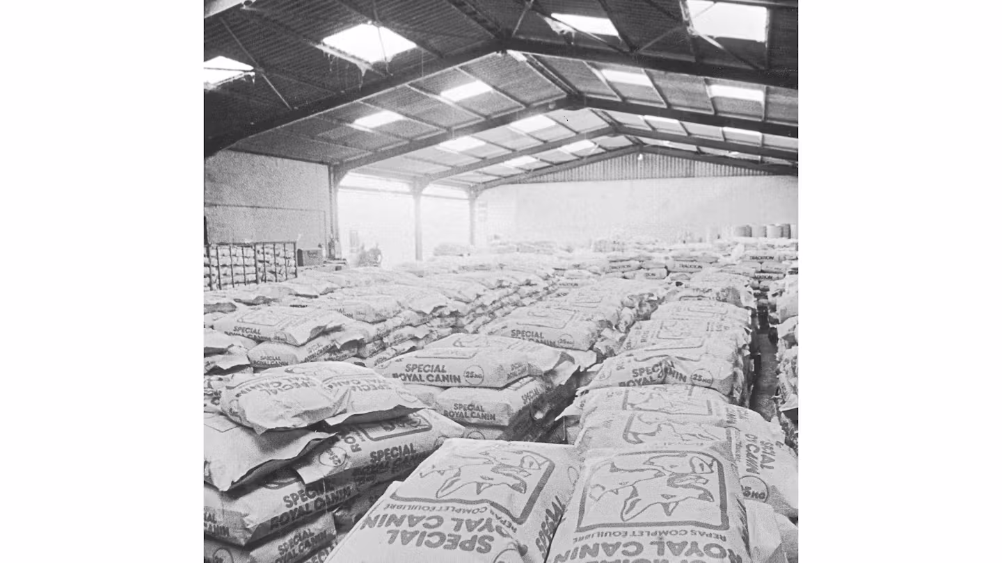
Packaging from the 1970s reveals a significant stylistic shift. The ornate lettering was replaced by a rounded sans-serif wordmark, marking a move toward clarity and accessibility. While simpler, this typography retained a sense of balance and approachability, signaling the brand’s intention to reach a broader audience without abandoning professional credibility.
This period represents a transitional phase, where Royal Canin began aligning its visual identity with emerging standards in scientific and medical branding.
1980s – Today: The Crowned Wordmark
By the 1980s, Royal Canin introduced the logo that remains in use today. The wordmark adopted bold, smooth uppercase lettering rendered in a rounded sans-serif style. Above the name, a stylized crown formed from circular dots created a distinctive arch between the two words.
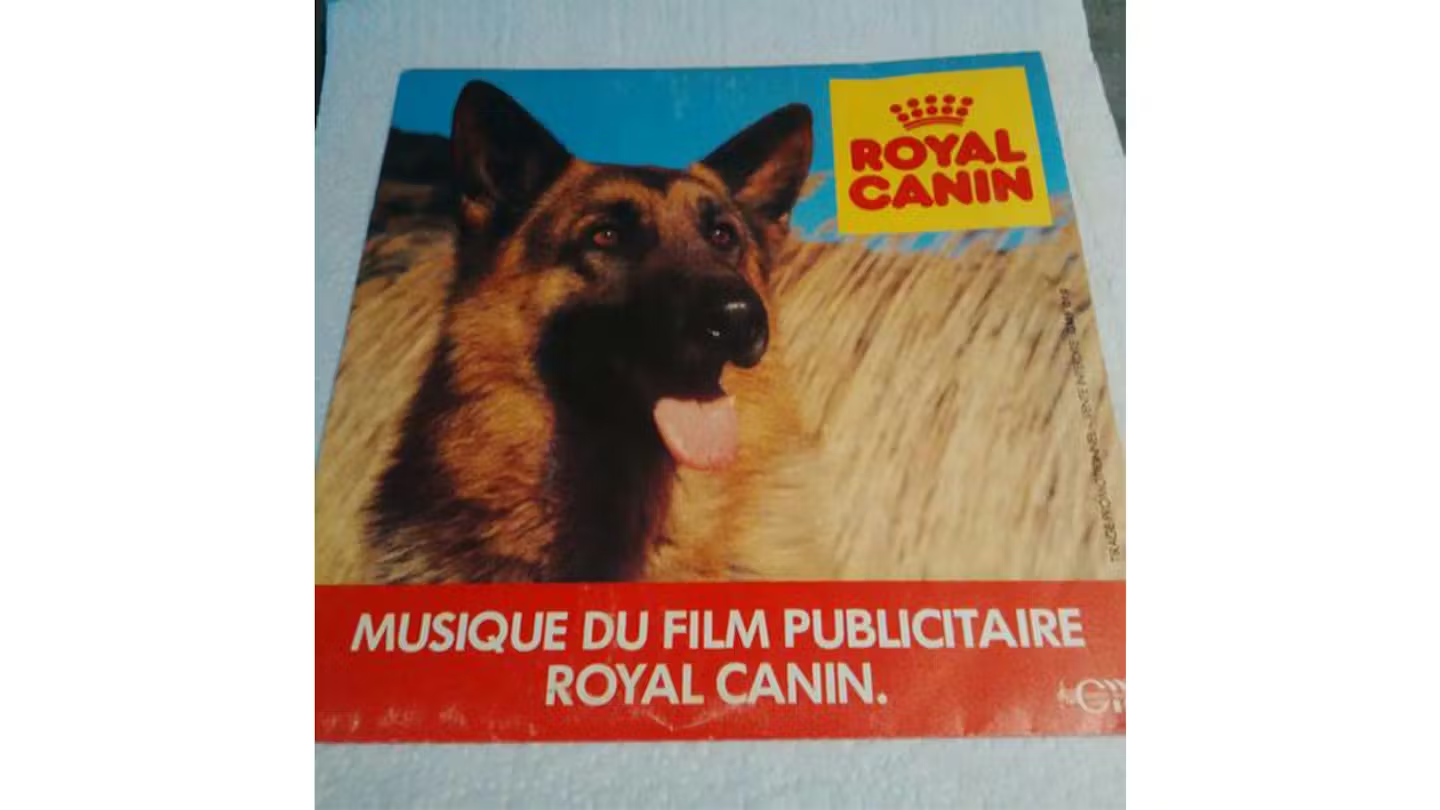
This crown replaced the earlier banner motif while preserving its arched structure, subtly linking the modern logo to its historical origins. The dotted construction of the crown introduced a gentle, pet-centric nuance, transforming a symbol of royalty into one of care and approachability.
The longevity of this design underscores its effectiveness. Minor refinements have occurred over time, but the core elements have remained unchanged, reinforcing global recognition.
Logo Symbolism: Authority Refined Through Care
Royal Canin’s logo symbolism balances authority with warmth. The crown suggests leadership, expertise, and premium positioning, while its softened, dotted execution prevents the mark from feeling distant or elitist. This duality reflects the brand’s mission: scientifically rigorous yet deeply attentive to animal well-being.
The arched crown also creates a visual embrace over the wordmark, subtly reinforcing protection and care. Rather than relying on literal animal imagery, Royal Canin communicates its purpose through refined abstraction.
Typography and Color Philosophy
Typography plays a central role in Royal Canin’s identity. The rounded sans-serif letterforms convey clarity, stability, and modern professionalism. While inspired by bold display fonts such as Yaro Abo Black or Pastrami Super, the custom execution refines contours to ensure legibility across packaging and clinical environments.
Color is deliberately restrained. Scarlet red dominates the palette, set against a clean white background. Red communicates passion, vitality, and commitment, while white reinforces cleanliness and scientific neutrality. This contrast allows the logo to perform effectively in both retail and veterinary contexts.
Royal Canin Logo Heritage and Global Recognition
The Royal Canin logo heritage demonstrates the strength of continuity in trust-based industries. By preserving its crowned wordmark across decades, the brand reinforced familiarity while expanding globally. For veterinarians and pet owners alike, the logo became a visual shorthand for reliability, specialization, and research-backed nutrition.
This approach mirrors broader patterns in veterinary-focused brand heritage, where visual stability strengthens professional credibility rather than limiting innovation.
Royal Canin Logo History and Enduring Identity
The Royal Canin logo history illustrates how a brand can evolve visually without abandoning its foundational values. From heraldic beginnings to a refined modern wordmark, the identity matured alongside advances in veterinary science and global distribution. This careful balance between tradition and clarity aligns Royal Canin with other enduring brands examined throughout pet nutrition logo history and science-driven brand heritage.
Today, the logo stands not merely as a mark of identification, but as a symbol of decades-long dedication to animal health. Its consistency reflects confidence, while its subtle symbolism reinforces care, expertise, and trust—principles that have defined Royal Canin since its founding.
FAQ: Royal Canin Logo Meaning and History
What does the Royal Canin logo represent?
The logo represents authority, expertise, and care through a stylized crown and balanced typography.
Why does the Royal Canin logo feature a crown?
The crown symbolizes leadership and quality, while its dotted design softens the symbol to reflect pet care.
Has the Royal Canin logo changed over time?
Yes, earlier versions were more decorative, but the core crowned wordmark has remained consistent since the 1980s.
What colors define the Royal Canin logo?
Scarlet red and white define the logo, symbolizing passion, vitality, and scientific clarity.