Olympic Logo History & Heritage: Meaning and Symbol Explained
![]()
Few emblems on Earth transcend culture, language, and geography the way the Olympic rings do. Whether you’re watching a broadcast from Paris, browsing sports highlights on your phone, or passing by a billboard in Times Square, the five interlocking rings instantly transmit one message—unity through sport.
But behind that simplicity lies one of the richest logo histories ever created.
The Olympic symbol wasn’t built overnight. It is the culmination of more than 3,000 years of human tradition, myth, athleticism, and eventually, graphic design. Its evolution reflects not only global aesthetics but also humanity’s desire for connection. This is the complete logo heritage of the Olympics—from ancient Greece to the modern day.
From Sacred Races to Global Spectacle: A Brief History of the Olympic Games
Long before television broadcasts and stadiums filled with LED screens, the Olympics were an intimate ritual. The earliest written record dates to 776 BC, when the Greeks formalized the festival honoring Zeus. Only one event existed then—the stadion footrace. The finish line adorned by Zeus’s sacred olive tree supplied the wreaths cut for champions.
Over centuries, the games evolved. Wrestling joined the roster, followed by chariot races, boxing, the pentathlon, and the pancratium. Audiences grew into the tens of thousands. The stadium expanded, altars multiplied, and the Olympics became not only a competition but a cultural phenomenon.
And then, abruptly, it vanished.
In 393 AD, Emperor Theodosius I abolished the Games, condemning them as pagan. An institution nearly 1,200 years old disappeared.
It would take another 1,500 years for the Olympic flame to reignite.
The Rebirth in the Modern Era
In 1894, French educator and visionary Baron Pierre de Coubertin led the first Olympic Congress in Paris. Two years later, Athens hosted the first modern Olympic Games. The early editions featured posters and illustrations, but no universal logo yet existed. By 1924, the Olympics introduced their first official emblem—an understated, early-20th-century design whose creator remains unknown.
But the true turning point came earlier than most realize.
The Birth of an Icon: How the Olympic Rings Were Created (1913)
In 1913, Coubertin sketched five interlocking rings atop a letter—almost casually—yet the world had just received one of its most enduring symbols. The design debuted publicly in 1914 during the Olympic Jubilee Congress, celebrating 20 years of the revived Games.
Coubertin explained that the rings represented “the five parts of the world now won over to Olympism,” united by “fertile rivalries.”
The colors—blue, yellow, black, green, and red—on a white background were chosen because every national flag in existence at the time contained at least one of these colors. Contrary to myth, no single ring formally represents a specific continent today, though early interpretations did assign meanings.
The emblem appeared unofficially in 1920, then officially for the first time in an Olympic emblem in 1932, at Lake Placid.
This is where true Olympic logo history begins.
Olympic Logo Evolution: A Century of Design (1912–Today)
![]()
1912–1986: The First Era of the Rings
The earliest official version of the five-ring symbol—used widely after 1912—featured thick, bold rings with darker hues than today’s palette. It looked solid, almost industrial, reflecting early 20th-century print techniques and the desire for a powerful global identity.
This version dominated for more than seven decades and became synonymous with the Games’ rapid international expansion.
![]()
1986–2010: The Modernized Interlock
In 1986, the IOC refined the emblem to meet contemporary standards:
– Thinner rings
– Cleaner geometry
– Subtle white gaps at points of overlap
– A warmer yellow and lighter blue
The redesign aligned the Games with a more polished, corporate world—symbolizing professionalism, international diplomacy, and a more mature Olympic movement.
This version appeared across countless broadcasts, posters, and official documents for nearly 25 years.
![]()
2010–Today: The Clean, Contemporary Standard
In 2010, the IOC removed the visible interlocking gaps and returned the rings to a fully connected, seamless form—closer to Coubertin’s original vision. The palette remained from 1986, but the execution became sharper and more digital-friendly.
This is the logo we recognize today:
pure, balanced, universally adaptable, and instantly iconic.
![]()
Special Editions: The Rings in 2020 & 2024
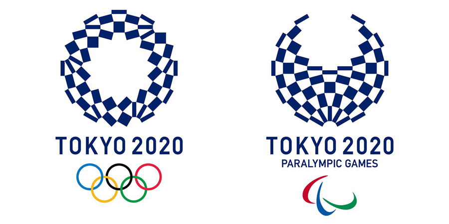
Tokyo 2020: Rings Reimagined as Numbers
For the delayed 2020 Games in Tokyo, the five rings were integrated into the number “2020,” with each digit adopting one of the Olympic colors. The final “0” became a red disc—a nod to the Japanese flag—and created one of the most memorable conceptual designs in Olympic graphic history.
Paris 2024: The Golden Flame & Marianne
For Paris 2024, the Olympic emblem blended the rings with a golden roundel featuring a stylized flame that simultaneously formed a face—Marianne, the national personification of France. This marked a bold fusion of national identity and global symbolism, reaffirming the Olympics’ cultural power.
![]()
The Symbolism Behind the Olympic Rings
Unity, Equality & Global Community
The interlocking rings represent more than continents—they symbolize connection, mutual respect, and the meeting of athletes from around the world. Their intertwined form communicates equality without hierarchy.
The Meaning of the Colors
The palette—blue, yellow, black, green, red with a white background—was designed to be universally inclusive. Together, these colors existed in every national flag of 1913, ensuring the emblem belonged to the entire world.
![]()
A Logo Built on Simplicity
Despite carrying massive symbolic weight, the design is minimal and timeless. Its simplicity is the key to its longevity—easy to reproduce, easy to recognize, and impossible to forget.
Official Rules for Using the Olympic Logo
The IOC enforces strict editorial guidelines to protect the symbol’s integrity:
– No altering colors, gradients, tones, or outlines
– No stretching, warping, rotating, or cropping
– No placing graphics behind, through, or inside the rings
– Full-color rings must always be on a white background
– Monochrome versions must be consistently applied
– Only seven official versions are legal: full-color, monochrome, or any of the five single-color variants
These rules ensure that the Olympic logo heritage remains pure, consistent, and instantly recognizable across all media worldwide.
Design DNA: Why the Olympic Logo Works
The Olympic rings succeed because they combine ancient symbolism with modern clarity. The entire system is built on:
– universal colors
– geometric simplicity
– interconnected shapes
– a clear message of unity
It is one of the few global brand marks that transcends marketing and becomes a cultural identity.
Conclusion: A Symbol That Defines Generations
The Olympic rings are more than a logo. They are a global emblem of hope, competition, unity, and international understanding. Their evolution mirrors humanity’s own progress—from ancient rituals to a modern world bound by sport.
This is the essence of Olympic logo heritage: a symbol that honors its origins while continuing to evolve, inspiring billions with every Games.
FAQ: Olympic Logo Heritage & Symbolism
1. Are the Olympic rings intentionally arranged in a specific order?
Yes. The sequence—blue, yellow, black, green, red—is fixed to maintain visual balance and historical consistency.
2. Why doesn’t each ring represent one continent today?
Because the IOC abandoned this interpretation to avoid racial or geopolitical associations; the rings now symbolize unity, not geography.
3. Why was the logo redesigned in 2010?
To modernize the design for digital screens, improve clarity, and return to a seamless interlocking form closer to Coubertin’s vision.
4. Does every Olympic host city design its own logo?
Yes. Each Games features a unique emblem, but the universal five rings must always appear as part of or alongside it.
5. Can brands use the Olympic rings in advertising?
Only with official IOC permission. Unauthorized commercial use is strictly prohibited and legally enforced.
6. Why are there seven official versions of the Olympic logo?
To ensure flexibility in diverse printing and digital environments while preserving recognition and consistency.