Off-White Logo History: Meaning, Symbolism & Brand Heritage
![]()
Few modern brands have altered the visual language of fashion as radically as Off-White™. Created in 2013 by Virgil Abloh, the label emerged at the intersection of luxury, streetwear, architecture, and conceptual art. Yet the most remarkable aspect of its visual identity is not its novelty but its unapologetic embrace of existing public-domain symbols. In an industry where brands obsess over unique emblems, Off-White chose the opposite path: a logo system openly borrowed from a 1960s airport signage project. And somehow, in the process, it created one of the most recognizable marks in contemporary fashion.
Off-White™’s identity does not try to conceal its origins. Instead, it elevates them — transforming utilitarian graphics into a cultural code that millions now associate with exclusivity, collaboration, and the fluid aesthetic Abloh called “the gray area between black and white.”
Meaning & Origins: From Architecture to Global Streetwear
Off-White™ was officially launched in 2013, but its conceptual foundation was formed much earlier in the mind of Virgil Abloh. Trained first as a civil engineer and later as an architect, Abloh entered fashion with a framework built on structural thinking, semiotics, and the visual systems of industrial design. Before founding his label, he was already embedded in the culture as Kanye West’s creative collaborator and as a rising figure in fashion’s experimental circles.
The brand’s name, according to Abloh, represented a conceptual middle ground — “the gray area between black and white,” a metaphor for reinterpretation, ambiguity, and cultural remixing. This philosophy guided every visual element of Off-White™, from its diagonal lines to its quotation-marked phrases and collaborative branding.
By 2014, Off-White™ debuted at Paris Fashion Week and quickly became a finalist for the LVMH Prize. In under five years, it was collaborating with Nike, Levi’s, Moncler, Timberland, Rimowa, and even IKEA. And in 2018, Abloh was appointed Artistic Director of Louis Vuitton Menswear — a historic moment that established Off-White™ not merely as a fashion label but as a global cultural engine.
Logo Evolution Timeline
2012 – Today: A Visual Identity Built on Public Symbols
The first Off-White™ logo, created in 2012 shortly before the brand’s public debut, was deceptively simple. It featured a clean title-case wordmark set in a neutral, sans-serif typeface, followed by an oversized trademark symbol. It looked almost intentionally unremarkable, a contrast to the increasingly complex visual language emerging in streetwear at the time.
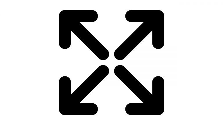
This understated wordmark became one face of the brand — but not its identity. The true Off-White™ emblems were the arrows and stripes, borrowed directly from a 1964 wayfinding system created for Glasgow Airport by the influential designers Jock Kinneir and Margaret Calvert.
The four-way arrow, originally conceived as an airport symbol indicating directions in and out of a terminal, became Off-White™’s most recognizable mark. The diagonal warning stripes — adapted from the same designers’ vehicle-visibility patterns — became the brand’s trademark texture, printed across clothing, accessories, tags, and packaging.
In the following years, Off-White™ added variations: square arrow formations, rectangular stripe arrays, extended diagonal sequences, and later the controversial 2019 “drowning man” logo. But the core symbols remained consistent, derived from the utilitarian visual codes that governed airports, highways, and industrial machines long before fashion ever claimed them.
No brand in modern luxury has been so transparent — and so intentional — in building its logo heritage from existing public signage.
![]()
Where the Symbols Really Come From
In 1964, Kinneir Calvert Associates developed an advanced signage and graphic system for the new Glasgow Airport. This work included a black-and-white directional emblem that resembles the Off-White™ cross-arrow symbol almost exactly: four arrows converging toward the center, forming what they described as “St. Andrew’s Cross for wayfinding.”
The same project extended to airport service vehicles, which were painted with alternating diagonal hazard stripes to increase visibility from the air. These identical stripes — originally yellow and black — inspired Off-White’s rectangular and square diagonal-mark compositions.
Abloh did not stumble upon these references by accident. With degrees in both engineering and architecture, he would have studied or encountered Calvert’s work, which is foundational in modern wayfinding design. Furthermore, Calvert also co-created the Rail Alphabet typeface used for British Rail signage — a font whose lightest weight was ironically named “Off White.”
The semiotic relationship between Abloh’s brand and Calvert’s design legacy is too exact, too layered, and too conceptually aligned to be coincidence. Instead, it forms one of the most elegant examples of cultural appropriation framed as design dialogue: a streetwear label borrowing the language of public infrastructure to create its own visual universe.
Meaning & Symbolism: The Culture of Repurposed Signs
Off-White™ thrives on the reinterpretation of context. The arrows and stripes are not symbols of luxury but symbols of public space. By placing them on expensive clothing, Abloh performed the essential act of streetwear culture: taking functional, utilitarian graphics and transforming them into status markers.
The diagonal lines evoke crosswalks, barriers, caution tape, and construction sites — places where rules, movement, and urban life intersect. The arrows express direction, fragmentation, and the constant flux of travel and transition. Together, they evoke the modern city as a design language, rather than merely a backdrop.
In Off-White™’s narrative, these symbols remind us that fashion is architecture in motion, that clothing is signage, and that meaning is something we put on our bodies every day.
Typography & Wordmark
Throughout its history, Off-White™ has used several wordmark variations, each tied to different collections, collaborations, or eras. Some versions appear in industrial monospace fonts reminiscent of technical manuals, while others use clean modern sans-serifs that echo architectural drafting or signage typography.
The earliest versions relied on simple geometric sans-serifs to maintain neutrality. Later editions used heavier, more rigid grotesques, reinforcing the brand’s utilitarian aesthetic. Quotation-marked phrases — “LOGO,” “SHOELACES,” “SCULPTURE” — became a typographic signature that blurred the line between label and concept, between description and branding.
The typography of Off-White™ is less about beauty and more about intent: it behaves like signage, instruction, or annotation, not merely decoration.
Color Palette
Off-White™ built its visual identity around the sharpest possible contrast: black and white. This monochrome palette allowed the stripes and arrows to reference their industrial origins directly while giving the brand the intensity, clarity, and universality of a warning sign.
Other colors occasionally appear in collaborations or limited editions, but the essential iconography remains overwhelmingly black-and-white — as stark, direct, and functional as the infrastructure systems that inspired it.
Conclusion: Off-White™ and the Legacy of Recontextualized Design
Off-White™ stands as one of the most fascinating case studies in contemporary logo heritage. Instead of inventing an entirely new emblem, Virgil Abloh elevated existing public symbols into a luxury context, challenging long-held assumptions about authorship, originality, and cultural ownership.
The brand’s diagonal stripes and crossed arrows are not merely design elements. They are conceptual statements — gestures that bridge fashion with architecture, street culture with semiotics, the everyday with the aspirational.
In transforming utilitarian graphics into global icons, Off-White™ redefined what a fashion logo could be and built one of the most recognizable visual identities of the 21st century.
FAQ: Off-White™ Logo, Meaning & History
What does the Off-White™ logo represent?
The most iconic Off-White™ emblem, introduced around 2019, showed the words “Off” and “White” separated by the abstract face of a drowning man — Virgil Abloh’s conceptual response to plagiarism accusations surrounding earlier arrow-based logos.
Who designed the Off-White™ logo?
All primary Off-White™ logos — including the crossed arrows, diagonal stripes, and the “drowning man” symbol — were developed by the in-house Off-White™ team under the direction of Virgil Abloh.
Where did the arrow symbol originate?
The crossed-arrow logo is directly derived from a 1964 Glasgow Airport signage system designed by Jock Kinneir and Margaret Calvert, pioneers of modern wayfinding.
Why does Off-White™ use black and white?
The stark monochrome palette replicates the visual intensity of public signage and hazard markings, aligning with Abloh’s architectural and industrial inspirations.
Does Off-White™ still use the arrows?
Yes. Although the drowning-man logo appeared briefly in 2019, Off-White™ continues to use the arrows, stripes, and core wordmarks across its collections.