Nespresso Logo History: Meaning, Symbolism & Brand Heritage
![]()
The Nespresso name has become a global shorthand for modern coffee culture—precision-engineered machines, tightly curated coffee capsules, and an entire lifestyle built around ritual, refinement, and design. Since its launch by Nestlé in 1986, Nespresso has shaped not only how millions consume coffee but also how a premium brand presents itself visually. Every detail, from capsule color to boutique architecture, is orchestrated to express mastery, indulgence, and reliability. At the center of this world sits the Nespresso logo, a rare case of a visual identity that has remained essentially unchanged since its introduction yet continues to feel contemporary, elegant, and unmistakably luxurious.
While many global brands have undergone dozens of revisions across decades, Nespresso has remained committed to a logo that mirrors its philosophy: refined consistency, technical precision, and a promise of taste elevated to art. The wordmark’s sculptural lines evoke the discipline and craft behind the brand’s capsule technology, and the distinctive monogrammed “N” has become one of the most identifiable symbols in modern food and beverage culture. More than decorative, the logo embodies the very heritage of Nespresso—Swiss engineering, Italian-style coffee mastery, and a meticulous approach to user experience.
This convergence of heritage, meaning, and symbolism is what makes the Nespresso visual identity an exemplary case study in long-term brand stewardship. It demonstrates how a logo can remain completely relevant across decades when the design principles guiding it are rooted in timelessness rather than trend.
Nespresso Meaning and Symbolism
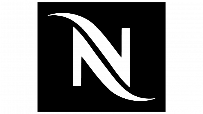
The Nespresso logo carries several layers of symbolic intention. The brand has always positioned itself as an intersection between high technology and indulgent sensory enjoyment, and the emblem reflects that duality. The custom-designed monogram “N” forms two mirrored shapes that resemble a sculpted ribbon or an elegant checkmark. This motif suggests movement, flow, and craftsmanship—qualities associated with extraction pressure, swirling crema, and the sophisticated mechanics within each Nespresso machine.
The symmetry of the “N” subtly communicates two additional themes central to Nespresso’s heritage. First, it evokes refinement through balance and proportion, principles that guide the brand’s approach to product development. Second, it hints at the premium Art Deco influence that subtly guides the entire wordmark, connecting the logo to a design era associated with elegance, luxury, and modern industrial progress. In essence, the monogram does more than identify a brand; it visualizes the promise of quality and the ritualistic experience of coffee preparation.
The logo’s minimalism reinforces Nespresso’s emphasis on purity and precision. Each capsule contains a measured, expertly balanced composition of Arabica or Robusta beans, and the clean, architectural typography mirrors that controlled perfection. By embracing restraint rather than ornamentation, the logo gives the product and its sensory qualities the space to stand out.
Nespresso Brand Heritage
Nespresso’s heritage begins in Switzerland, but its conceptual DNA draws equally from Italian espresso tradition and global industrial design. The company’s early vision was radical: offer café-level espresso quality through a closed, patented capsule system. From the very beginning, Nespresso linked its product innovation with visual sophistication. Boutique stores resembled art galleries, machines adopted sculptural forms, and every packaging script, color, and finish functioned as an extension of the brand’s promise of elevated quality.
Founded as a division within Nestlé, Nespresso grew from a specialized innovation into one of the company’s strongest global brands. By the 1990s, Nespresso had expanded beyond Switzerland, positioning itself as a premium lifestyle label. This shift made visual identity even more essential. The logo became a symbol of entry into a world built around refined taste, precision manufacturing, and the emotional appeal of a personal coffee ritual.
Over time, Nespresso’s heritage has evolved into a fusion of artistry and engineering. The company’s monogram encapsulates that narrative: a brand built on harmony between creativity and control, luxury and accessibility, tradition and innovation.
Nespresso Logo History & Evolution Timeline
While the Nespresso logo is renowned for its consistency, its evolution reflects subtle refinements rather than radical redesigns. Introduced at the brand’s founding in 1986, the original logo established the monogrammed “N” and the custom wordmark that continue to define the brand today. The precision of the shapes, the slight curvature of the strokes, and the Art Deco undertones were all intentional choices made to convey luxury, craftsmanship, and modernity.
Over the years, the most significant variations have been in color rather than form. The earliest uses of the logo often appeared in monochromatic black, reflecting premium restraint and aligning with the minimalist aesthetic of early packaging and advertising. As capsule lines expanded and boutiques flourished, the palette extended into rich browns, espresso tones, and metallic shades. These adaptations aligned the brand with the natural colors of roasted coffee and the tactile finishes of its machines.
Despite these refinements, the structural design of the logo has remained essentially unchanged for nearly four decades. This longevity underscores the clarity and strength of the original concept. It also demonstrates Nespresso’s commitment to building a stable visual heritage—one that resists trends and instead reinforces the premium experience that defines every interaction with the brand.
Typography and Color
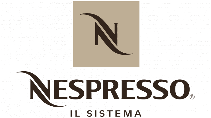
Typography plays a central role in the Nespresso identity. Developed by the design agency Zecraft, the proprietary typeface is rooted in Art Deco principles: geometric balance, elongated forms, and elegant contrast. The lettering appears sculptural rather than flat, giving the logo a sense of architectural precision. The all-uppercase composition amplifies the brand’s authority and refinement. The mirrored strokes in the initial “N” act as both a functional letterform and a symbolic motif, merging technology and elegance into a single visual gesture.
Color usage has historically served as an extension of the brand’s sensory narrative. Black and white remain the most iconic palette, conveying sophistication and timelessness. In other contexts, Nespresso employs deep espresso browns or warm metallics that mimic the tones of roasted coffee, aluminum capsules, and machine finishes. These palettes reinforce the brand’s commitment to premium materials and its heritage rooted in craftsmanship and flavor excellence.
The Enduring Power of a Modern Classic
The Nespresso logo is a hallmark of contemporary brand-building: precise, memorable, and deeply aligned with the company’s heritage and values. Its restrained design has allowed it to remain relevant for nearly forty years, serving as a visual anchor for a brand that continues to grow, innovate, and define its category. By merging symbolic sophistication with the clarity of modern industrial design, the Nespresso logo stands not only as a mark of identity but also as an emblem of craftsmanship, ritual, and the global culture of refined coffee consumption.
FAQ Nespresso
Why has the Nespresso logo changed so little over time?
Because the original design captured the brand’s core values—precision, elegance, and premium quality—Nespresso had no reason to undertake major redesigns. Minor adaptations focused mainly on color updates rather than structural changes.
What does the stylized “N” symbolize?
The mirrored strokes evoke craftsmanship, flow, and refined movement, representing both the coffee extraction process and the brand’s commitment to technical excellence.
Why is the Nespresso logo associated with Art Deco influences?
Its geometric symmetry and sculptural letterforms echo Art Deco aesthetics, a design style historically linked to luxury, modernity, and high craftsmanship.
What role does color play in the Nespresso visual identity?
Black, espresso brown, and metallic tones reflect premium materials, roasted coffee hues, and the sensorial richness of the brand’s products.
Who designed the custom Nespresso typeface?
The proprietary typography was developed by Zecraft, ensuring a unique and timeless aesthetic aligned with the brand’s refined character.