McDonald’s Logo Heritage
![]()
Few symbols in modern culture are as instantly recognizable as McDonald’s Golden Arches. What began as a modest California burger stand grew into a global empire—and much of that rise is tied to one of the most powerful visual identities in brand history. The McDonald’s logo isn’t just a fast-food emblem; it’s a cultural landmark, a piece of everyday Americana, and a masterclass in logo heritage that transcends borders, age groups, and decades.
From its origins as an architectural feature to its evolution into the sleek “M” we know today, the Golden Arches tell a story of design innovation, business ambition, and the kind of branding that defines generations. Let’s explore the complete logo history of McDonald’s—where it started, how it transformed, and what gives those two golden curves their extraordinary staying power.
Humble Beginnings: The Road to Something Bigger
Before the arches, before the Big Mac, and before the global expansion, the McDonald family’s first venture started small. In 1937, Patrick McDonald opened “The Airdome” in Monrovia, California—a simple drive-in serving hot dogs, hamburgers, and cold drinks.
By 1940, his sons, Richard and Maurice McDonald, relocated and rebranded their business as “McDonald’s” in San Bernardino. Frustrated by slow service at typical drive-ins, the brothers developed the groundbreaking “Speedee Service System”—a streamlined, assembly-line approach to fast food that revolutionized the industry.
![]()
This innovation set the stage for something much bigger. Customers loved the speed and reliability, and the McDonald brothers boldly envisioned a future where fast food was predictable, consistent, and delicious.
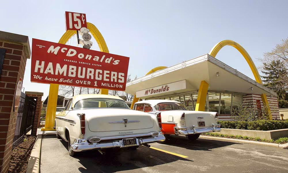
1953: The Birth of the Golden Arches—Literally
In 1953, architect Stanley Clark Meston gave McDonald’s its first true design identity. The building itself featured two towering yellow arches—architectural markers that made the restaurants unmistakable from the roadside.
These weren’t logos yet, but they were symbolic. The arches communicated optimism, modernism, and a sense of forward motion—the perfect representation of America’s booming postwar era. They were not just structural details; they were the seeds of branding genius.
![]()
1955: Enter Ray Kroc—The Visionary Who Saw the Arches’ Potential
Ray Kroc, a Chicago-based milkshake-machine salesman, visited the San Bernardino location in 1954. Impressed by the brothers’ efficiency, he saw an opportunity to expand the brand nationwide. In 1955, he opened his own McDonald’s restaurant in Des Plaines, Illinois—marking the beginning of the franchise empire.
By 1961, Kroc purchased exclusive rights to McDonald’s for $2.7 million. It was one of the most impactful business moves of the century.
1961: Where Architecture Meets Logo Design
This year marks the official birth of the McDonald’s logo.
![]()
Kroc hired draftsman Jim Schindler to translate the building’s arches into a cohesive graphic symbol. Schindler merged the two structural arches into a single “M”—a brilliant fusion of form and brand identity.
The result? A simple, bold, unforgettable emblem that visually unified every McDonald’s location, franchise, and product. It was modern, futuristic, and unmistakably McDonald’s.
This was the moment the Golden Arches shifted from architectural novelty to global brand icon.
1968: Streamlining the “M” for a New Era
McDonald’s logo evolution
As McDonald’s continued to expand, the logo required refinement. In 1968, the brand introduced a sleeker, more polished version of the Golden Arches—clean, symmetrical, and balanced. This redesign arrived just as the company surpassed 1,000 locations and was preparing to leap onto the global stage.
The updated “M” captured the essence of the McDonald’s experience: fast, friendly, reliable, and warmly familiar.
![]()
2003: A New Century, A New Shine
With the launch of the “I’m Lovin’ It” campaign in 2003, McDonald’s refreshed the Golden Arches once again. The logo gained a bright, contemporary update—a glossy, dimensional look that reflected the digital age.
This version modernized the brand while preserving everything recognizable about its identity. The new arches aligned with global advertising, youthful energy, and a new brand voice centered around warmth, joy, and everyday indulgence.
The campaign became the most successful in McDonald’s history—and the logo became more iconic than ever.
![]()
Design Breakdown: What Makes the Golden Arches So Powerful?
1. The Shape: Welcoming, Warm, and Instantly Readable
The iconic “M” is simple, geometric, and unmistakable from any distance. Its curves are friendly and inviting, echoing a sense of community and consistency—no matter where you are in the world.
2. The Colors: Red and Gold with Purpose
These colors weren’t chosen by accident:
-
Yellow evokes warmth, happiness, optimism, and appetite.
-
Red conveys energy, excitement, and urgency—ideal for fast service.
Together, they create one of the most psychologically effective palettes in branding.
![]()
3. The Typography: Clean and Confident
While the Golden Arches alone carry the brand today, earlier lockups used bold, simple sans-serif lettering that communicated strength and accessibility. Even without text, the logo remains unmistakable—a testament to its design power.
4. Cultural Impact: More Than a Logo
From films to commercials to highways around the world, the Golden Arches appear everywhere—often as a symbol not just of fast food, but of comfort, routine, and nostalgia.
McDonald’s logo heritage isn’t just design history; it’s pop culture history.
Why the McDonald’s Logo Works
-
It’s globally recognizable, regardless of language.
-
It evokes emotion instantly—warmth, hunger, familiarity.
-
It’s adaptable across eras without losing its core identity.
-
It embodies the brand promise: consistency, convenience, and comfort.
Few logos in the world achieve this level of universal understanding.
Conclusion
The Golden Arches aren’t just part of the McDonald’s story—they are the story. From their origins as architectural features to their status as one of the most recognizable symbols on Earth, the arches have become a beloved piece of branding history. Their evolution shows how powerful, thoughtful design can shape not just a company, but culture itself.
McDonald’s logo heritage remains a benchmark for designers, marketers, and brand storytellers looking to create symbols that last generations.
FAQ
1. Who created the McDonald’s Golden Arches logo?
Jim Schindler designed the first official “M” logo in 1961 by merging the restaurant’s architectural arches into a single symbol.
2. Why are the arches yellow?
Yellow is associated with happiness, warmth, visibility, and appetite—ideal traits for a fast-food brand.
3. When did the modern McDonald’s logo take shape?
The sleek, unified “M” design debuted in 1968 and has remained the foundation of all later versions.
4. What inspired the shape of the logo?
The original arches were part of the building design, later transformed into a unified symbol to represent the brand.
5. Why is red used in the McDonald’s branding?
Red creates excitement, encourages quick decisions, and stimulates hunger—perfect for drive-thru dining.
6. What makes McDonald’s logo one of the most recognizable in the world?
Its simplicity, bold color palette, and consistent use across decades have made it iconic worldwide.