Little Caesars Logo History: Meaning, Symbolism & Brand Heritage
![]()
Little Caesars is one of the most recognizable names in American fast-food culture, a brand whose identity is inseparable from affordability, consistency, and mass appeal. Founded in Michigan during the late 1950s, the chain grew from a single family-owned restaurant into a global pizza powerhouse with more than five thousand locations across 27 countries. By 2019, Little Caesars had firmly secured its place as the third-largest pizza chain in the United States.
The Little Caesars logo history reflects this growth with unusual consistency. While many fast-food brands have repeatedly reinvented their visual identities, Little Caesars has remained loyal to a single concept for more than half a century. Its logo meaning is rooted in humor, approachability, and tradition, while its logo symbolism relies on a playful historical figure adapted for modern fast-food culture. This disciplined continuity defines the brand’s logo heritage.
Meaning and History: The Origin of the Little Caesars Logo
Little Caesars was founded in 1959 in Detroit, Michigan, by Mike Ilitch and Marian Ilitch. The couple initially named the restaurant “Little Caesars Pizza Treat,” positioning it as a family-friendly, value-driven pizza concept. From the beginning, the brand emphasized accessibility rather than exclusivity, a philosophy that would later define both its business model and visual identity.
The logo origin reflects this mindset. Instead of abstract shapes or aggressive typography, Little Caesars embraced character-based branding. The use of a cartoon version of Julius Caesar was intentionally lighthearted, signaling that the brand did not take itself too seriously. This approach made the logo instantly approachable, especially for families and younger customers.
As the company expanded through franchising in the 1960s and entered international markets by the end of the decade, the logo became a critical tool for recognition and trust.
Little Caesars Logo History Timeline
![]()
1959–1971: “Little Caesars Pizza Treat”
The first logo introduced in 1959 was typographic in nature. It appeared as a rectangular banner with a two-level inscription. The words “Little Caesars” were rendered in an elegant cursive script, while “Pizza Treat” appeared below in a bold, uppercase sans-serif typeface. This combination balanced friendliness with clarity, clearly communicating the product offering.
Although simple, this logo laid the groundwork for the brand’s emphasis on legibility and warmth.
![]()
1971–2000: The Birth of the Caesar Mascot
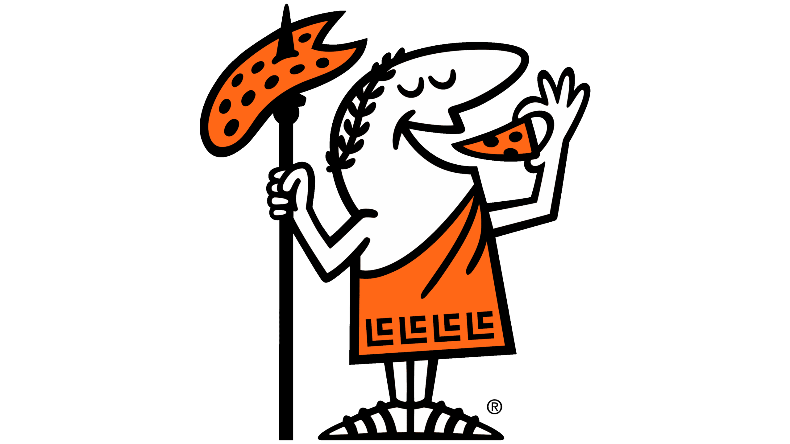
In 1971, the company shortened its name to “Little Caesars,” marking a pivotal moment in its branding. A new logo was introduced featuring a round emblem with a cartoon Caesar dressed in an orange tunic, holding and eating a slice of pizza. The character was playful and expressive, instantly memorable.
Below the emblem sat a bold wordmark set in a refined, old-style serif typeface. This version became the definitive visual identity of Little Caesars and remained largely unchanged for decades, embedding itself deeply in American pop culture.
![]()
2000–2017: Structural Refinement
In 2000, the logo underwent a structural adjustment rather than a conceptual change. The circular emblem was replaced with a square-shaped mark with an arched top, and the Caesar figure was cropped to show only the upper body. The emblem moved to the left of the wordmark, adapting the logo for modern signage and digital layouts.
Typography was subtly refined, becoming slightly bolder and smoother, but the color palette and overall style remained intact.
![]()
2017–Today: Return to Heritage Composition
The 2017 redesign reintroduced the full figure of Caesar above the wordmark, echoing the iconic 1971 layout. However, the circular frame was removed, giving the logo a more open and contemporary appearance. The wordmark was updated to read “Little Caesars Pizza,” with characters slightly narrowed for improved balance and scalability.
This version reinforces the brand’s heritage while aligning with modern branding standards.
Logo Symbolism: Humor, Heritage, and Accessibility
The symbolism of the Little Caesars logo centers on humor and familiarity. The Caesar character references Roman history but is deliberately caricatured, transforming a symbol of imperial authority into a friendly mascot. This contrast reinforces the brand’s positioning as casual, welcoming, and unpretentious.
The pizza slice held by Caesar is a literal representation of the product, leaving no ambiguity about the brand’s purpose. This directness has been a key factor in Little Caesars’ mass-market appeal.
Typography and Color in the Little Caesars Logo
Typography plays a crucial role in maintaining continuity. The wordmark uses a title-case serif typeface with rounded contours and slightly condensed proportions. Fonts similar to Waverly RR ExtraBold Condensed or Sabre Medium capture the same balance of elegance and friendliness.
Color is equally important to the logo meaning. Orange dominates the palette, symbolizing energy, warmth, and appetite. Black provides contrast and authority, while white ensures clarity and legibility. Together, these colors create a dynamic yet familiar visual identity that stands out in competitive fast-food environments.
Little Caesars Logo Heritage and Brand Identity
Little Caesars’ logo heritage is defined by loyalty to a single idea. Since the early 1970s, the brand has resisted dramatic rebranding, choosing instead to refine details while preserving its mascot-driven identity. This consistency has helped maintain strong brand recall across generations.
In a market crowded with minimalist and abstract logos, Little Caesars stands out by embracing character and narrative. The logo functions not just as a mark, but as a brand personality.
A Timeless Mascot in Modern Fast Food
The Little Caesars logo history demonstrates the power of consistency in branding. By anchoring its identity in a memorable character and a stable visual system, the company created a logo that remains relevant decades after its introduction.
Rather than chasing trends, Little Caesars refined what already worked. The result is a logo heritage that feels timeless, approachable, and instantly recognizable—a visual identity as dependable as the brand’s promise of affordable pizza.
FAQ: Little Caesars Logo Meaning, Symbolism, and History
What does the Little Caesars logo represent?
The logo represents approachability, humor, and tradition through the cartoon Caesar mascot.
Who founded Little Caesars?
Little Caesars was founded in 1959 by Mike and Marian Ilitch in Detroit, Michigan.
Why is Caesar used as a mascot?
The Caesar character adds humor and memorability, transforming a historical figure into a friendly brand symbol.
Has the Little Caesars logo changed much over time?
The core design has remained consistent since 1971, with only minor refinements.
What colors define the Little Caesars logo?
Orange, black, and white define the brand’s visual identity.
Is the original logo still used today?
Elements of the 1971 design are still present in the current logo.