Linux Logo History: Meaning, Symbolism & Brand Heritage
![]()
Few technological projects have influenced the modern digital world as profoundly as Linux. Born not inside a corporation but within a global community of developers, Linux reshaped how software could be created, shared, and sustained. Its success lies not only in its technical robustness but also in its philosophy: openness, collaboration, and transparency.
Unlike commercial operating systems that rely on corporate branding strategies, Linux developed an identity rooted in culture rather than marketing. Much like the long-term recognition achieved through the Unix logo history and the community-driven consistency behind the Mozilla Firefox logo heritage, Linux’s visual identity reflects its decentralized nature. At the center of this identity stands Tux, a penguin that became one of the most recognizable mascots in technology. The Linux logo heritage tells a story of how simplicity, humor, and community values can form a lasting symbol.
Meaning and History: The Origin of the Linux Identity
Linux traces its origin to 1991, when Linus Torvalds released the Linux kernel as a personal project. Designed as an open-source alternative inspired by Unix principles, Linux quickly attracted a growing base of contributors who expanded it into a complete operating system ecosystem.
The name “Linux” itself was not imposed from above. While Torvalds registered the trademark, the final name emerged through user consensus, reinforcing the community-driven nature of the project. This collective authorship also influenced the logo meaning. Rather than adopting a corporate emblem or abstract symbol, Linux embraced a mascot that felt approachable and human.
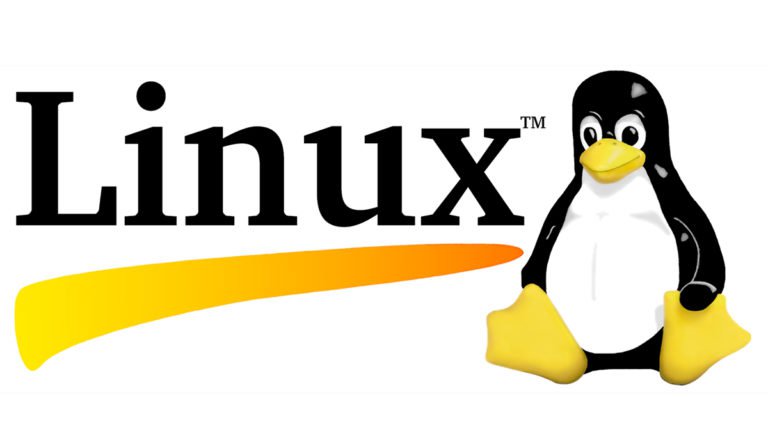
Tux, the penguin, was conceived by Torvalds himself. According to popular accounts, his fondness for penguins—and a memorable encounter with one during a visit to Australia—sparked the idea. From the start, Tux was meant to convey friendliness rather than authority, reflecting the inclusive spirit of the Linux community.
Linux Logo History Timeline
![]()
1996 – Today: The Birth of Tux
Discussions about creating a Linux mascot began in early 1996. Numerous logo concepts were proposed, many parodying existing technology brands. Ultimately, the design that would define Linux’s identity was created by Larry Ewing.
Interestingly, Ewing’s penguin did not win any of the official logo competitions held at the time. Despite this, the image resonated strongly with the community and was organically adopted as the face of Linux. The original Tux depicted a relaxed, seated penguin with rounded shapes, large eyes, and a content expression—an intentional departure from aggressive or corporate imagery.
![]()
2005 – 2008: Caricature and Experimentation
In 2005, an alternative version of the Linux logo emerged, presenting Tux in a more exaggerated, cartoon-like style. The penguin appeared circular, with crossed eyes and an overtly humorous expression, suggesting exhaustion from long hours in front of a computer.
This version reflected a playful moment in the brand’s evolution but lacked the timeless quality of the original. Its limited lifespan underscored the community’s preference for balance between humor and recognizability.
![]()
2008 – Today: Refined Familiarity
The 2008 redesign refined the caricature approach, reintroducing more realistic proportions while preserving the friendliness of Tux. This version struck a balance between the original 1990s design and the exaggerated 2005 iteration.
Today, Linux does not enforce a single rigid logo standard. Tux appears in numerous interpretations across distributions, merchandise, and events, reinforcing the idea that the mascot belongs to the community rather than a centralized authority.
Logo Symbolism: Openness, Approachability, and Freedom
The symbolism of the Linux logo lies in its mascot-driven design. Tux is not aggressive, sleek, or intimidating. Instead, the penguin appears relaxed, approachable, and even playful. This choice reflects the ethos of open-source software, where collaboration and curiosity matter more than dominance.
The penguin’s seated posture and soft contours suggest stability and calm, while its expression conveys accessibility. The logo meaning aligns closely with Linux’s promise: a powerful system that remains open and welcoming to anyone willing to learn.
Typography and Visual Language
The Linux wordmark, when used, is set in a customized serif typeface. The first letter is capitalized, while the remaining letters are lowercase, creating a balance between formality and friendliness. Importantly, the wordmark is optional. In many contexts, the logo consists solely of Tux, emphasizing the mascot’s standalone recognition.
The name “Tux” is commonly believed to reference “tuxedo,” a nod to the penguin’s natural coloring. Another interpretation suggests it stands for “Torvalds Unix,” further linking the mascot to the system’s creator.
Color Palette and Visual Expression
Tux’s color palette is simple yet expressive. Black and white form the foundation, echoing the penguin’s natural appearance, while yellow accents add warmth and approachability. Psychologically, these colors are associated with intelligence, optimism, and enthusiasm—qualities often attributed to the Linux community.
The absence of rigid color enforcement allows for endless reinterpretations, from plush toys to tattoos, reinforcing Linux’s cultural flexibility.
Linux Logo Heritage and Cultural Impact
The Linux logo heritage stands apart from traditional corporate branding. It evolved organically, guided by community preference rather than marketing mandates. This approach enabled Tux to become a global cultural icon, recognized even by those who have never used Linux directly.
Similar patterns appear throughout open-source logo heritage, where identity grows through shared ownership rather than strict control. Linux’s mascot remains one of the clearest examples of how authenticity and community values can create enduring visual symbols.
For readers interested in how decentralized projects build lasting recognition, further examples can be explored within the technology brand logo history archive and the broader collection of software logo heritage studies.
FAQ: Linux Logo Meaning and History
What does the Linux logo represent?
The Linux logo represents openness, friendliness, and community-driven collaboration through the Tux penguin mascot.
Who created the Linux logo?
The original Tux design was created by Larry Ewing in 1996.
Why is the Linux mascot a penguin?
Linus Torvalds chose a penguin due to his personal fondness for the animal and its non-aggressive, approachable character.
Has the Linux logo changed over time?
Yes. While the original concept remains intact, several refinements and stylistic variations have appeared since 1996.