Haribo Logo History: Meaning, Symbolism & Brand Heritage
![]()
Haribo is one of the most recognizable and beloved candy brands in the world. Founded in Germany in 1920, the company became a cultural phenomenon thanks to its iconic gummy bears, first introduced in 1922. What began as a small confectionery business in Bonn evolved into a global symbol of joy, childhood, and playful indulgence, with products enjoyed by generations across continents.
This emotional connection is deeply embedded in the Haribo logo history. Unlike corporate or financial brands that emphasize restraint and authority, Haribo’s visual identity was designed to evoke happiness, warmth, and immediacy. Its logo heritage reflects a rare consistency of purpose: to communicate fun, trust, and emotional comfort through color, form, and character.
Meaning and History of the Haribo Logo
The name Haribo itself carries historical and emotional significance. It is an abbreviation formed from the name of the company’s founder, Hans Riegel, and the city of its origin, Bonn. This combination anchors the brand firmly in its German roots while remaining universally pronounceable and memorable.
From the beginning, the Haribo logo meaning centered on approachability and joy. Rather than relying on complex symbolism, the brand embraced bold typography and vibrant color to create instant recognition on store shelves. Over time, the logo evolved visually, but its emotional message remained unchanged. Haribo’s logo heritage is built on happiness, playfulness, and the promise of a simple pleasure.
Haribo Logo Evolution Timeline
![]()
1922 – A Simple Wordmark for a Growing Candy Brand
The first Haribo logo, introduced in the early 1920s, was a straightforward black wordmark. Rendered in bold, geometric sans-serif capital letters, the logo focused entirely on legibility and brand recognition.
This early design reflected the practical needs of a young company establishing itself in a competitive confectionery market. While visually restrained, it laid the groundwork for Haribo’s future identity by emphasizing clarity and consistency, key foundations of its logo history.
![]()
1979 – Rounded Forms and the Birth of Playful Identity
In 1979, Haribo introduced a major redesign that would define the brand for decades. The wordmark retained its original structure but underwent a dramatic stylistic transformation. The letters were colored bright red and their sharp edges were replaced with soft, rounded contours.
White highlights were added to the letterforms, giving them a balloon-like, inflated appearance. This redesign marked a turning point in Haribo logo history, shifting the brand’s visual identity toward playfulness, friendliness, and emotional warmth. The logo now visually echoed the texture and joy of gummy candy itself.
![]()
2015 – Today: Dimensional Depth and Shelf Impact
The 2015 update refined the iconic red wordmark without altering its recognizable form. The letters gained a more pronounced three-dimensional appearance through realistic lighting effects and subtle shading. The black outlines were softened into depth-enhancing shadows, while thick white contours were added around each letter to increase contrast.
This version was designed to maximize shelf visibility and digital clarity, ensuring the logo remained impactful across packaging, advertising, and screens. The update strengthened Haribo’s logo heritage by modernizing its appearance while preserving its unmistakable identity.
Haribo Logo Symbolism
The symbolism of the Haribo logo lies primarily in emotion rather than abstraction. The rounded letterforms suggest softness, friendliness, and approachability, mirroring the tactile experience of gummy candy. The bold structure conveys confidence and consistency, reassuring consumers of familiar quality.
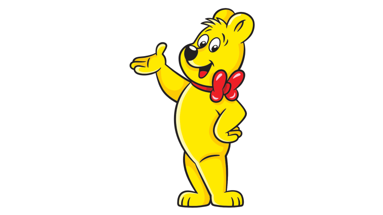
Beyond the wordmark, Haribo’s brand identity is closely associated with its iconic mascot, the yellow Haribo bear with a red bow. This character reinforces the logo meaning by adding a friendly, playful presence that resonates strongly with children while evoking nostalgia among adults. Together, the logo and mascot form a cohesive visual language centered on happiness.
Typography and Color
Typography is the backbone of Haribo’s visual identity. The all-caps wordmark is set in a bold, rounded typeface closely related to Helvetica Rounded Bold Condensed and VAG Rounded. The softened geometry eliminates sharp edges, creating a sense of comfort and fun that aligns perfectly with the brand’s products.
Color plays an equally powerful role. Haribo’s signature scarlet red is energetic, warm, and emotionally charged. It symbolizes passion, excitement, and joy, making it one of the most effective colors for attracting attention. Paired with white highlights and outlines, the red lettering becomes vibrant and dynamic, reinforcing the brand’s joyful logo heritage.
Haribo and the Power of Emotional Logo Heritage
The Haribo logo history demonstrates how a brand can achieve global recognition through emotional consistency rather than constant reinvention. By refining its visual identity while preserving its core message, Haribo built one of the most enduring and joyful logos in consumer branding.
As a symbol of happiness and nostalgia, Haribo’s logo heritage stands as proof that strong typography, expressive color, and emotional clarity can create timeless brand value. Few logos in the world communicate joy as instantly and universally as Haribo’s.
Haribo Logo FAQ
What does the Haribo logo represent?
The Haribo logo represents happiness, fun, and emotional warmth, using rounded typography and bright red color to evoke joy.
Where does the name Haribo come from?
Haribo is an abbreviation of Hans Riegel, the founder, and Bonn, the city where the company was established.
Why is the Haribo logo red?
Red symbolizes energy, excitement, and warmth, aligning with the brand’s goal of making consumers happy.
When was the current Haribo logo introduced?
The current three-dimensional version of the Haribo logo was introduced in 2015.
What font is used in the Haribo logo?
The logo uses a bold rounded typeface similar to Helvetica Rounded Bold Condensed and VAG Rounded.