Giorgio Armani Logo History: Meaning, Symbolism & Brand Heritage
![]()
There are few names in modern fashion that evoke timelessness with the same quiet power as Giorgio Armani. More than a brand, Armani represents an aesthetic philosophy: purity of line, the discipline of minimalism, and a devotion to elegance stripped of excess.
When Giorgio Armani founded his label in 1975, he reshaped the language of fashion design, particularly menswear, with soft tailoring and a palette of discreet sophistication. His rise was not accidental but the natural evolution of a designer who mastered restraint, respected form, and understood how clothing can speak without shouting.
In many ways, Armani’s visual identity mirrors his design ethos. The Giorgio Armani logo is not flamboyant, nor does it chase trends. It is a masterclass in minimalism — an emblem that radiates quiet authority, composure, and taste. To understand the brand’s symbolic and graphic heritage is to understand the man who shaped it: disciplined, deliberate, and unwaveringly dedicated to refinement.
Origins of Giorgio Armani: From Apprentice to Legend
Before the name Armani became synonymous with global luxury, Giorgio Armani was a young designer navigating the rigorous world of Italian tailoring. His entry into fashion during the early 1960s through Nino Cerruti’s Hitman label placed him within a creative environment defined by precision and craftsmanship. Armani’s work on menswear quickly gained attention for its sensitivity to proportion and comfort — qualities that would later become signatures of his own house.
Throughout this period, Armani freelanced for multiple fashion labels, honing his instinct for construction and fabric. By 1970, together with Sergio Galeotti, he opened an independent design studio that soon attracted the attention of Milan’s fashion insiders. Their collaboration matured into the founding of Giorgio Armani S.p.A. in 1975, marking the birth of a label that would transform both menswear and womenswear through its quiet revolution of relaxed elegance.
By 1980, Armani’s empire had expanded into fragrances, accessories, and global retail. Sub-brands such as Emporio Armani, Armani Jeans, Armani Junior, and Armani Exchange would eventually form a multilayered universe, each with its role yet all bound by the same DNA: discipline, simplicity, and a distinctly Italian sophistication.
Meaning & Symbolism Behind the Armani Identity
Every element of Armani’s visual identity is built upon clarity. Where many luxury houses depend on elaborate symbols or ornate typographies, Armani pursues restraint. The logo communicates through proportion, geometry, and negative space rather than embellishment. This minimalistic approach is not an absence of meaning — it is a reflection of the brand’s core philosophy: elegance through reduction.
The primary Giorgio Armani logotype, maintained since 1975, uses serif typography with refined proportions. The very architecture of the letters expresses equilibrium, control, structure, and timelessness. Nothing is overstated, nothing is unnecessary. This is the Giorgio Armani ethos in its purest graphic form.
The emblematic eagle, associated more with Emporio Armani, speaks to a different facet of the brand — one rooted in dynamism and ambition. Its forward-facing gaze and upward wings suggest aspiration and progression. The eagle is not flamboyant; it is architectural, linear, modern. Its message is unmistakable: power, precision, and leadership.
At the center of the brand’s heritage lies the famous GA monogram — an interlocking geometric circle formed by the letters “G” and “A”. It is a symbol of completeness and continuity, an emblem that subtly references the designer’s name while embodying the circular perfection that Armani builds into his garments.
![]()
Logo Evolution Timeline: The Visual Story of Giorgio Armani
1975–Today: The Eternal Logotype
From the moment Giorgio Armani launched his fashion house, the brand adopted a typographic identity that has barely changed. This first and enduring logotype is set entirely in uppercase serif letters, elegantly spaced and precisely balanced. Its black-on-white execution evokes luxury without ornamentation, echoing the clean architectural silhouettes of Armani’s suits.
The typeface resembles classical serif families such as Elegante Roman and An Education, characterized by sharp serifs, graceful vertical tension, and a moderate stroke contrast. What makes it distinctly Armani is the harmony of proportions — a visual parallel to the controlled tailoring of his garments. Because of its purity, the logo has remained untouched for nearly five decades, a testament to the timelessness of the brand’s design philosophy.
![]()
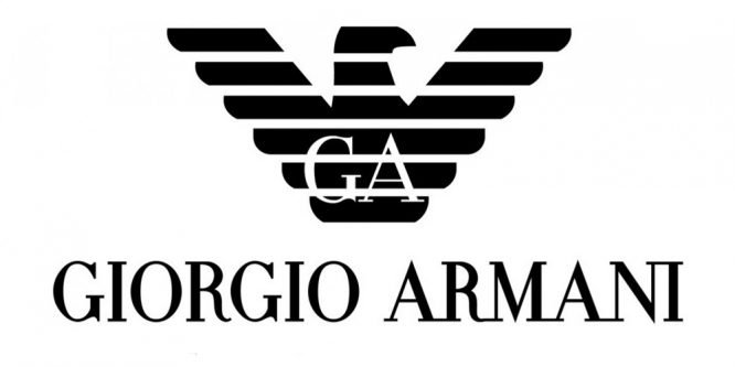
The Eagle Emblem: Power, Precision, and Modernity
While the Giorgio Armani logotype remains the cornerstone of the brand’s identity, the stylized eagle introduced for Emporio Armani has become one of the most recognizable symbols in contemporary fashion. Unlike traditional heraldic eagles, the Armani bird is reduced to horizontal black bars shaped into an abstract, futuristic form. Its wings are outstretched, its head turned to the right, signifying forward momentum.
The eagle symbolizes strength, intelligence, and dominance — values aligned with Emporio Armani’s positioning as a youthful, dynamic, urban sub-label. Its graphic minimalism carries Armani’s aesthetic signature, merging classic symbolism with modern geometry.
The GA Monogram: Circular Harmony
The iconic GA monogram represents one of the brand’s most elegant visual inventions. Formed by interlocking the initials “G” and “A” into a perfectly balanced circular emblem, the logo blends symmetry with modernity. The rounded shapes evoke continuity and cohesion, while the elongated internal strokes add a sense of movement and finesse.
Often reproduced in black, silver, or soft beige, the GA monogram functions as a hallmark of the brand’s accessories, from watches and eyewear to leather goods. It is understated yet unmistakable — a quiet icon in a world of loud fashion branding.
![]()
Typography and Color: The Silent Language of Armani
Armani’s typographic universe is characterized by stability and refinement. The serif typeface used for the Giorgio Armani primary logo relies on precise verticals and elegantly extended terminals, reflecting the designer’s passion for discipline and structure. It is a typeface anchored in tradition but elevated through minimalistic interpretation.
In terms of color, Armani consistently returns to monochrome. Black and white reflect luxury, neutrality, and permanence — the perfect canvas for a brand that built its success on tailoring, silhouette, and tactile experience rather than flamboyant graphics. On certain lines or monograms, beige or metallic tones appear, selected for their associations with sophistication, warmth, and timeless elegance.
The Enduring Legacy of Armani’s Visual Identity
The Giorgio Armani logo stands among the most stable identities in the luxury sector. While the fashion industry cycles through rapid cultural shifts, the Armani aesthetic remains remarkably consistent — a testament to the clarity of Giorgio Armani’s creative vision. The logotype, the eagle emblem, and the GA monogram each represent facets of the brand’s identity: refined elegance, dynamic ambition, and timeless classicism.
Together, they form a visual heritage that has endured for nearly fifty years, proving that true luxury does not require reinvention — only refinement.
FAQ Giorgio Armani Logo & Brand Identity
What does the Giorgio Armani logo represent?
The primary Giorgio Armani logo represents refined minimalism and timeless elegance, using a classic serif logotype to convey authority and luxury.
Why does Armani use an eagle in its branding?
The stylized eagle, associated mainly with Emporio Armani, symbolizes strength, ambition, and forward momentum through its geometric, upward-leading wings.
What is the GA monogram?
It is a circular emblem formed by the interlocking initials “G” and “A”, representing harmony, continuity, and the iconic signature of the Armani brand.
Who owns Giorgio Armani today?
Giorgio Armani S.p.A. remains privately owned, with Giorgio Armani retaining full control over the company.
What is Armani best known for?
Armani is globally recognized for its soft tailoring, minimalist elegance, luxury ready-to-wear, accessories, fragrance collections, and refined interior design lines.