Fendi Logo History: Meaning, Symbolism & Brand Heritage
![]()
Fendi carries a presence that feels almost inseparable from the city where it was born. Founded in Rome in 1925 by Edoardo and Adele Fendi, the maison grew from a small family atelier into one of the most influential fashion houses of the modern era. What sets Fendi apart has always been its ability to weave tradition with reinvention — a balance reflected not only in its craftsmanship, but also in the evolution of its visual identity.
Long before the double-F became a global monogram, the brand expressed itself through symbols that were intimate, unexpected and deeply tied to family heritage. Over the decades, as Fendi expanded and transformed under visionary designers like Karl Lagerfeld, its logo followed the same trajectory: from a charming personal emblem to one of the most recognizable marks in luxury fashion.
Tracing the history of the Fendi logo is, in many ways, tracing the story of the house itself — its Roman roots, its creative milestones, and the visual language that continues to define the brand almost a century later.
Fendi Logo Evolution: A Chronological Journey Through Nearly a Century of Identity
![]()
1925–1965: The Squirrel and the Roots of a Roman Maison
The story of the Fendi logo begins long before the monogram entered the vocabulary of luxury fashion. When Edoardo and Adele Fendi opened their Roman atelier in 1925, the emblem chosen to represent their family business was a small, charming squirrel perched on a branch. The symbol was personal rather than commercial: Edoardo had gifted his wife a painting of a squirrel, a playful nod to how tirelessly she worked. Beneath the illustration, a turquoise-blue wordmark and the founding year completed the earliest Fendi identity, a logo intimately tied to family and heritage.
![]()
1965–2000: Karl Lagerfeld and the Birth of the Double-F
A new era began in 1965, when Karl Lagerfeld arrived in Rome and reshaped the house’s visual identity. In a matter of seconds — as he often recalled — he sketched the double-F emblem that would become one of fashion’s most influential symbols. Originally standing for “Fun Fur,” the mirrored Fs encapsulated the innovative spirit of the brand, its reinterpretation of fur, and its bold, contemporary aesthetic. Paired with a strong uppercase wordmark in a tall, straight sans-serif, the new logo captured Fendi’s transformation from a family workshop into a modern luxury house.
![]()
2000–2013: Minimalism and the Wordmark Era
At the start of the new millennium, Fendi refined its visual identity by temporarily removing the double-F from its official logo. The monogram remained a central motif on fabrics, hardware, and accessories, but the brand’s primary signature became a clean and spacious sans-serif inscription. With generous letter spacing and a refined geometric structure, the new wordmark mirrored the minimalist design trends that defined early 2000s luxury.
![]()
2013–Present: The Rounded Roman Signature
The redesign of 2013 brought warmth and softness back into the logo. The wordmark adopted rounded terminals and smoother contours, giving the brand a friendlier yet unmistakably luxurious tone. Beneath it, the addition of the small “ROMA” tagline reconnected the house to its birthplace and creative foundation. Today, both the double-F monogram and the rounded FENDI ROMA wordmark coexist as twin pillars of the brand’s visual universe — one expressive and iconic, the other clean and architectural.
![]()
The Symbol: Understanding the Double-F
Few icons in fashion are as influential as Fendi’s “FF” monogram, often referred to as the “Zucca” (the inverted “F”). The two letters, stacked and mirrored, create a rhythm, a sense of motion and an architectural balance that reflects the brand’s ability to bridge classic and contemporary design.
Despite sharing the same letter, the “F” in the monogram differs subtly from the “F” in the wordmark, giving each part of the identity its own personality. This distinction adds visual richness and helps the logo adapt seamlessly across applications — from handbag clasps to jewelry, from sunglasses to haute couture.
Fendi also uses a script logo in certain contexts, built from the Helvetica Bold typeface. This clean, grotesque sans-serif adds versatility to a brand that thrives on hybrid identities.
![]()
Fendi on Bags and Accessories
The double-F appears across accessories in different ways, each reflecting a specific design intention. On iconic handbags like the Baguette or Peekaboo, the logo often forms the clasp — a focal point where metalwork meets branding. Other bags use FF-printed fabric, turning the emblem into a repeating textile pattern that has become synonymous with Fendi’s visual language.
Inside the bags, the lining frequently carries the monogram as well, reinforcing authenticity and craftsmanship through every detail.
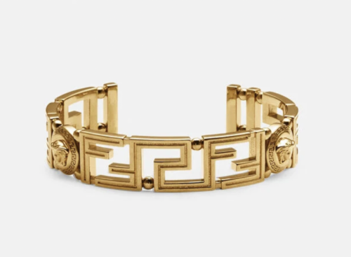
Jewelry and bracelets interpret the logo in sculptural ways: wide metallic cuffs with oversized monograms, chain bracelets featuring individual letters as charms, and leather bracelets adorned with FF-engraved clasps.
Typography and Color: The Silent Foundations of Luxury
The current Fendi logotype uses a soft-rounded, extra-bold sans-serif reminiscent of typefaces like Bondan Regular Bold or Innovate P Rounded Bold, though custom-tailored to the brand’s exacting standards. Letters spaced generously apart give the wordmark an architectural confidence.
Color remains consistently black and white — a timeless palette rooted in fashion tradition. This restraint gives the Fendi logo an elegant neutrality, allowing it to adapt seamlessly across luxury materials, from gold hardware to printed silk.
Conclusion: A Legacy Etched in Two Letters
Fendi’s logo evolution mirrors the brand’s journey from a small Roman leather shop to an international fashion powerhouse. From the charming squirrel of 1925 to the monumental double-F of Karl Lagerfeld, each chapter reveals a brand constantly reinventing itself while staying deeply connected to its roots. The modern Fendi logo, minimalistic yet iconic, expresses the essence of the house: bold creativity, timeless luxury, and the unmistakable Roman soul that defines one of fashion’s most enduring emblems.
Fendi Logo FAQ: History, Meaning, Symbolism and Evolution
What does the Fendi logo represent?
The double-F emblem represents “Fun Fur,” the concept introduced by Karl Lagerfeld in 1965, and today stands as a symbol of modern Italian luxury and avant-garde creativity.
Why did Fendi change its original squirrel logo?
The original squirrel was a personal family symbol. When Karl Lagerfeld joined the house in 1965, he modernized the identity to reflect Fendi’s growing international influence and contemporary direction.
Is the double-F the official Fendi logo today?
The double-F is used widely on products and patterns, while the official corporate logo is the rounded sans-serif FENDI wordmark accompanied by “ROMA.”
What font does Fendi use?
The primary logotype uses a custom rounded sans-serif, similar to Bondan Regular Bold or Innovate P Rounded Bold. The script logo uses Helvetica Bold.
What is the meaning of “Roma” in the logo?
“ROMA” honors the city where Fendi was founded and reflects the brand’s enduring connection to Roman culture, architecture and craftsmanship.