Dodge Logo History: Meaning, Symbolism & Brand Heritage
![]()
Dodge is one of the most storied names in American automotive culture — a brand forged in Detroit’s industrial rise, tempered by racing ambition, and defined by a fierce commitment to raw mechanical power. Founded in 1900 by brothers John and Horace Dodge, the company first built engines and components for other automakers, including Ford. But when Dodge introduced its first automobile in 1914, the marque quickly became synonymous with durability, engineering confidence and a distinctly American form of muscular design.
Across more than a century, Dodge has reinvented itself multiple times — shifting ownership, expanding its product line, surviving war, recession and market upheavals — yet its visual identity has remained one of the most fascinating and diverse in automotive history. Few brands have reshaped their logo as radically or as often. From industrial emblems to geometric abstractions, from pentagrams to rams, Dodge’s logo evolution traces a narrative of innovation, ambition and unmistakable American attitude.
Below is a complete exploration of Dodge’s visual heritage — a look at the meanings behind each transformation, the symbols that shaped the brand, and the artistic lineage that makes the Dodge emblem one of the most dynamic in the automotive world.
The Meaning Behind the Dodge Name
The Dodge name carries a straightforward origin: it is simply the surname of the company’s founders, John Francis Dodge and Horace Elgin Dodge. Yet behind that simplicity lies a deeper story of craft and capability. Before introducing a single car of their own, the Dodge brothers were already respected as the most skilled machinists and component builders in Detroit. By the time their own automobiles entered production, the Dodge name had come to signify not just product identity, but engineering authority.
As a brand, Dodge has long positioned itself as a builder of powerful, honest, driver-focused vehicles. Its visual identity reflects this worldview — often sharp, geometric, mechanical, and energetic — a graphic language built for performance.
Dodge Logo Evolution Timeline
![]()
1910–1914: The Industrial Monogram
The earliest Dodge emblem reflected the company’s roots in the world of mechanical fabrication. The logo resembled a stylized bearing — a circular industrial frame enclosing an intertwined “DB” monogram for Dodge Brothers. It looked technical, engineered, confident — and perfectly suited to the company’s role as a parts supplier before automobile production began.
![]()
1914–1928: The Star Emblem and the Global Ambition
The redesign of 1914 introduced one of the most storied symbols in Dodge history: a six-pointed star (often described as a Magen David) placed over a globe. At the center, the “DB” monogram remained. Rather than a religious reference, the star symbolized harmony, interconnection and the universal reach Dodge aspired to. The globe signified international presence at a time when American automaking was rapidly expanding beyond national borders.
With bold white lettering placed along the circular border, the emblem conveyed sophistication and global ambition — a significant visual leap for the brand.
![]()
1928–1955: A Bold Wordmark for the Chrysler Era
After Dodge was purchased by Chrysler Corporation in 1928, the intricate design gave way to a simple yet imposing typographic logo: the word “DODGE” in a narrowed serif typeface with thick, confident strokes. It was direct, authoritative and easier to reproduce — ideal for a company integrating into Chrysler’s rapidly growing portfolio.
![]()
1955–1962: Triangular Motion and Aerospace Influence
By the mid-1950s, American culture was fixated on rockets, satellites and the promise of the space age. Dodge embraced this cultural shift with a bold new logo composed of two angular, intersecting shapes in blue and red — figures resembling stylized triangles or “birds” in flight. This emblem symbolized speed, progress, optimism and technological ambition.
![]()
1962–1968: The Fractured Triangle
The next design refined the triangular theme. Three angled shapes, forming the suggestion of a triangle yet separated by space, created an emblem that was both stable and dynamic. The silver-blue palette conveyed precision and modernity, reflecting Chrysler’s expanding engineering capabilities.
![]()
1964–1993: The Scarlet Wordmark
Parallel to its symbol-based emblems, Dodge introduced a clean, slanted logotype in bright scarlet red. The open-ended shapes of the letters gave the inscription movement and lightness, while the color choice reinforced energy, performance and attention-grabbing confidence. This wordmark became a familiar sight throughout Dodge’s mid-century advertising.
![]()
1980–1993: The Double Pentastar
Chrysler’s corporate symbol — the Pentastar — made its way into the Dodge identity. A red outer pentastar contained a white inner one, creating a strong geometric emblem associated with unity, power and structure. This logo linked Dodge more closely to its parent company during a period of intense brand consolidation.
![]()
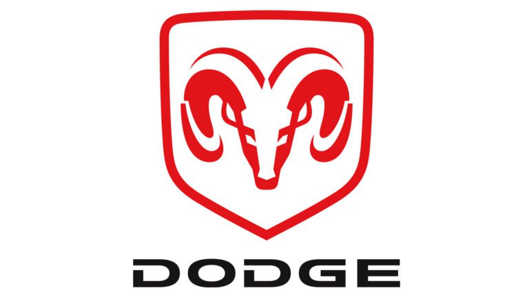
1994–2010: The Ram Head — A New American Icon
In 1994, Dodge introduced what would become one of the most recognizable emblems in American automotive history: the ram’s head. The bold red shield with a sculptural ram represented toughness, aggression and the rugged character of Dodge trucks.
Although the logo is often jokingly compared online with unintended anatomical shapes, the ram carried real significance. In mythology and astrology, the ram symbolizes leadership, determination and raw force — qualities Dodge sought to embody. It also tied back to the Dodge brothers’ reputation for fearlessness.
![]()
2010–2022: The Dual Stripes and a Modern Wordmark
In 2010, the official Dodge badge shifted to a sleek silver wordmark accompanied by two diagonal red stripes — a graphic gesture implying acceleration, direction and motion. The ram symbol remained associated primarily with RAM Trucks, which became a separate brand in the Chrysler lineup.
This design brought Dodge into the modern performance era, aligning with its muscle-focused portfolio of Chargers, Challengers and performance SUVs.
![]()
2022–Today: The Return of the Fractured Triangle
The most recent redesign reintroduced the geometric three-part symbol first explored in the 1960s — but now rendered in neon red outlines on a black background. Futuristic, sharp and aggressive, the new emblem echoes Dodge’s modern identity as a performance-driven brand entering the electric era.
It feels at once retro and avant-garde, a visual bridge between heritage and the brand’s next technological chapter.
![]()
Symbolism of the Dodge Emblem
Dodge’s symbolic language has ranged from industrial to mythical to geometric. Yet several themes remain constant:
Power: Through rams, angular shapes and bold typography, Dodge emphasizes physical strength.
Motion: Slants, stripes, triangles and fractured forms all evoke speed and acceleration.
American identity: The brand’s emblems often have the rawness, directness and muscularity associated with American automotive culture.
Heritage: Whether through the Dodge Brothers monogram or the return of classic geometric motifs, the brand maintains strong ties to its early visual forms.
The modern neon triangle pays homage to both past and future — a striking emblem of performance and transformation.
Typography & Color
The Dodge logotype has changed many times, but modern versions consistently use extended uppercase characters with increased horizontal tension. The typeface resembles Ordin Rounded, modified to be sharper, wider and more aggressive. The stretched proportions suggest speed and mechanical precision, while the clean sans-serif construction keeps the logo contemporary and legible.
Silver metallics and red form the backbone of Dodge’s color identity. Silver conveys engineering, machinery and technical excellence. Red represents passion, competition, performance and power. From the mid-20th century to today, this palette has helped position Dodge as an energetic, assertive and unmistakably performance-oriented brand.
The Legacy of a Transforming American Icon
Few automotive brands have reshaped their identity as boldly as Dodge. From industrial monograms to global symbols, from pentagrams to rams and neon geometry, Dodge has always reflected the cultural moment — from early mechanization to the jet age to American muscle to the electric future. Yet behind every redesign lies the same fundamental spirit: power, motion and an unwavering commitment to performance.
Dodge’s logo is more than a trademark; it is a living record of American automotive evolution — a heritage written in steel, speed and symbolism.
Dodge Logo FAQ: History, Meaning, Symbolism and Evolution
What does the Dodge logo represent?
Depending on the era: industrial engineering, global ambition, geometric motion or the ram’s qualities of strength and leadership. Today’s neon geometric emblem symbolizes performance and modernity.
Why did Dodge stop using the ram head?
Because RAM became an independent brand within Stellantis (formerly FCA), representing Dodge’s truck division. The ram symbol remained with RAM Trucks.
What is the meaning behind the 2022 Dodge logo?
It revives the 1960s three-angle emblem, now outlined in neon red — a modern expression of power, speed and electric-era design.
Is Dodge still owned by Chrysler?
Dodge is now part of Stellantis, the global corporation formed from the merger of Fiat Chrysler Automobiles and PSA Group.