Danone Logo History: Meaning, Symbolism & Brand Heritage
![]()
Few corporate identities in the food industry carry the emotional weight and global familiarity of Danone. Founded in Barcelona in 1919 by Isaac Carasso and later moved to France, the brand has spent more than a century redefining how the world perceives yogurt, dairy products, and nutrition. Danone evolved from a modest family initiative into one of the world’s largest food corporations, operating in more than 130 countries and shaping the everyday diets of hundreds of millions.
Over decades of expansion, acquisitions, social missions, and scientific research, Danone refined its identity not simply as a manufacturer, but as a guardian of health and well-being. The logo mirrored these transformations: from early geometric inscriptions to warm, approachable designs speaking to trust, care, and the company’s enduring vision of nourishing people and the planet. Today, the Danone logo is one of the most universally recognized signatures on supermarket shelves worldwide—a symbol woven into the daily routines of families across continents.
Danone Meaning and Symbolism
The Danone identity has always carried more than a corporate message. At its core lies a philosophy of purity, trust, and quality. The brand name itself derives from “Daniel,” the founder’s son, linking the company’s essence directly to family values and care. Danone matured into an emblem of healthy living, relying on natural ingredients and pioneering nutritional research long before these became global priorities.
As the company grew, its logo increasingly emphasized accessibility and optimism. The curved underline, which eventually became a smile, symbolized joy and confidence in the product’s quality. The later introduction of the emblem featuring a child gazing at a star brought emotional resonance, reflecting both heritage—Daniel Carasso as a child—and the brand’s forward-looking focus on future generations. The star suggested aspirations and hope, while the upward gaze reinforced Danone’s mission of inspiring healthier lifestyles around the world.
Danone Brand Heritage
Danone’s heritage is rooted in craftsmanship and purpose. Isaac Carasso began making yogurt to help combat digestive illnesses in children—an origin story that deeply shaped the brand’s long-term commitment to health. Over decades, Danone expanded far beyond its Mediterranean beginnings, moving into Western Europe and then global markets. Its identity remained consistent: natural ingredients, scientific rigor, and a blend of tradition with innovation.
By the late twentieth century, Danone was no longer just a food producer; it had become a multinational corporation with a portfolio spanning dairy, water, infant nutrition, and medical nutrition. Yet the company continually returned to its heritage to guide its visual and strategic decisions. Every logo evolution honored the emotional history of the brand while modernizing its execution to meet contemporary expectations.
Danone Logo History & Evolution Timeline
![]()
1919–1968: The Geometric Origins
The very first Danone logo, introduced at the brand’s birth in 1919, featured bold uppercase lettering executed in a striking red. Its geometric sans-serif structure conveyed stability and modernity, while small artistic interventions—the triangular crossbar in the “A” and a circular middle stroke in the “E”—created a distinctive visual language. For nearly fifty years, this minimal yet energetic mark defined the company, symbolizing early ambition and industrial confidence.
![]()
1968–1980: A Softer Identity Emerges
In 1968, Danone ventured into a friendlier and more organic direction. The palette shifted from red to deep blue, and the typography adopted rounded, softened contours. The letter “O” was stylized as an egg, reinforcing the company’s association with natural products. The mood moved decisively toward nourishment and gentleness, matching Danone’s evolution into a family-oriented brand.
![]()
1970–1995: The Era of the Oval and Early Branding Systems
The 1970s introduced a more structured visual system. A purple horizontal oval housed the wordmark, creating a unified badge that improved shelf visibility. Later variations added segmented shapes, bolder contrasts, and multitone blues symbolizing freshness and reliability. Throughout this period, Danone experimented with geometry to build an identity recognizable across expanding international markets.
![]()
1992–2004: The Smile Appears
In the early 1990s, the logo adopted a clearer, brighter identity. The hexagon was streamlined, colors intensified, and a red curved line appeared beneath the wordmark. This curve, initially an abstract dynamic stroke, soon evolved into the iconic smile—one of the most memorable elements in Danone’s modern visual universe. It brought emotional warmth and friendliness, suggesting satisfaction and trust.
![]()
2004–Today: Refinement and Human Warmth
The 2004 redesign established the silhouette most consumers still recognize. The hexagon was replaced by a softened oval with gently rounded sides, emphasizing approachability. The smile became more expressive, while the white wordmark atop a vivid blue field made the composition feel clear and optimistic. The brand fully embraced its identity as a global ambassador for health and joy.
![]()
2013–2020: Reversal of Contrast
Danone inverted its design for a cleaner, more contemporary feel—white became dominant while the wordmark turned blue. The red smile grew more confident and dynamic. This reversal refreshed the brand without losing its core symbolism, making it compatible with digital environments and modern packaging.
![]()
2020–Today: A Pursuit of Simplicity and Purpose
Danone’s 2020 rebranding aligned with its sustainability mission. The typography became thinner and more refined, gradients were removed, and solid blue tones delivered clarity and responsibility. The enlarged smile anchored the composition, reinforcing the emotional connection between brand and consumer. The update signaled a commitment to transparency, health, and planetary well-being.
![]()
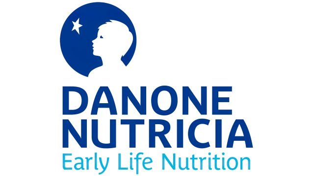
The Emblem
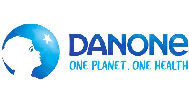
While Danone relied solely on its logotype for most of the twentieth century, the 1990s marked the introduction of a figurative emblem: a child looking up at a star, encased within a circular frame. The image represented Daniel Carasso, embodying the brand’s origins and its dedication to future generations. The star symbolized aspiration, optimism, and the pursuit of better health.
A 2017 refinement softened the illustration, introduced lighter blue gradients, and added the handwritten tagline “One Planet. One Health.” This phrase captured Danone’s global responsibility narrative, emphasizing the interconnectedness between human health and environmental stewardship. The emblem became a storytelling device—a portrait of heritage, mission, and hope.
Design Analysis, Font & Color
Typographically, Danone has consistently embraced clarity. The current lettering is a contemporary sans serif with open shapes and gentle curves, echoing accessibility and purity. While reminiscent of commercial fonts like Nouveau Poster JNL or Feltboard JNL, the Danone logotype remains distinct thanks to tailored proportions and softened geometry.
Color has always been central to Danone’s visual identity. Blue dominates the brand’s history, symbolizing trust, freshness, and honesty—traits integral to the food industry. The red smile adds contrast and energy, evoking joy, vitality, and human warmth. Together, the palette reflects a balance between scientific reliability and emotional connection.
The Enduring Power of a Global Food Icon
The evolution of the Danone logo tells a story of more than aesthetics; it charts a century of transformation, from family enterprise to global leader in nutrition. Each iteration retained the brand’s essence while adapting to cultural shifts, scientific progress, and changing consumer expectations. The smile, the blue, the child looking at the star—these elements form a narrative of care, optimism, and responsibility.
Danone’s identity remains rooted in its heritage, driven by innovation, and aligned with a vision that sees health not as a product, but as a shared journey. In this sense, the Danone logo stands as both symbol and promise—an enduring mark of quality, trust, and nourishment for generations.
FAQ — Danone Logo & Brand Identity
What does the Danone logo represent?
The Danone logo symbolizes trust, health, and optimism, combining a clean wordmark with a smile motif and, in the emblem version, a child looking at a star to represent hope and future generations.
Why does Danone use blue in its logo?
Blue reflects purity, trust, and freshness—values central to the brand’s identity as a global food and nutrition leader.
What is the meaning of the Danone smile?
The smile conveys satisfaction, friendliness, and connection, reinforcing the brand’s mission to promote well-being through better nutrition.
Who is the child in the Danone emblem?
The child represents Daniel Carasso, the founder’s son, whose name inspired the brand. It symbolizes heritage, care, and the brand’s focus on future generations.
When was the current Danone logo introduced?
The modern minimalist version debuted in 2020, aligning with Danone’s sustainability vision and simplifying the iconic shapes for contemporary use.