Chanel Logo Heritage: Meaning, History & Brand Identity
![]()
Few fashion houses embody timeless elegance the way Chanel does. Founded in 1910 in Paris by the legendary Gabrielle “Coco” Chanel, the brand became a cultural force that redefined women’s fashion—introducing the little black dress, liberating silhouettes, and elevating simplicity into an art form. Today, Chanel spans haute couture, ready-to-wear, beauty, jewelry, sports equipment, and one of the most iconic perfume lines ever created. Yet amid all this expansion, one visual element has remained untouched for nearly a century: the iconic interlocking CC logo.
More than a trademark, the Chanel logo is a symbol of heritage, craftsmanship, and a philosophy built on clarity, comfort, and understated glamour. It is one of the most recognizable emblems in luxury history—and one of the strongest examples of logo heritage in the fashion world.
A Legacy Begins: Coco Chanel and the Birth of a Symbol
Although the Chanel fashion house opened in 1910, the official story of its famous logo begins in 1925, when Coco Chanel released the now-mythical fragrance Chanel No. 5. To accompany the perfume, she designed a monogram of two intertwined, mirrored Cs—a design so simple yet so striking that it would become the face of the brand.
While many believe the “CC” simply stands for Coco Chanel, the story is richer. During her childhood, Gabrielle spent years in an orphanage operated by the Aubazine monastery. The chapel’s stained-glass windows featured elegant geometric patterns—curves and mirrored shapes that she admired deeply. One particular motif inspired the shape of what would later become the Chanel emblem.
Thus, the logo blends personal history, emotional memory, and aesthetic purity. It is both a tribute to Coco’s origins and a symbol of the modern, liberated woman she envisioned.
Chanel Logo Evolution: A Century of Refined Identity
1910–Today: A Wordmark That Defines Modern Luxury
The earliest Chanel identity consisted simply of a bold black logotype, appearing on garments and accessories. Chanel embraced black and white not just for practicality but for its symbolism: clarity, elegance, and uncompromising strength.
Unlike most brands, Chanel has kept both its wordmark and its monogram virtually unchanged since their creation—a rare achievement in logo history.
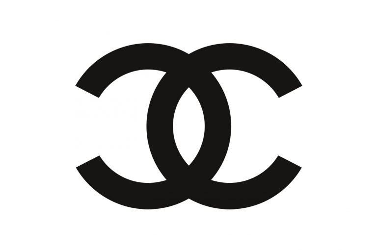
1925–Today: The CC Monogram Takes Its Place in Iconic Fashion
![]()
Introduced in 1925 for Chanel No. 5, the double-C monogram quickly became the ultimate mark of luxury. By 1926, the symbol was added to couture collections, jewelry, handbags, and accessories.
The emblem consists of:
– two interlocked, mirrored Cs
– perfectly balanced negative space
– clean geometric lines
– an optional circular outline (added later for select product lines)
Its design reflects Coco Chanel’s philosophy: beauty through clarity, minimalism with meaning.
The Logo’s Only Subtle Tweaks
Chanel is famously strict about preserving its identity, but two small variations appeared across the decades:
1940s:
A lightweight uppercase logotype was added beneath the monogram for select applications.
1950s:
A thin circular frame was introduced around the CC for products in the fragrance and cosmetics categories. This bordered emblem remains in use today on beauty packaging.
Beyond these, the core monogram has remained untouched—a symbol of discipline and brand integrity.
Symbolism: Why the Chanel Logo Endures
The CC monogram is the purest expression of Coco Chanel’s design values:
Geometry & Balance
The perfect symmetry of the two Cs creates a sense of harmony and permanence.
Comfort & Simplicity
Coco believed that luxury must also feel effortless—and the logo reflects that belief.
Honoring the Past
The monogram carries echoes of the monastery windows that shaped Coco’s early aesthetic sensibility.
Universal Recognition
It transcends language, culture, and geography—an immediate signal of refinement.
Versatility
It sits seamlessly on everything from perfume bottles to quilted handbags to fine jewelry.
In short, the Chanel emblem is not merely a logo—it is emotional architecture.
Typography and Color: The Chanel Signature
![]()
Typography
The CHANEL wordmark uses a custom bold uppercase sans-serif typeface with clean cuts, geometric balance, and strong proportions. While close to fonts like Double Porter 3, RoundCut Bold, or ITC Blair Pro Bold, the Chanel lettering is unique to the brand.
A secondary typeface family—seen in campaigns and editorial work—is also minimalist, modern, and strictly monochromatic.
Color Palette
Chanel uses a strict black-and-white palette, symbolizing:
-
elegance
-
duality
-
timelessness
-
authority
-
purity of form
Both positive (black on white) and reverse (white on black) versions are equally iconic.
Chanel Jewelry: The Logo as a Luxury Statement
Chanel Logo Earrings
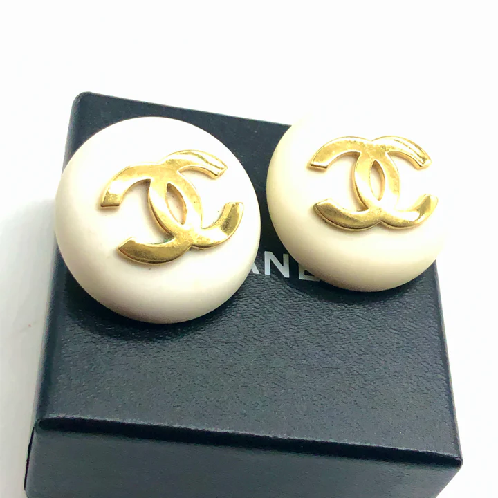
The CC monogram has become one of the world’s most coveted motifs in fashion jewelry. Chanel earrings—sometimes minimalist, sometimes embellished with pearls or crystals—are a global symbol of luxury.
The earrings demonstrate Coco’s belief that accessories should be expressive yet simple. Whether crafted from precious metals or designed with pearl detailing, the CC earrings need no explanation—they speak for themselves.
Chanel Logo Necklaces
![]()
Chanel necklaces incorporate the monogram into long chains, chokers, and delicate pendants. Pearl accents are common, echoing Coco Chanel’s love of effortless sophistication. A string of pearls was her signature accessory—hence why many CC necklaces use pearls as a central theme.
The result is a line of jewelry that blends iconic branding with refined femininity.
Conclusion
The Chanel logo represents more than a fashion house—it is the visual embodiment of Coco Chanel’s philosophy: simplicity with depth, elegance without excess, and identity rooted in personal heritage. For nearly a century, the interlocking CC monogram has remained unchanged, becoming the ultimate symbol of luxury and refinement.
In the world of logo heritage, few emblems demonstrate such enduring power. The Chanel logo is not only instantly recognizable—it is a piece of cultural history, an icon of femininity, and a timeless representation of the most influential fashion house ever created.
Chanel Logo and the Foundations of Luxury Branding
Chanel’s visual identity reflects the essence of French luxury through simplicity, balance, and restraint. Its logo is part of a broader tradition in which national culture plays a defining role, explored in Luxury Fashion Logos Explained: Brand Origins and Meaning.
FAQ
When was the Chanel logo created?
The CC monogram was created in 1925 for the Chanel No. 5 perfume and quickly became the brand’s official emblem.
What does the “CC” stand for?
It represents the initials of Coco Chanel—Gabrielle Chanel’s nickname from her youth.
Why are black and white used in the logo?
Coco Chanel believed black and white symbolize elegance, clarity, and modernity—core values of the brand.
Has the Chanel logo ever been redesigned?
Only minimally. Aside from small adjustments in the 1940s and 1950s, the core monogram has remained unchanged.
What inspired the design of the logo?
Coco Chanel was influenced by geometric patterns in the stained-glass windows of the Aubazine monastery where she spent part of her childhood.