Caterpillar Logo History: Meaning, Symbolism & Brand Heritage
![]()
Few industrial symbols command recognition as instantly and universally as the Caterpillar logo. Whether displayed on a colossal mining truck cutting across dusty terrain or stitched onto a contractor’s jacket, the bold CAT insignia has become synonymous with durability, engineering excellence, and American industrial heritage. Yet the path to this unmistakable visual identity spans nearly a century of innovation, mergers, technological leaps, and evolving design philosophies.
Caterpillar Inc., formed in 1925 through the merger of the Holt Manufacturing Company and the C. L. Best Tractor Co., emerged at a time when mechanization was reshaping the agricultural and construction landscapes. The brand’s earliest visual identities reflected its eclectic origins: sometimes literal, sometimes experimental, and often rooted in the grit of early 20th-century engineering.
Today, the CAT logo—anchored by its signature yellow triangle—is one of the most recognized industrial trademarks in the world. To understand its power, we must trace the company’s history through its founders, the merger that defined the brand, and the remarkable visual evolution that led to its modern form.
Origins of a Heavy Machinery Giant
The Caterpillar story begins not with a logo but with two visionaries: Benjamin Holt and C. L. Best. Both pioneers understood the urgent need for reliable mechanized assistance in farming, transportation, and construction.
Benjamin Holt: Engineering the Future
In the late 1800s, Benjamin Holt observed the extraordinary effort required of farmers working the soil with primitive tools and limited mechanical support. His response was innovation. Holt engineered one of the earliest steam tractors in 1890, helping farmers work longer, faster, and more efficiently.
His most transformative contribution, however, was the invention of the first commercially successful continuous track system. These tracks—capable of crossing soft soil, steep inclines, rocky terrain, and loose surfaces—immediately revolutionized the industry. Their distinctive movement even inspired the company’s eventual name: “Caterpillar.”
C. L. Best: Mastering Power and Reliability
While Holt focused on steam and track innovation, C. L. Best advanced gasoline technology and undercarriage engineering. Gasoline-powered tractors were lighter, easier to maintain, faster to start, and more efficient. Best’s work helped shift the industry away from steam entirely.
He refined stability, traction, and structural integrity—qualities essential for machines operating on unpredictable landscapes. His contributions laid the mechanical foundation for what Caterpillar equipment would eventually represent: power, dependability, and endurance.
The Merger That Built an Empire
Although Holt and Best began as competitors, they shared an overarching vision: to build machines that could reshape human industry.
In 1925, the Holt Manufacturing Company and the C. L. Best Tractor Company merged to form the Caterpillar Tractor Co. It was a turning point not only in the companies’ histories, but in the history of global mechanization. The new corporation immediately became a driving force in agriculture, construction, transportation, and wartime engineering.
What followed was decades of expansion, diversification into mining and energy equipment, global distribution, and the birth of a logo that would travel the world.
Logo History and Evolution Timeline
The Caterpillar visual identity evolved significantly as the brand matured, each transformation reflecting new technologies, global expansion, and changing design philosophies.
![]()
1925–1931: The Original Caterpillar Wordmark
The first Caterpillar logo embraced a literal interpretation: the undulating letters mimicked the movement of a crawling insect and simultaneously evoked tractor tracks. It appeared in both black-on-white and red-on-gray versions, and its serif-type styling reflected the industrial design norms of the era.
Though simple, it projected ruggedness and directness during a time when farming machinery brands relied on straightforward communication.
![]()
1931–1939: A New Red Wordmark
By 1931, Caterpillar abandoned the “crawling text” style in favor of a more refined, rounded serif wordmark in red. Beneath it appeared product and manufacturing details in gray. It was a cleaner, more traditional design—aesthetic decisions that aligned with the sober tone of the Depression era.
![]()
A year later, the palette switched to black, creating a modern, high-contrast identity that hinted at the brand’s growing strength.
![]()
1939–1941: Subtle Refinements
In 1939, the letterforms were subtly sharpened and spacing adjusted. The location tag beneath the wordmark was shortened to “U.S.A.,” a practical move that unified branding for global distribution.
![]()
1941–1957: Expanding the Letter Spacing
The 1941 wordmark featured narrower letterforms with increased spacing, giving Caterpillar a more elongated and confident presence.
![]()
1957–1967: A Bold New Identity
In 1957, Caterpillar embraced a dramatic redesign. The wordmark shifted to extra-bold sans-serif capitals, its thickness communicating power and confidence. The brand was no longer just a tractor manufacturer—it was becoming an engineering leader.
This modernist logo mirrored the company’s growing dominance in construction and industrial equipment.
![]()
1967–1989: The Stylized “C” Era
A significant evolution arrived in 1967 with the introduction of a geometric emblem beside the wordmark: a black square divided by intersecting lines forming a stylized “C”. Combined with a thinner sans-serif Caterpillar name, the emblem visually summarized the brand’s engineering precision and expanding corporate identity.
![]()
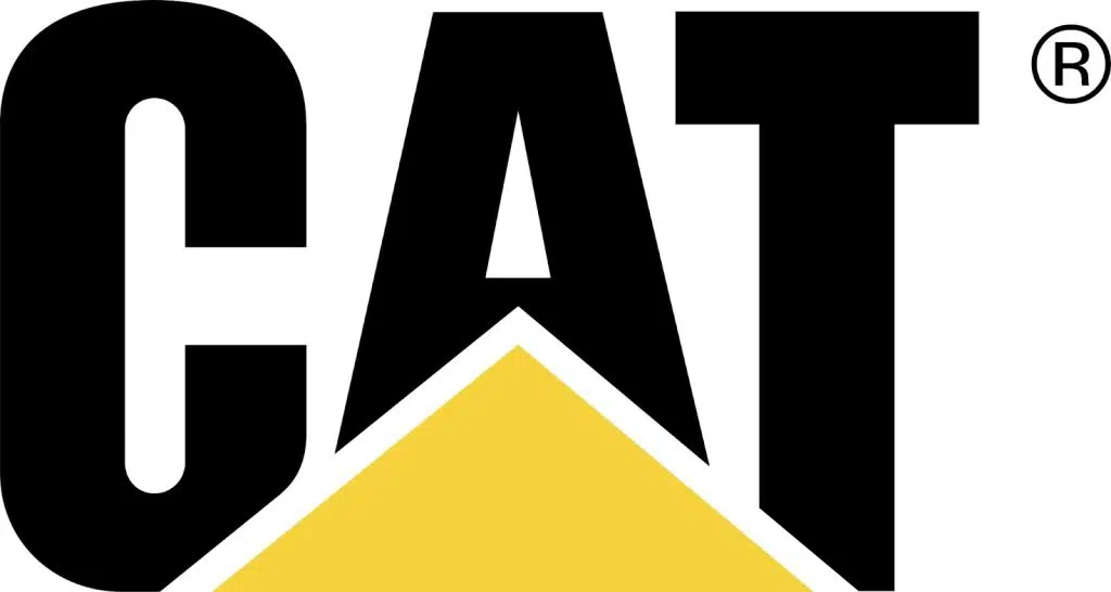
1989–Present: The Yellow Triangle
In 1989, Caterpillar unveiled the logo that would define it worldwide: the word CAT in bold, geometric capitals, accompanied by a forward-leaning yellow triangle beneath the “A.” This triangle symbolizes power, stability, and upward momentum, while the abbreviated name reflects the reality that customers around the globe already called the company “CAT.”
The triangular accent helped anchor the logo in the construction world while distinguishing it from its competitors.
![]()
The Modern Hex Trade Dress (2020s)
In its most recent evolution, Caterpillar introduced the “Cat Modern Hex” trade dress, replacing the long-running “Power Edge” visual system.
The new design integrates:
-
the CAT wordmark,
-
a bold red hexagon, and
-
a 3D grille pattern.
This is both a tribute to the original crawler tractor graphics of 1925 and an evolution toward a modern, premium industrial aesthetic.
Meaning & Symbolism
The Caterpillar identity has always drawn strength from clear, functional symbolism. What began as a literal representation of a crawling machine evolved into a design language built on engineering values. The yellow triangle embodies direction, upward mobility, and industrial precision—echoing the pointed geometry of heavy machinery components. The bold, blocky lettering conveys endurance and mechanical power.
As the brand matured, its logos shifted away from literal representations to abstractions rooted in energy, stability, and momentum. Through every revision, Caterpillar retained one unshakable visual purpose: to symbolize work, engineering excellence, and unbreakable reliability.
Typography & Color Palette
Caterpillar’s typographic journey charts the evolution of industrial design. Early serif styles gave way to modernist sans-serifs, culminating in bold, geometric letterforms that communicate strength and simplicity. The current CAT logotype uses a tall, wide sans-serif font that balances stability with clarity.
The color palette remains unmistakable:
-
Black for authority, weight, and engineering seriousness.
-
Caterpillar Yellow for construction heritage, safety visibility, and brand distinction.
-
Red (in the Modern Hex system) as a historic nod to early machinery graphics and a symbol of energy and innovation.
Together, these tones form one of the strongest color identities in global industry.
A Legacy Built in Iron
The Caterpillar logo is more than a corporate mark—it is the signature on some of the largest, most influential machines ever built. From its early literal illustrations to its modern geometric precision, the logo reflects a century-long story of innovation.
Holt and Best’s vision lives on in every iteration: machines that conquer terrain, change landscapes, and move industries forward. As Caterpillar continues innovating—from AI-enabled machinery to sustainable energy solutions—its visual identity remains a stable anchor in a rapidly evolving world.
Few brands achieve this level of timeless recognition. Fewer still earn it. CAT has done both.
FAQ — Caterpillar Logo & Brand
What does the Caterpillar (CAT) logo represent?
The CAT logo symbolizes power, stability, and upward momentum. The yellow triangle reflects engineering precision and industrial heritage, while the heavy typeface conveys reliability.
Why is Caterpillar abbreviated to CAT?
“CAT” became the widely used shorthand among customers long before it was formalized. In 1989, the company embraced the abbreviation as its primary visual identity.
When was the first Caterpillar logo created?
The earliest official Caterpillar logo appeared in 1925, shortly after the merger of Holt and Best, featuring an undulating wordmark mimicking a crawling insect or tractor tracks.
What is the meaning of the red hexagon in the latest trade dress?
The red hexagon is a modernized homage to the graphics found on Caterpillar’s original crawler tractors from 1925, reflecting both heritage and innovation.
Who founded Caterpillar?
Caterpillar was founded in 1925 through the merger of two companies led by Benjamin Holt and C. L. Best—pioneers of tractor engineering and continuous track technology.