Calvin Klein Logo History: Meaning, Symbolism & Brand Heritage
![]()
There are fashion logos that shout, and there are fashion logos that whisper—yet stay carved in collective memory. Calvin Klein belongs firmly to the second category. Since its founding in 1968, the brand has built its entire visual identity around clarity, restraint, and the modern American attitude that defined a new era in global fashion. What began as a small New York label grew into an international empire, with a logo that became as iconic as the campaigns that carried it around the world.
More than a symbol of a brand, the Calvin Klein logo is an emblem of cultural influence. It reflects a philosophy of sensual minimalism, a reverence for clean lines, and a belief that confidence needs no embellishment. Throughout its evolution, the identity has remained unmistakably Calvin Klein—quiet, bold, and profoundly modern.
Meaning & Symbolism
The meaning of the Calvin Klein logo lies in the very essence of understatement. From the beginning, Calvin Klein positioned his fashion house against the ornate traditions of European luxury, choosing instead a visual language rooted in purity and modern structure. The logo expresses this philosophy with remarkable precision. Its geometry is clean, its lines are unadorned, and its presence is almost architectural.
Rather than conveying symbolism through imagery, the logo lets typography itself speak. It reflects the brand’s devotion to simplicity and proportion, a nod to the human form and the New York minimalism that shaped Calvin Klein’s aesthetic. The neutrality of the wordmark is intentional — it becomes a backdrop, a supporting framework that allows the brand’s daring, provocative advertising photography to shine.
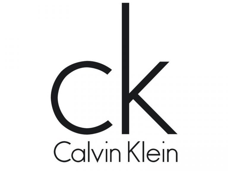
During the 1990s, the lowercase “CK” monogram added a new layer of symbolism. It became an international badge of youthful cool: approachable, modern, and instantly recognizable on denim waistbands, underwear elastics, perfume bottles, and streetwear. Its lowercase composition suggested ease and intimacy, capturing the sophisticated casualness that Calvin Klein was championing long before it became mainstream.
The Calvin Klein logo symbolizes clarity, sensuality, and modernity. It does not dominate — it resonates. In an industry often defined by lavish ornamentation, its restraint is its luxury.
Logo Evolution Timeline
![]()
1968–1975: The Birth of Minimalism
Calvin Klein introduced his first official logo in 1968, the same year he launched his fashion brand. The wordmark was set in a delicate, lightweight sans-serif typeface, rendered in a classic black-on-white palette. It looked effortless and fresh, echoing the designer’s belief that true refinement lies in simplicity.
The typography resembled early geometric sans-serifs such as Kontora Light and Hess Gothic Round NF—clean, open, and human-centered. This was the foundation of the Calvin Klein identity: quiet, modern, unmistakably pure.
![]()
1975–1992: Stronger Lines, Clearer Presence
In 1975 the logo was refined to give it more visual weight. The letters became bolder and slightly more condensed, switching to a typeface closer to ITC Avant Garde Gothic Pro Book and OL Round Gothic Bold.
This period coincided with the brand’s growing influence and its shift toward a more assertive aesthetic. The logo reflected this evolution with a firmer, more defined structure that carried presence whether printed on labels, packaging, or advertising campaigns.
![]()
1992–2017: The Era of the “ck” Monogram
The early 1990s marked a pivotal moment for Calvin Klein’s global identity. The logo transitioned to a typeface that balanced the lightness of the 1960s version with the boldness of the 1970s, resembling Bambino Light in tone.
Simultaneously, the now-iconic lowercase “ck” monogram emerged as a signature element. Seen on underwear, jeans, fragrances, and accessories, it became one of the most recognizable symbols in fashion culture, embodying the effortless cool associated with the brand.
![]()
2017–2020: A Confident Uppercase Reinvention
In 2017, the Calvin Klein logo was dramatically reimagined. The wordmark switched to uppercase, returning to the ITC Avant Garde Gothic Pro Book typeface previously used in the 1980s.
The letters were placed closer together, giving the logo a condensed strength that aligned with the bold, editorial direction overseen by then-Chief Creative Officer Raf Simons. It was modern, sharp, and unapologetically assertive.
![]()
2020–Today: A Contemporary Return to Essentials
The most recent evolution brought a subtle refinement: the wordmark now uses the same typeface as the 2017 version, but its capitalization varies depending on context. In some applications, the brand uses lowercase; in others, uppercase.
This flexibility reflects Calvin Klein’s present-day identity — timeless, stripped-down, and effortlessly adaptable across haute couture, casual wear, fragrance, and lifestyle products.
![]()
Font & Typography
Typography has always been the soul of Calvin Klein’s identity. Over five decades, the brand has remained loyal to the geometric purity of sans-serif fonts inspired by Futura and Avant Garde. These typefaces, with their clean circles and straight lines, mirror the structural clarity of minimalist architecture — one of the visual foundations of Calvin Klein’s design language.
The balance between thick and thin strokes, the meticulously calculated spacing, and the precision of each glyph create a wordmark that feels both modern and timeless. This typographic approach allows the logo to remain elegant regardless of scale, from runway invitations to billboard campaigns.
Whether lowercase or uppercase, the typography communicates the same message: refined restraint, contemporary luxury, and a commitment to visual clarity.
Color Palette
Calvin Klein’s color palette is a deliberate statement of purity and versatility. The primary version of the logo uses deep black against a white background — a pairing that creates sharp contrast and absolute legibility. Black represents sophistication, authority, and the brand’s uncompromising refinement. White echoes purity, lightness, and the minimal aesthetic that defines the Calvin Klein universe.
In practice, the logo also appears in gray and white variations depending on the collection. Black dominates haute couture and luxury lines. Gray often appears on everyday ready-to-wear. White typically accompanies activewear and sport collections. Across all variations, the principle remains the same: monochromatic simplicity as a symbol of elegance.
A Modern Classic That Redefined Fashion Branding
Few fashion logos have shaped popular culture as profoundly as Calvin Klein’s. Its quiet authority, built on typography rather than ornamentation, marked a turning point in visual branding. The logo became synonymous with a new fashion language — clean, sensual, urban, and timeless. Each evolution over the decades respected this DNA while adapting to cultural shifts and new audiences.
Today, the Calvin Klein logo remains a masterclass in minimalism. It is not the loudest logo in luxury fashion, but it is one of the most enduring, precisely because it stays true to the belief that simplicity is the ultimate form of sophistication.
Calvin Klein Logo and Modern Minimalism
Calvin Klein’s clean wordmark demonstrates how simplicity and repetition can define modern luxury. This design philosophy aligns with broader branding trends examined in Luxury Fashion Logos Explained: Brand Origins and Meaning.
Calvin Klein Logo FAQ: Meaning, History & Design Insights
What does the Calvin Klein logo represent?
The logo embodies the brand’s minimalist philosophy, emphasizing clarity, proportion, and modern elegance. It symbolizes purity, sensuality, and the confidence of understated design.
Why is the Calvin Klein logo so minimal?
Calvin Klein built his brand on the idea that simplicity is more powerful than excess. The minimalist logo reflects the designer’s aesthetic roots in American modernism.
What is the meaning behind the “ck” monogram?
Introduced prominently in the 1990s, the “ck” monogram became a cultural symbol of youthful cool and intimacy. Its lowercase form expresses accessibility and modern refinement.
What font does Calvin Klein use?
The logo has long relied on geometric sans-serif fonts inspired by Futura and ITC Avant Garde Gothic Pro. These typefaces give the brand its crisp, architectural style.
Why does Calvin Klein change between uppercase and lowercase?
The brand uses different versions depending on context: uppercase for strong, editorial applications and lowercase for softer, lifestyle-oriented collections. Both styles maintain the same minimalist DNA.