Tommy Hilfiger Logo History: Meaning, Symbolism & Brand Heritage
Few modern fashion brands have built an identity as instantly recognizable — and as deeply tied to American culture — as Tommy Hilfiger. Since its debut in 1985, the Hilfiger flag has become synonymous with youthful confidence, nautical freshness, and a preppy heritage infused with pop-culture energy. While the brand itself evolved from small upstate New York shops to a global powerhouse present in nearly 100 countries, its logo remained remarkably stable: a bold, geometric signal flag flanked by a classic serif wordmark.
More than a symbol, the Tommy Hilfiger logo became a visual shorthand for a lifestyle — the essence of American cool, blending East Coast prep, maritime influences, and the optimistic colors of the U.S. flag.
Meaning and Origins of the Tommy Hilfiger Emblem
Long before Tommy Hilfiger became a household name, he was a young designer with a fascination for Americana and nautical culture. These influences are visible in everything he touches — from varsity stripes to yacht-club aesthetics. So when the brand launched in 1985, it made perfect sense that the central icon of its new visual identity would derive from a maritime signal flag.

In the International Code of Signals — the communication system used by ships — the white-over-red square pattern represents the letter H (“Hotel”). Its literal meaning is “I have a pilot on board.” For Hilfiger, however, the attraction was purely symbolic: H stood for “Hilfiger,” and the flag’s clean geometry perfectly matched his vision for a crisp, preppy, all-American brand.
The result was one of the most iconic fashion emblems of the 20th century — a logo that could both command attention on billboards and sit subtly embroidered on the chest of a cotton polo.
Tommy Hilfiger Logo Evolution Timeline
Although the logo has undergone refinements over the decades, its structure and spirit have remained intact: the rectangular flag, the serif typography, and the red-white-blue palette are constants of the brand’s DNA.
![]()
1985 – Today: The Birth of the Flag and the Hilfiger Identity
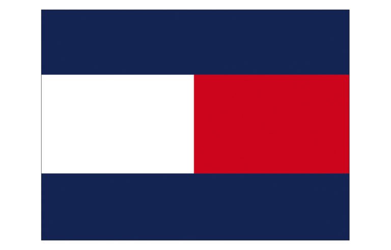
When the brand officially debuted in 1985, its logo combined two elements: a clean serif wordmark and a bold flag constructed from navy, white, and red fields. The design was modern yet rooted in tradition — the balance Hilfiger always sought.
The original mark featured slightly wider typography, designed to fit proportionally within the width of the flag when used as a unified block. Over time, the wordmark was refined, becoming narrower and more sophisticated, but it never abandoned its uppercase serif structure.
The central flag — two horizontal rectangles of white and red framed by navy — became the heartbeat of the brand. It blended maritime precision with the three colors most synonymous with American heritage.
Across campaigns, fashion shows, and clothing lines, the Hilton flag became a symbol of confidence, coolness, and aspirational lifestyle. Even as the logo layout was occasionally tweaked, its core visual remained unchanged, a testament to its enduring cultural relevance.
Symbolism Behind the Tommy Hilfiger Logo
The Hilfiger flag is not just a geometric pattern. It is a cultural bridge between maritime tradition and American identity.
Nautical Significance:
The logo’s core shape is directly inspired by maritime signal flags, evoking coastal life, sailing culture, and classic preppy influences — hallmarks of Tommy Hilfiger’s aesthetic.
American Heritage:
The palette — navy blue, bright red, and pure white — mirrors the U.S. flag, reinforcing the brand’s roots in American optimism, freedom, and youthful style.
Personal Meaning:
The “H” flag expresses Hilfiger’s identity in its purest form. While it echoes centuries of naval communication, its real message is simple: Hilfiger is onboard.
The Emblem: A Visual Manifesto of Preppy Modernity
The blocky, rectangular Hilfiger flag is at once minimalist, assertive, and deeply symbolic. It communicates clarity and order — much like the crisp lines of a naval uniform or the clean construction of traditional American sportswear.
When combined with the serif wordmark, the emblem becomes a statement of heritage. When used alone — as it often is on sportswear, jackets, and polos — the flag achieves an even stronger symbolic presence: a global icon recognizable without a single letter of text.
Typography: Tradition Framed by Modern Precision
The wordmark uses a stately, uppercase serif font inspired by classic Roman proportions. The deliberate contrast between thick and thin strokes adds elegance while preserving a sense of straightforward confidence.
Earlier versions of the wordmark were slightly wider, accommodating the proportions of the rectangular flag above or beside it. Modern iterations are slimmer but remain unmistakably Hilfiger — refined, clean, timeless.
This typographic restraint amplifies the brand’s message: simplicity is luxury, and clarity is confidence.
Color Palette: Red, White, Blue — and Undeniably American
Tommy Hilfiger’s color story is inseparable from its logo. The palette mirrors the U.S. national flag, reinforcing the designer’s deep admiration for American culture.
Navy blue conveys trust, depth, and sophistication.
White signals clarity, minimalism, and freshness.
Red adds energy, passion, and assertiveness.
The palette has remained unchanged since 1985, with only one functional modification: early logos used white lettering for the wordmark, but modern versions use navy blue for stronger contrast and versatility.
A Timeless Flag of American Cool
The Tommy Hilfiger logo is a masterclass in branding longevity. It is a flag — both literally and metaphorically — proudly waving for nearly four decades. Its strength lies in its simplicity: clean geometry, bold color blocks, and a typeface that balances elegance with youthful energy.
The emblem captures the essence of Hilfiger’s world: coastal confidence, American heritage, and the enduring appeal of classic preppy style. In an industry where many logos evolve dramatically, Tommy Hilfiger’s has remained an anchor — steady, unmistakable, and universally resonant.
It is not just a logo. It is a lifestyle standard-bearer, a timeless emblem of American fashion that still speaks with clarity and relevance across generations.
FAQ — Tommy Hilfiger Logo & Brand Identity
What does the Tommy Hilfiger logo represent?
It represents the brand’s nautical inspiration, American heritage, and the designer’s initial “H” derived from the maritime signal flag system.
Why does the logo use a red, white, and blue palette?
These colors mirror the U.S. flag, reinforcing Tommy Hilfiger’s strong American identity.
Is the Tommy Hilfiger logo a real nautical flag?
Yes. The central symbol is a genuine maritime signal representing the letter “H” (“Hotel”) in the International Code of Signals.
Does the logo appear differently on different products?
Yes. Casualwear often features only the flag, while formalwear sometimes uses only the serif wordmark or a minimal version.
Has the Tommy Hilfiger logo changed over time?
The design has been refined but not fundamentally altered since 1985, preserving its iconic structure.