Givenchy Logo History: Meaning, Symbolism & Brand Heritage
![]()
Few fashion houses have managed to merge aristocratic restraint with avant-garde precision the way Givenchy has. Founded in 1952 by the young prodigy Hubert de Givenchy, the maison rose instantly through the ranks of Parisian couture thanks to a vision of purity, architectural elegance, and a discipline of form that influenced generations. The brand’s identity, both visual and cultural, reflects this ethos: refined, modern, and unmistakably French.
Givenchy was the couture house that dressed Audrey Hepburn; the brand that introduced luxury ready-to-wear before it became industry practice; the maison that evolved seamlessly from Hubert’s aristocratic minimalism to Riccardo Tisci’s sensual darkness, and later Clare Waight Keller’s romantic modernity. Through all these eras, the brand’s logo—both typographic and symbolic—remained a pillar of continuity, a statement of restraint in a world of perpetual reinvention.
Today, Givenchy stands among the world’s most influential luxury houses, its logo heritage representing a masterclass in modernist design: geometric, balanced, and timeless.
Meaning and Symbolism
Givenchy’s identity has always been anchored in purity of line and clarity of form. The maison’s founder believed deeply in the architectural discipline of couture—clothes should be simple, impeccably constructed, and emotionally resonant. This philosophy translated naturally into the brand’s visual identity.
The Givenchy logotype operates like a piece of modernist design: structured, balanced, but emotionally neutral, allowing the garments to take center stage. The four-G emblem, introduced later and used in tandem with the wordmark, expresses the same principles through abstraction. Its geometric symmetry nods to Celtic motifs, evoking notions of eternity, continuity, and interlocking meaning. Each “G” is mirrored, rotated, and locked into place, forming a perfect square that symbolizes order, unity, and the refined restraint of Parisian couture.
Even the spacing of the letters in the wordmark speaks to the brand’s approach. Generously spaced characters allow air and light to enter the composition, emphasizing modernity while preserving legibility at any scale—from leather goods to fragrance bottles.
Givenchy Logo Evolution
1952 – Today: The Original Wordmark
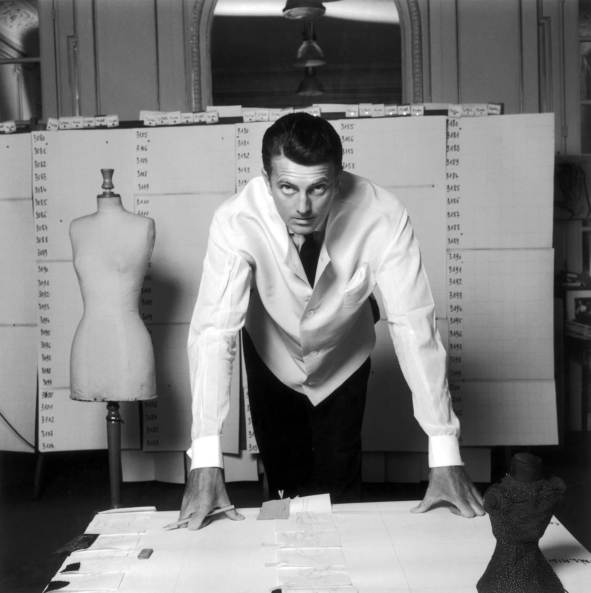
Since its founding in 1952, Givenchy has relied on a typographic identity that remained remarkably consistent. The original wordmark featured the maison’s name set in a clean, modern sans-serif typeface, with all letters capitalized and arranged with thoughtful spacing. Unlike many fashion brands that oscillated between ornate scripts and elaborate symbols, Givenchy’s choice was one of radical minimalism for its era. This clarity embodied Hubert de Givenchy’s fashion philosophy: elegance through simplicity, power through understatement.
Over the decades, the wordmark was refined only in micro-details—adjusted kerning, stricter geometric proportions, more contemporary cuts—but its overall personality remained the same. This continuity is rare in luxury branding and reflects the maison’s belief in structural timelessness.
![]()
2003 – Today: The Four-G Emblem
The iconic quadruple-G emblem, designed in 2003 by Paul Barnes, became the most recognizable symbol associated with Givenchy’s visual language. Built from four identical “G” letters arranged in a square, the motif creates a seamless pattern of interlocking geometry. It recalls both Celtic knots and modernist monograms, embodying a perfect balance between heritage and futurism.
The symbol was introduced during a period when Givenchy’s brand identity needed a stronger visual anchor beyond typography. The emblem provided exactly that—an icon that could function on its own across accessories, leather goods, scarves, hardware, and branding materials. Despite its relatively recent introduction compared to century-old fashion houses, the four-G symbol quickly became one of the most recognizable luxury marks in the world.
![]()
The “Parfums Givenchy” Mark
In addition to the main logotype and the four-G emblem, Givenchy developed a dedicated identity for its fragrance division. This version places the word “PARFUMS” in smaller, refined uppercase letters above the main Givenchy wordmark. The hierarchy is intentional: the brand name carries the visual weight, while the category label functions as a gentle descriptor. The mark is consistent with the maison’s minimalist tradition, maintaining clarity and legibility across compact fragrance bottles and packaging.
The Givenchy Symbol
The four-G emblem is the purest expression of Givenchy’s design philosophy. It is geometric, modular, and deeply modern. Its symmetry suggests structure, and its negative space creates an optical rhythm that works beautifully both as a standalone mark and as a repeatable pattern. This repeatability made it ideal for leather goods and textile prints, where subtle luxury is prized.
The emblem also pays homage to the maison’s founder, Hubert de Givenchy, whose meticulous approach to proportion and geometry shaped the DNA of the brand. The symbol is not literal or figurative; instead, it communicates the sophistication of a house that built its identity on precision.
![]()
Typography and Color
The typography of the Givenchy wordmark is unmistakably modern. It features bold strokes balanced with a classic sans-serif structure, giving the letters authority without heaviness. The spacing between the characters is generous, adding lightness and ensuring clarity across all applications. It aligns with mid-century modern graphic principles and resonates with Givenchy’s architectural approach to couture.
The color palette remains almost exclusively monochrome. Black on white, or white on black, dominates every iteration of the logo. Monochrome reflects luxury without embellishment, aligning with the maison’s commitment to timelessness. In rare moments, metallic treatments appear in packaging, but the identity remains rooted in purity and contrast.
A Modernist Icon in the World of Haute Couture
The Givenchy logo is a landmark of minimalist luxury. While fashion houses often reinvent their identities to follow trends, Givenchy has mastered the art of enduring clarity. Its wordmark is architectural in its restraint, while the four-G emblem presents a powerful, modernist abstraction that feels both historical and futuristic.
Together, they form one of the most refined visual identities in fashion—a system built not on ornament, but on balance, geometry, and the confidence of understatement. From couture salons to global fragrance counters, Givenchy’s logo heritage stands as a symbol of eternal modernity.
FAQ — Givenchy Logo, Meaning & Brand Identity
What does the Givenchy logo represent?
The Givenchy logo represents modernity, precision, and timeless luxury. The four-G emblem symbolizes unity, symmetry, and the architectural approach of the maison, while the wordmark embodies minimalism and elegance.
Who designed the Givenchy symbol?
The iconic quadruple-G emblem was designed by Paul Barnes in 2003 and quickly became a defining mark of the brand.
Why does Givenchy use four Gs?
The four Gs represent a geometric abstraction of the brand’s initial, arranged symmetrically to evoke balance and refinement.
Is the Givenchy logo always black and white?
Nearly always. Givenchy maintains a monochrome palette as a signature of its minimalist, high-luxury identity.
What is the Parfums Givenchy logo?
It is a variation of the main wordmark with the word “PARFUMS” added in smaller text above, used specifically for fragrance products.