
Burberry Logo History: Meaning, Symbolism & Brand Heritage
![]()
Few fashion houses embody the fusion of British heritage, technical innovation, and global sophistication quite like Burberry. Founded in 1856 by Thomas Burberry, the brand began as a modest outfitter dedicated to creating weatherproof garments for everyday life. It eventually became a worldwide symbol of elegance, function, and craftsmanship. The invention of gabardine, the rise of the trench coat, and the introduction of the iconic Burberry check shaped the brand’s cultural identity; yet just as influential has been the evolution of its logo — a visual story spanning more than a century and reflecting shifts in style, leadership, and cultural relevance.
As Burberry transitioned from Victorian Britain to a modern fashion empire, its logos adapted from ornate heraldry to contemporary simplicity, mirroring the house’s journey from equestrian romance to street-influenced luxury. The Burberry logo heritage stands as one of the most distinctive in the world of fashion branding.
Meaning and Symbolism
Burberry’s visual identity has always been rooted in ideas of protection, performance, and noble craftsmanship. Thomas Burberry believed clothing should empower the wearer — shielding them from weather and elevating their presence — and the early emblems translated these ideals into symbolic language.
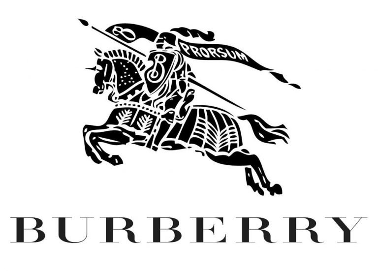
The equestrian knight, introduced in 1901, became the brand’s central metaphor. The lance, shield, and armor reflected strength, honor, and endurance, while the flowing banner bearing the Latin word “Prorsum” (“forward”) declared Burberry’s commitment to progress and technical innovation. The emblem was both historical and aspirational, pairing medieval heraldry with a modern industrial spirit.
As the fashion landscape entered the digital age, Burberry shifted toward minimalist typography that could adapt across contexts — from luxury boutiques to global campaigns — and in 2018 the wordmark became the brand’s primary identifier. In 2023 Burberry embraced a more expressive serif, signalling a renewed interest in heritage, literature, and British craftsmanship, while still maintaining a contemporary vision. Each transformation reflects the brand’s ability to balance legacy with reinvention.
Burberry Logo Evolution
Burberry’s logo reflects centuries of British craftsmanship and tradition. Its evolution fits into the wider context of national identity and luxury branding explored in Luxury Fashion Logos Explained: Brand Origins and Meaning.
![]()
1901–1968: The Era of the Equestrian Knight
The first official Burberry logo debuted in 1901 after an internal design competition. It showcased a knight charging forward on horseback, holding a shield inscribed with the letter “B” and a lance from which flowed a banner reading “Prorsum”. The emblem communicated authority, craftsmanship, and a sense of forward motion. The accompanying wordmark was set in a stately serif that suited the Edwardian era. For more than sixty years, this logo symbolized Burberry’s commitment to quality outerwear and British military uniform heritage.
![]()
1968–1999: A Refined, Modern Silhouette
In the late 1960s Burberry refined its identity for a rapidly modernizing fashion world. The knight remained, but it was simplified into a solid black silhouette without the internal detailing of the earlier illustration. Beneath it, the wordmark shifted to a title-case serif accompanied by the phrase “Of London,” creating a look that balanced tradition with contemporary style. This period marked Burberry’s expansion into international fashion and luxury retail, and the cleaner emblem reflected a more cosmopolitan identity.
![]()
1999–2018: Balanced Elegance and European Modernity
Another major refinement arrived in 1999, when Burberry repositioned itself as a global luxury house. The knight regained a sense of sharp contouring and precision, rendered in a striking black-and-white contrast. The wordmark, now in a high-fashion serif resembling the Bodoni family, adopted a more architectural and elegant presence. The tagline became a single word — “London” — underscoring the brand’s roots. For nearly two decades, this version defined Burberry both in retail environments and international campaigns.
![]()
2018–2023: The Typographic Breakthrough
In 2018, under creative director Riccardo Tisci, Burberry underwent one of the most radical visual transformations in its history. The equestrian knight was removed from the main logo for the first time, signaling a move toward cleaner, international luxury branding. The new wordmark was bold, geometric, and tightly spaced, designed for maximum legibility across digital platforms. Often paired with the tagline “London England,” the 2018 logo embraced modernity with assertiveness, clarity, and a new graphic language.
Despite this shift, the knight remained present on packaging, linings, and heritage-inspired products, preserving the brand’s connection to its past.
![]()
2023–Today: A Return to Crafted Elegance
With the arrival of Daniel Lee, Burberry reintroduced emotional craftsmanship into its branding. The 2023 wordmark features a refined serif with flared terminals and subtle movement, creating an expressive and almost calligraphic rhythm. It feels distinctly British — reminiscent of book covers, archival typography, and traditional signage — yet modern in its sharp geometry. This new direction balances nostalgia with contemporary luxury, reinforcing Burberry’s identity as both a heritage house and a creator of modern culture.
![]()
Symbolism: The Equestrian Knight
Even though it is no longer the official primary logo, the equestrian knight remains one of the most culturally significant emblems in fashion history. It symbolizes honor, dignity, and craftsmanship, aligning with Burberry’s tradition of outfitting explorers, officers, athletes, and public figures. The shield conveys protection, echoing the protective qualities of gabardine and the trench coat. The banner expresses ambition and direction. And the entire composition stands as a visual tribute to Burberry’s origins in Victorian Britain.
To this day, the knight appears on certain garments, linings, and accessories, continuing to embody Burberry’s historical soul.
Typography and Color
Burberry’s typographic choices have always mirrored the mood of its era. Early sans-serif interpretations suggested modernity in the early twentieth century. The 1999 serif expressed European luxury and precision. The 2018 geometric sans-serif embodied digital-age clarity. And the 2023 serif blends literary elegance with contemporary sharpness. This typographic evolution demonstrates Burberry’s responsiveness to cultural change.
The color palette remains predominantly black — a universal symbol of sophistication, authority, and timelessness — allowing the brand’s textiles, especially the iconic check, to take center stage.
Burberry’s Logo as a Living Expression of Heritage
The history of the Burberry logo is, ultimately, the history of Burberry itself: a brand born from purpose, elevated by craftsmanship, and continually redefined through innovation. Its identity has moved from equestrian heraldry to geometric minimalism and back toward expressive craftsmanship, mirroring the transformations of fashion and the shifting values of luxury.
Through every iteration, Burberry has preserved a delicate equilibrium between heritage and modernity. Its visual identity — whether through the knight galloping “forward” or the refined serif of today — tells the story of a house that respects its past while never ceasing to evolve.
Burberry Logo FAQ
What does the Burberry logo represent?
The Burberry logo has historically represented protection, honor, and forward movement. The equestrian knight, introduced in 1901, symbolized nobility and the brand’s commitment to innovation, while its modern wordmarks emphasize clarity, craftsmanship, and contemporary luxury.
Why did Burberry change its logo in 2018?
The 2018 redesign reflected a shift toward modern minimalism. Under creative director Riccardo Tisci, Burberry sought a stronger digital and global presence, choosing a bold geometric wordmark and simplifying its identity for the contemporary luxury market.
What happened to the Burberry knight emblem?
The knight was removed from the official main logo beginning in 2018 but continues to appear on packaging, heritage garments, linings, and select accessories. It remains an essential part of the brand’s visual heritage.
Is Burberry a French or British brand?
Burberry is a British fashion house founded in 1856 in England. Its identity, craftsmanship, and history are deeply rooted in British culture.
What does “Prorsum” mean on the original Burberry logo?
“Prorsum” is Latin for “forward.” It highlighted Burberry’s commitment to innovation and its continuous pursuit of technical progress, particularly in garment construction and fabric development.
Who owns Burberry today?
Burberry remains an independent British luxury company, publicly traded on the London Stock Exchange. Unlike many heritage brands, it is not owned by a conglomerate such as LVMH or Kering.